
Tag Archives for " web page "

How Backlinks from Different Page Locations Are Worth More (Or Less): Not All Backlinks Are Created Equal
If you want to get found online, you need a strong backlink profile.
The problem? Not all backlinks are created equal.
Links from high-quality, relevant sites are far more valuable than links from random sites in another industry. Links from spam sites can actually hurt your website.
How do you make the most of your backlinks? You need to pay close attention to the factors that impact backlink value.
Here is what you need to know to make the most of backlinks.
What Are Backlinks?
Backlinks are links from an external site to your website. For example, if I link to a source about how to protect your app from security issues, that creates a backlink to that website.
If another site links to your site, you receive a backlink.
For a long time, getting as many backlinks as possible was a core component of SEO. Google viewed backlinks as “votes” and rewarded sites with lots of backlinks with higher rankings.
Eventually, however, businesses began to use black-hat strategies to build backlinks. For example, paying sites to add links, buying links from shady sites, adding comments to other blogs with links to own site, or building networks of sites that are all linked to each other.
Google got wise to these strategies and issued an update that made it much harder to get away with building poor-quality backlinks. It released a number of backlink guidelines that marketers should follow and also released another update targeting spammy links in June of 2021.

How Do Backlinks Affect SEO?
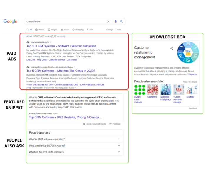
As mentioned above, Google views links as votes. The more sites that “vote” for your site (meaning link to pages on your site), the more valuable and relevant Google assumes your pages and site are.
In fact, backlinks are one of several hundred factors Google considers when deciding where to rank a website in its search results.
Here’s why: A backlink to your website means another site found your content engaging, interesting, or educational. So much so that they decided to share it with their audience. Google assumes that means your content is valuable to users, and is more likely to share your content with searchers.
However, there isn’t much you can do to impact how many links another site puts on its pages. Just keep it in mind when considering which links are most valuable for your website’s SEO.
If many trusted sites link to yours, Google knows your site has great content that users will want to read. As a result, you’re more likely to rank high in the SERPs.
What Makes a Backlink Valuable?
More backlinks isn’t always better.
If you use link schemes or other black or gray hat SEO practices, Google will punish you with lower rankings or even manual action. What makes a backlink more valuable than another?
1. Location and Number of Links on a Page
Did you know that where a link is located on a page can impact backlink value? Sounds weird, right?
Well, Google considers the first link on a page to be the most valuable, which means it gets more of the benefits of having a backlink. In addition, the more links on a page, the less link value each link has.
In practice, this means that if your link is the only backlink on a page, you’ll see more SEO benefits than if your link is at the bottom of a page and is one of twenty other links.

2. Dofollow Vs. Nofollow Backlinks
Dofollow links are your basic backlinks. When the website owners don’t fiddle with the HTML surrounding the link, the link will always be a dofollow.
Dofollow links tell Google the linking website trusts your domain, which can help your rankings.
Nofollow links, on the other hand, look like this in HTML:

Nofollow links tell Google that this link should not pass on value (sometimes called link juice).
In other words, nofollow links still take someone from Website A to Website B, but they won’t help Website B’s rankings.

Why do sites use nofollow links? Because linking to low-quality or low-domain authority websites can hurt the link-hosting website’s rankings. Also, Google doesn’t allow you to pay for links, so some sites use nofollow links on sponsored posts.
Don’t assume nofollow links are a complete waste of time. In fact, they really help generate traffic to your website and increase the visibility of your business despite their unhelpful SEO influence.
3. Domain Authority and Page Authority
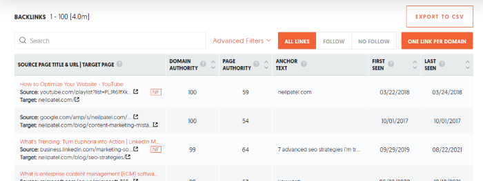
DA, or domain authority, is a metric created by Moz that predicts how likely a website is to rank well in the search engines. Scores range from one to 100, with higher numbers meaning the site is more valuable and more trusted.

Page authority is the same metric, but for a specific page on a website.
It isn’t an exact science, and it isn’t a metric Google came up with—Moz did. However, it does use machine learning to get a pretty decent idea of how well a site will rank.
What does this mean for your backlinks? If a site with a higher domain authority or page authority links to your site, Google will assume your site is more trustworthy, too. That’s a good thing!
Think of it like vouching for a friend to get a job. If you are a dedicated worker and recommend someone else, your boss is likely to assume they can be trusted to work hard, too.
TL;DR: Links from high-domain authority pages are more valuable.
You can find the domain authority of sites using Moz’s domain analysis tool.
Or, you can use Ubersuggest to run a backlink analysis on your site, and we’ll share all the domain authority and page authority metrics in one place.
4. Relevant Sites and Pages
Relevancy matters when it comes to recommendations. Let’s say you wanted to buy a new snowblower. You look around the internet and find two articles that review the top snow blowers—one is from a hardware store, and the other is from a food blogger.
Which one would you trust? You’re likely wondering what a food blogger really knows about snow blowers, right? The hardware store, on the other hand, probably sells snowblowers and talks about them to customers on a regular basis. There is a good chance they know what they’re talking about.
Google also considers relevancy when deciding how valuable a backlink is. For example, a link from a digital marketing publication or a publisher like Forbes to my site is worth more than a link from a plumber.
In general, links from irrelevant sites won’t hurt your website (unless they are spam sites!), but links from other industry websites do carry more value.
5. Quality of Other Links on the Website
It’s not just the domain authority that impacts backlink value. The quality of every other backlink on the referring domain can impact the value of a link too.
It doesn’t sound fair, does it? You can’t control what someone else does on their site. While that is true, there is a reason for this.
Let’s pretend that you receive a backlink from a website with high domain authority. Your ranking goes up, traffic is pouring in, and you feel like the SEO pro you are.

Then one day, the website that gave you that precious backlink becomes a spam site. They publish low-quality content and link to a bunch of spam sites.
It’s no longer a high-quality site in Google’s eyes, which means that link has lost its value. In other words, pages that link to spam websites devalue all other links that they host.
It’s important to evaluate the websites you get backlinks from. That will help you avoid harmful URL relationships. Make sure they are trustworthy and do their own link evaluating when choosing which links to include so that your website won’t be at risk.
Also, never buy links from websites. Even sites that seem legitimate will likely get caught by Google at some point, and your site may suffer the consequences.
6. Anchor Text
Anchor text is the text that is highlighted and often underlined that you click on to follow a link, like this.
If the site that links to your website uses anchor text that is closely related to the content on that page, Google will assume the link is more useful to users and, therefore, assigns it more value. As a result, Google made anchor text a ranking factor.
Let’s look at an example from Yoast’s website. I’ve highlighted the anchor text:
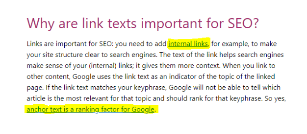
The anchor text for internal links goes to a page about, as you might expect, internal links. Because the anchor text uses the keyword the linked page targets, that link is more valuable than if they used anchor text like “click here.”
Pro tip: This applies to internal links, too. Make sure to use relevant anchor text when linking to other pages on your own website.
Frequently Asked Questions About Backlink Value
How do I identify valuable backlinks?
Backlinks that come from high-quality, relevant sites are the most valuable. Look for the following links and pay attention to other sites they link to. All of these factors impact backlink value.
What’s the easiest way to get valuable backlinks?
The easiest way to build backlinks is to create highly-valuable content that other sites will want to link to. This is often called link attracting, versus link building. Other strategies include looking for broken links on sites and asking them to replace them with yours, guest posting, creating infographics, and creating new data.
What types of backlinks are valuable?
The most valuable backlinks are dofollow links from trusted sites related to your industry with high domain authority.
How much are backlinks worth?
You can’t put a dollar amount on backlinks. However, a solid backlink profile can improve your search engine ranking, drive traffic, and increase your revenue. In that sense, they are priceless.
What is the difference between backlinks and internal links?
Backlinks are links from other websites that point to your site. Internal links are links that point from one page on your site to another. Both have SEO value, but backlinks are usually harder to get and, therefore, considered more valuable.
What do I do if I have a bunch of low-quality backlinks pointing to my site?
In most cases, Google can spot poor-quality backlinks and will ignore them. If you think they are impacting your site (or if you get a manual penalty), you can use Google’s Disavow tool to tell them to ignore those links.
Backlink Value Conclusion
Backlinks are a cornerstone of SEO. However, not all backlinks deliver the same value. Links that are higher on a page or from pages with a higher DA will help your website rank better in Google’s search results.
You can use this information to build higher-quality backlinks. Get it right, and your site can see a flood of traffic and conversions.
Do you consider backlink value when building links? Why or why not?
Source: neilpatel.com

12 Best Landing Page Examples
Would you rather have a beautiful website or a website your customers love?
From a business perspective, you shouldn’t go for either.
Your answer must be 100% I want a high-converting website.
Because if people buy, then they both like it and you can safely and predictably scale your business.
Disclosure: This content is reader-supported, which means if you click on some of our links that we may earn a commission.
Many people get in the trap of creating designs they like while their perfect client avatar is so much different than what they would imagine.
And that can be easily noticed when you click on ads you see on social media.
You might like the ad itself but most times the landing page on the other side is not what you want to see.
The connection between your traffic and your landing page is called an accurate message to market fit.
You want your message to perfectly fit your market so you can start with a winning funnel that’s only bound to go up from there.
Because if you mess up there, you would be optimizing and tweaking little components that will barely get you to break even.
But if you nail your message you would be getting customers left and right without even knowing why or how they came to you.
It’s your most powerful weapon and most businesses do it completely wrong.
So to help you out and guarantee your immediate success, we’ll be going over the best 12 landing page examples that you should use to scale your business.
We’ll go over each one’s strengths and weaknesses while making sure you find one that fits your exact business.
After this post, you’ll be able to come up with high-converting landing pages like magic.
But before we do that, we must go over…
What Makes a Great Landing Page?
In general, a great landing page includes:
- a strong heading that includes your main keyword
- a subheading that clarifies the heading
- a copy that explains the offer
- an image, video, or illustration that supports the offer
- a form or CTA button where the user can convert
You might also include social proof or trust symbols, such as reviews, testimonials, or logos of your past customers.
The exact design, however, will depend on your goals, your business, and your industry.
Let me ask you a couple of questions that will guide you in the right direction.
What do you want to accomplish with your landing page?
Your most common options are:
- Getting people to opt-in in exchange for free value on a subject.
- Directly selling a low-ticket product like a book or a mini-course.
- Free Trial offer for a monthly service or software,
- Free + Shipping offer where you count on upsells to make a profit.
You’ve got to know exactly what offer you want to present on your landing page before creating it.
Of course, there are other offers you can make but the idea here is to clarify what is the one that you want to use for your business.
If you’re not sure, there are multiple examples further down the post.
Are you committed to this project or are you just trying out an offer?
Building a high-converting landing page is not an overnight hustle.
You might find yourself optimizing a non-profitable landing page for months before it starts generating real returns.
If you’re not ready for that, then I recommend you quit before you even start.
Yes, you can get a lucky shot and hit a homerun from your first try, but don’t count on it.
Be ready for the long game so you catch the long-term gains that are so much sweeter than the momentary satisfaction.
What’s your budget?
Before you begin designing your high-converting landing page, you need to prepare a solid budget.
You can’t expect everything to go smoothly throughout the process.
Problems are going to occur and most times the easiest and fastest way to solve them is to pay someone who is an expert in the field.
That can be a developer, a funnel designer/builder, an Ad specialist, or a CRO consultant.
Either way, you should be ready to pay someone to do it right so you don’t face the same problems over and over.
In marketing and life, there’s a rule of thumb that suggests you should finish your work and then let someone else judge it.
Obviously, for landing pages, the way is to run some ads and see if the traffic converts.
If it does, you raise your ad budget and try to scale.
If it doesn’t convert initially then you should let a professional take a look at it.
Even if you already hired someone to build it for you, don’t expect him to help you here.
Yes, they can optimize your page but you’ve got to keep in mind that people have an emotional attachment to their work.
That’s why you need a third party to help you out.
When it comes to optimizing a landing page for conversions, you must consider the idea of hiring an agency.
Big marketing agencies nowadays have had hundreds if not thousands of clients who had been in your exact situation.
That’s why hiring a marketing agency to help you increase your conversion is the best bet.
Talking about CRO (conversion rate optimization) there’s no better choice than NP Digital.
It is simply the best marketing agency for both SEO and CRO.
If you’re at the stage where you want to optimize your existing landing page but you don’t know exactly how to do it, then book a quick call with a professional where you’ll unravel the secret conversion optimization methods your business needs.
Now, let’s look at some landing page examples.
The Best 12 Landing Page Examples
These are the 12 Best Landing Page Examples we could find.
We’ll be judging them for conversions, offer, design, and customer experience.
1. Get Response
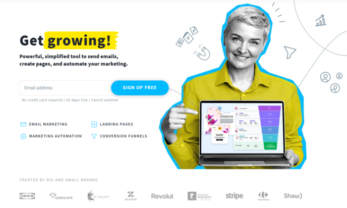
Get Response is a simple yet interactive landing page example.
You can see the Get Response team is bold as they’re the only software in the industry that uses an interactive headline.
The yellow sign you see on the image below changes between the words growing, leads, and sales.
That makes it for a great attention-grabbing headline that just makes you read on.
Also, they use a friendly, positive face which is something we don’t see very often in business that is not centered around a personal brand.
That of course is not a bad thing. It automatically builds trust and makes it easier for people to sign up for their software.
2. Slack
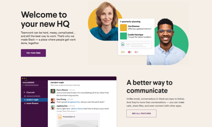
Slack is always on the top of its game when it comes to landing pages.
They are constantly optimizing for conversions and that’s the best way to find your winning landing page.
Their current one is extremely interactive, has a big eye-popping headline, and also shows how easy it is to use the software with a quick five-second gif.
Straight from the get-go, you can see they value customer satisfaction and if you’re still not sure, scrolling down will lead to non-stop credibility and results that prove their authority in the marketplace.
3. Intercom
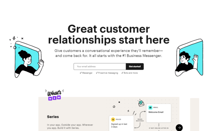
Intercom’s main objective on this landing page is to get you to sign up for their email list.
Keeping it to email is a great way to increase your opt-in rate.
A big, positive headline that puts you in the right state of mind to act now.
The images they use perfectly represent the headline’s main unique selling proposition.
You can see an overall friendly environment and you just have to opt-in if you got to this page.
4. Lyft
Lyft has been growing in the past years, and its website, landing page, and overall online funnel is a driving force.
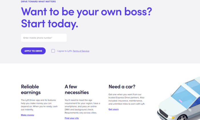
They focus on attracting new drivers that want to control their own life.
Promising your workers’ freedom while working for you is the best way to snap the best candidates from your competitors.
Lyft has used multiple landing pages in the past, but their current one shows real professionalism.
Once again, we see a giant, attention-grabbing headline. This time with a question to anticipate curiosity and thought process in their prospects.
Check out the button “APPLY TO DRIVE”. It implies that it’s not 100 percent sure you’ll be able to get the position.
Making it so your clients have to compete to get a hold of your attention makes it so they try harder in the job itself.
5. Zoho
Zoho’s landing page is a great example of a more complicated but still extremely powerful messaging.
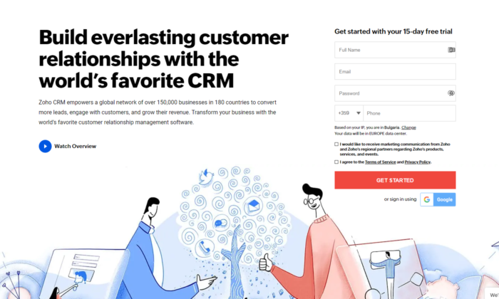
They use more text than the average software in the industry but that’s not necessarily bad.
For their specific case, they need to convert the prospect to begin a free trial which automatically builds tension in a prospect because he knows it will come a time he’d have to pay.
Converting someone to pay is way harder than just getting their email.
That’s why using more text in their messaging makes it for a powerful copywriting punch that maximizes free-trial registrations.
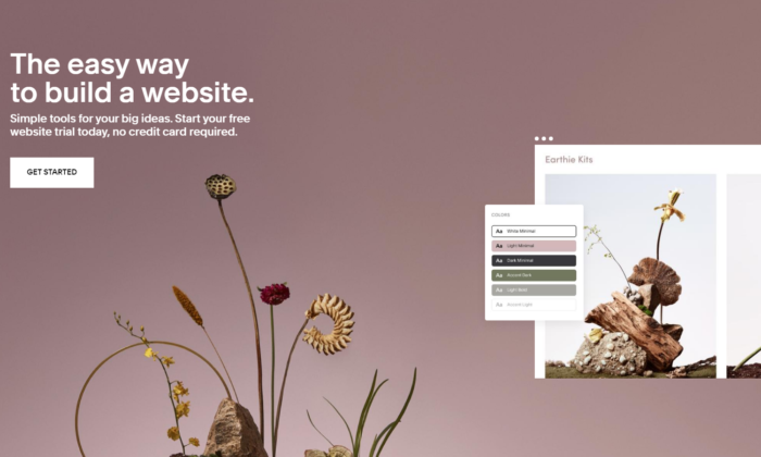
6. Squarespace
Squarespace tops the list for the least amount of text in their landing page design.
You might think that copy is not enough to convert someone.
However, once you see that they’re a website builder, you can see how the design and the quick and powerful messaging are all you need to sign-up.
They know their prospects mainly struggle with complicated codes and want to show a safe space where they can relax and drag and drop their winning website design.
7. ActiveCampaign
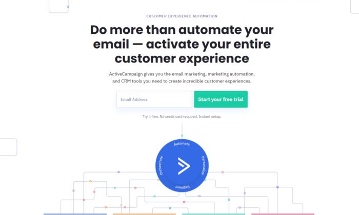
ActiveCampaign solely focuses on showing you how their software brings the best customer experience possible.
If you’re a business owner, you both want to be treated well and want to help your customers in tough times.
Their headline hits two birds with one stone and, once again, there’s no useless text or design.
Everything leads to the big green button and you starting your free trial.
8. Hubspot
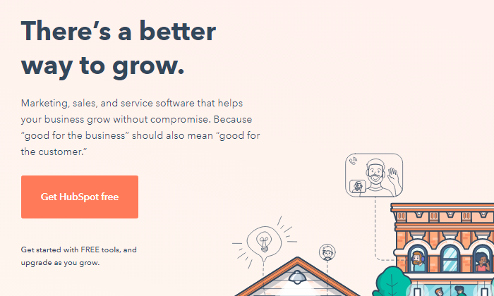
Hubspot is one more CRM that tops out the list today.
Just like ActiveCampaign, they show you that using their software will both help you and your customers feel better throughout the process.
Knowing that their ideal customer’s main objection is that learning a whole new CRM from scratch might be hard, tedious, and maybe even impossible, helps them narrow their message straight to the point.
9. Shopify Plus
Shopify is one of the most well-known platforms in today’s online space and they know it.
As they’ve grown, they’ve been able to test out multiple landing page designs to find one that converts.
And Shopify Plus’s landing page shows for it.
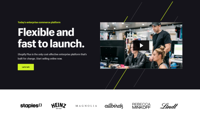
Their main goal is to book a consultation call with their prospects, which takes more than just a couple of words.
They have the budget to shoot professional videos for all of their products and services which helps transfer valuable information to their prospects in the fastest possible way — video marketing.
Down below you see powerful credibility and if you take the time to watch the video, you’re most likely going to book a call with them.
Videos are a deadly weapon in the right business’s hands and Shopify proves that here and pretty much with anything they do.
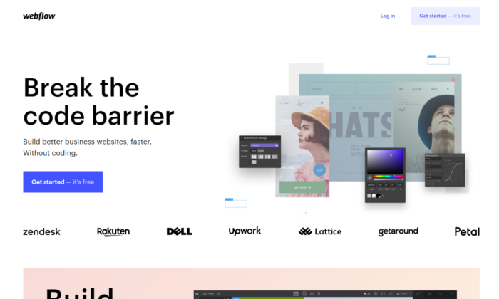
10. Webflow
Webflow shows the insights of the software immediately when you land on their landing page.
You can see instant credibility from big websites that have used their services and also you can begin for free.
That breaks any tension the prospect might have.
On top of that, you can see that their software is similar to Photoshop.
So if you’ve ever used Adobe’s products, you immediately know this work will be a piece of cake for you.
11. ClickFunnels
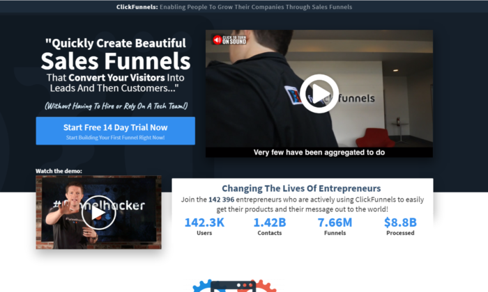
ClickFunnels uses its software to convert you for a free trial.
Even if you’re skeptical, you can play around with the funnel pages and buttons to see the responsiveness of their tool.
You can see that they use more text than the average website/funnel builder.
Once again they’re trying to convert people to start a 14-day free trial which is not an easy task.
They also use powerful videos that sell directly to their ideal customers.
The best part is the analytics they’ve added to their landing page.
It’s a bold and powerful move if done correctly.
The way these analytics are crafted makes it so they are constantly being updated and it’s not just 100K+ users as you might see on other platforms.
ClickFunnels values its customer’s success stories and is always there to record each result.
It’s one of the harder landing page designs to pull off but if you do it, your conversions will skyrocket.
12. Conversion Lab
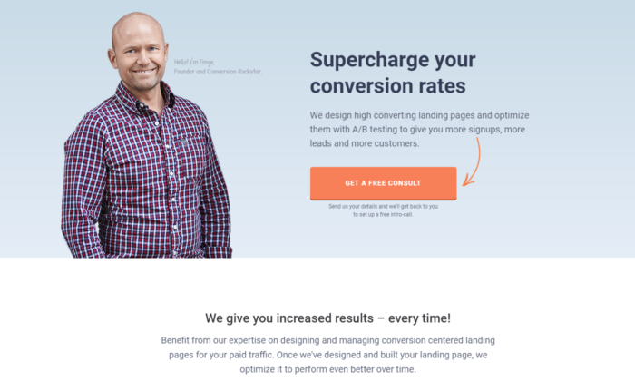
Conversion Lab has been using this landing page design for years now.
We’ve noticed they split test different button CTAs, like book a call, get a free consult, and many more.
Keeping their Founder on the main page of the website builds a long-term relationship many businesses nowadays miss out on.
They clearly state their services through their persuasive headline and, even if you’re not ready to book a consultation, a pop-up will appear collecting your email.
Email follow-up is a great way to ensure that a high percentage of prospects that land on your website will end up booking a call with you.
Landing Page Examples: Frequently Asked Questions
What is a landing page and how does it work?
A landing page is a specially designed page intended to encourage users to complete a specific task (i.e., convert.)
They work by highlighting key points, using social proof or case studies to build trust, and providing a CTA to encourage conversion.
What should a landing page include?
While the exact format may vary, landing pages should include:
- a headline that includes the main keyword
- subheading that clarifies the heading
- a description of the offer image, video, or illustration CTA button or form (optional) trust elements such as customer logos, reviews, or testimonials
Who needs a landing page?
Any business with a website should have a landing page of some sort to encourage users to take an action, such as book a demo, call for a quote, sign up for an email list, etc.
Do I need to A/B test my landing pages?
Absolutely. A/B testing should be an ongoing process to increase your landing page performance.
Landing Page Example Conclusion
These examples can serve as an inspiration to create a high-converting landing page.
To get the most out of your landing page, be sure to:
- Find what your best customers struggle the most with and then directly destroy this objection with a short and punchy headline.
- Use credibility and videos if possible.
- Know your goals — Is it to get their email, phone, ook a call, start a free/paid trial, or something else?
- Use clear and follow Call to Actions.
Finally: always, always, always optimize your landing pages.
You can NOT be perfect from day one.
Every business on this list tests their pages dozens if not hundreds of times before finding the winning landing page.
Even then, they still optimize.
Have you tried building a landing page before?
How’d it go — did it convert well and what were your biggest breakthroughs?
Source: feedproxy.google.com

Google’s New Algorithm: Page Experience
Don’t worry… your traffic hasn’t gone down (or up) because the Page Experience algorithm update hasn’t rolled out yet.

But it will in 2021 according to Google.
Due to the coronavirus, they decided to give us all a heads up on the future algorithm update and what it entails… that way you can adjust your website so your traffic doesn’t tank.
So, what’s the Page Experience update and how can you prepare for it?
What’s Page Experience
In Google’s own words, here is what it means…
The page experience signal measures aspects of how users perceive the experience of interacting with a web page.
Optimizing for these factors makes the web more delightful for users across all web browsers and surfaces, and helps sites evolve towards user expectations on mobile.
We believe this will contribute to business success on the web as users grow more engaged and can transact with less friction.
In other words, they are looking for how usable your website is.
Here’s an example of what they don’t want…
As you can see from the graphic above, the user was trying to click on “No, go back”, but because an install bar popup up at the top, it pushed the whole page down and caused the user to accidentally click on “Yes, place my order.”
The purpose of this update is to make sure that sites that rank at the top aren’t creating experiences that users hate.
The simplest way to think about this update is that user-friendly sites will rank higher than sites that aren’t user-friendly.
But this change is the start of a big shift in SEO.
Why is this update so important?
What sites do you think that Google wants to rank at the top?
Take a guess…
Maybe sites with the best backlinks?
Or sites with the buttoned-up on-page code?
It’s actually none of those.
Google wants to rank the sites at the top that users love the most.
Here’s what I mean…
When you want to buy athletic shoes, what brand comes to mind?
If I had to guess, I bet you’ll say, Nike.
And if you were to get a credit card… I bet Visa, American Express, or Mastercard will come to mind.
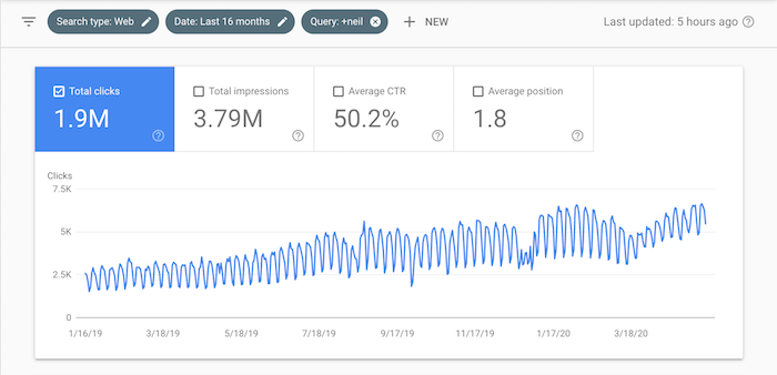
This is why brand queries (the number of users who search for your brand name on Google and click on your website) impact rankings, which I’ve broken down as one of the most important SEO lessons I learned.
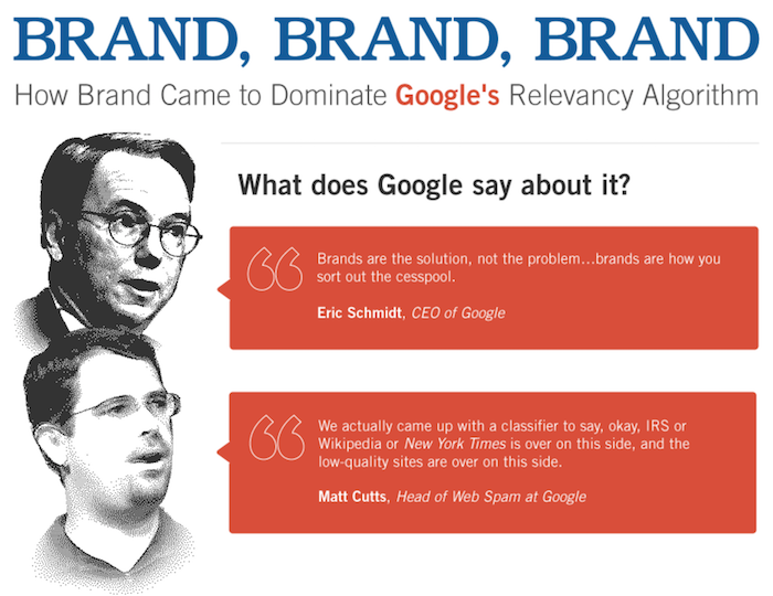
Just look at how the Neil Patel brand has grown over time… the graph below shows the number of people searching for my name over time:
And here is my SEO traffic over time:
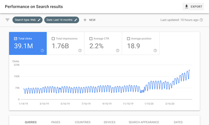
As your brand grows so will your SEO traffic.
But that is old news, that’s been part of Google’s algorithm for years now.
Here is the thing though, most sites don’t have large brands and Google knows that. So, if you don’t have one, you can still rank.
At my ad agency, when we look at our clients and their growth over time, only 4% have large well-known brands. The other 96% are still seeing traffic growth.
What Google is doing is adapting its algorithm to more closely align with the mission of showing the sites first that users love the most.
And yes, brand queries are one of the ways they can do this, but the user experience is another metric.
Over the next few years, I bet you will see many algorithm updates focusing on user experience.
So how do you optimize your user experience?
It starts with each page
If you look at the original article Google posted about the future algorithm change, they emphasize “page experience” or “website experience.”
It doesn’t mean that your whole website shouldn’t have a good user experience, but instead, I bet they are going to focus on their algorithm from a page-level basis.
Because if you have a few pages on your websites that have a poor experience, but the rest are good, it wouldn’t make sense for Google to reduce the rankings of your whole site, especially if, many of your pages provide a much better experience than your competition.
How You Optimize Your User Experience
Here’s how you optimize your user experience:
Step #1: Optimize your speed and reduce 400 errors
The faster your website loads, the better experience you’ll have.
Go to this page and enter your URL.
You’ll then see a report that looks like this:
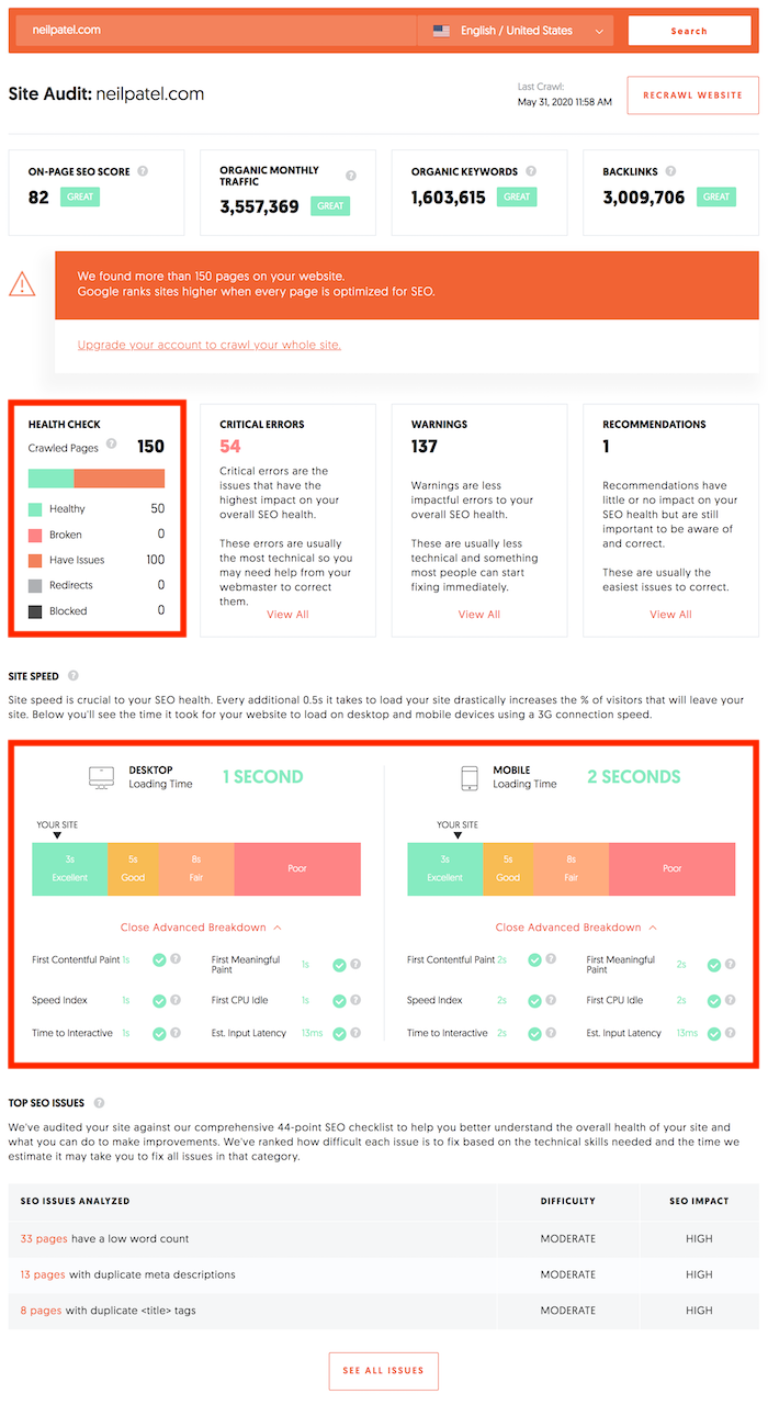
You’ll notice two important aspects of that report that impact user experience that I’ve highlighted in the screenshot above.
In the health checkbox, you’ll want to make sure there are no broken pages.
Broken pages create bad experiences.
In the site speed box, you’ll see the load time of your site.
The faster your site loads the better.
Try to get your website load time for both desktop and mobile under 3 seconds.
Ideally, you should be in the 1-second range if possible.
Step #2: Compare your experience to your competitions’
You may think you have an amazing user experience, but how does it stake up to your competition?
So go here and type in your biggest competitor.
I want you to go into the navigation and click on “Top Pages.”
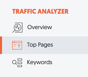
You should see a report like this:
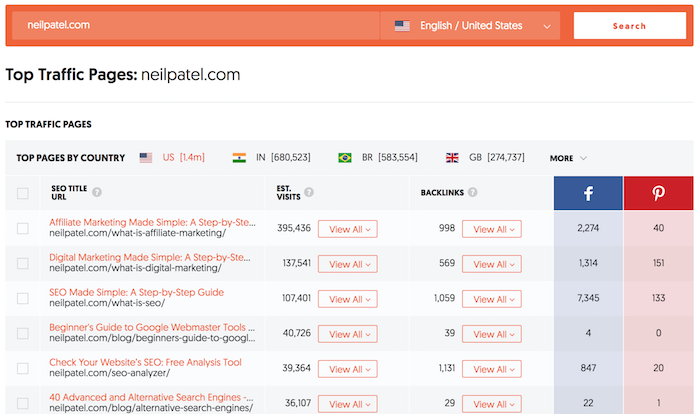
The Top Pages report shows the most popular pages on your competition’s site from an SEO perspective.
The pages at the top are the ones with the most SEO traffic, which means they are doing something right.
I want you to go through their top 50 pages.
Seriously, their top 50 pages, and look at the user experience of each of those pages.
What is it that they are doing?
How does their content quality compare to yours?
What are the differences between their website compared to yours?
For each page that ranks, I also want you to click on “View All” under the “Est. Visits” heading.
This will show you all of the keywords each page ranks for.
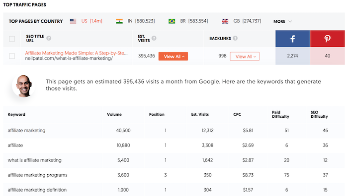
When evaluating your competition’s user experience, keep in mind how they are delighting people who search for any of those keywords.
This will give you an idea of what you need to do as well.
But your goal shouldn’t be to match your competition, it should be to beat your competition.
Step #3: Analyze your design
Remember the graphic I showed above of what Google doesn’t want?
Where the user tried to click on “No, go back” instead of “Yes, place my order” due to design issues.
In most cases, you won’t have that issue, but you will have other usability issues.
The way you find usability issues is through heatmaps. Just like this one:
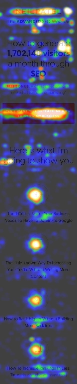
What you can do to find usability issues is run a Crazy Egg test on your site.
Once you log into Crazy Egg, you’ll see a dashboard that looks like this:
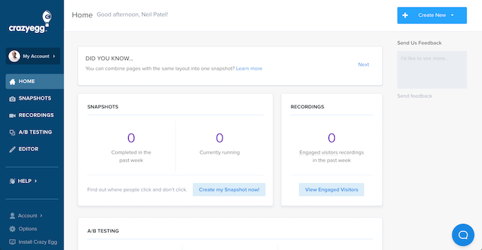
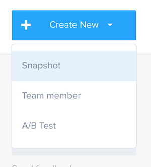
On the top right, I want you to click on “Create New” and select “Snapshot.”
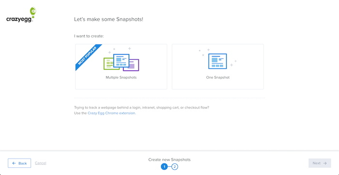
Then select “Multiple Snapshots.”
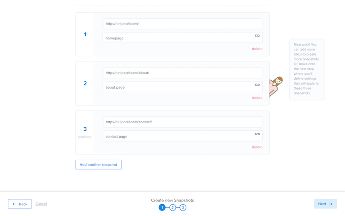
From there, you’ll want to add at least 3 popular URLs to your site.
Over time you’ll want to do this with all of your popular pages.
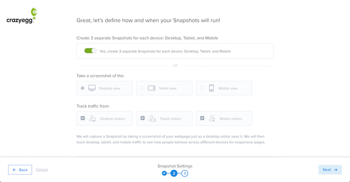
Then you’ll see settings like the image below, you don’t need to do anything here. Just click “Next.”
You’ll then be able to review everything. If it looks good, you can click the “Create Snapshots” button in the bottom right.
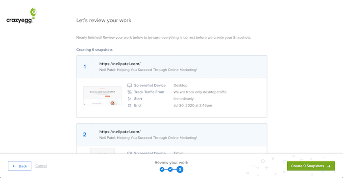
Last but not least, you’ll have to install your tracking script.
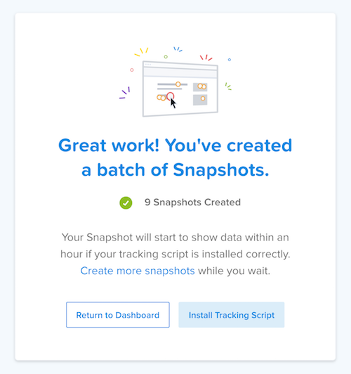
So, click on “Install Tracking Script.”
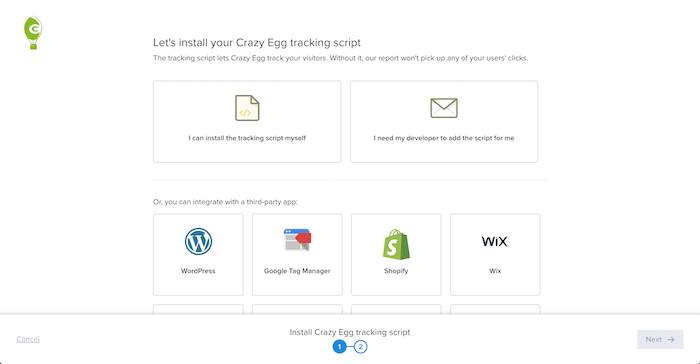
Select the option that works for you and then you are off and to the races.
For example, for NeilPatel.com I use WordPress so I would select the WordPress option.
Once you are set up, it will take at least a day to see results, if not a bit longer.
It depends on your traffic.
If you get thousands of visitors to your site each day you’ll see results within a few hours.
After you set up your test and it has been a few days, log back into Crazy Egg and click on Snapshots in the sidebar.
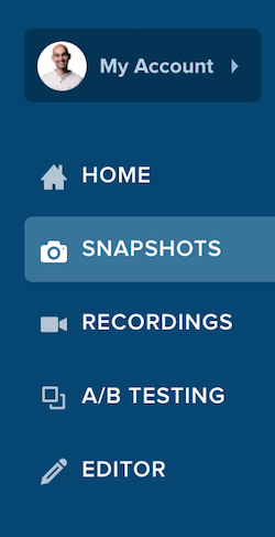
Once you are there you will see a list of snapshots you have created.
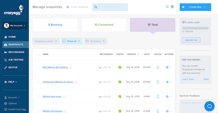
Click on any of your snapshots and you’ll see a heatmap of how people are engaging with your web page.
What’s cool about snapshots is they show you every single click, or even scroll that people take.
Just look at this example from the NeilPatel.com site.
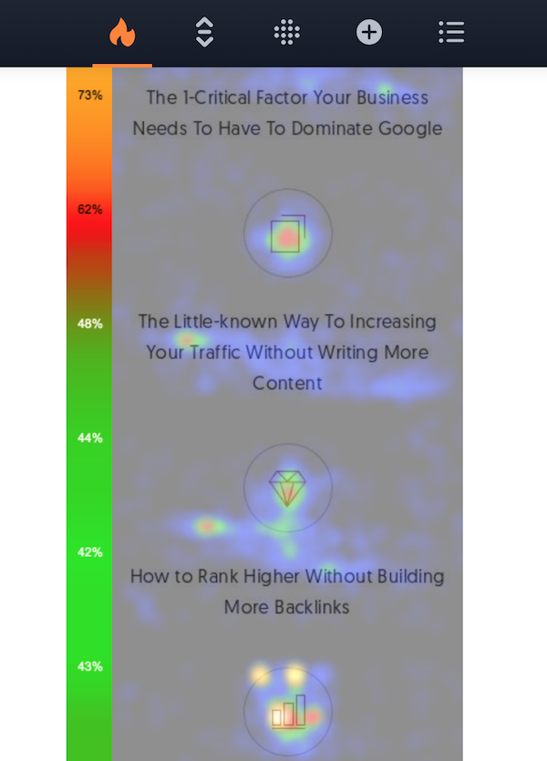
As you can see, people are clicking on those images above the text. But there is an issue… can you guess what it is?
If you click those images, nothing happens.
But for all of those people to click on those images, it means that they believe they are clickable and that something should happen when they click on them.
An easy fix for me is to make them clickable and when a user clicks maybe I would take them to a page that goes into detail on each of those features.
Or maybe I could expand upon each feature right there on that page.
Once you make the fixes to your page, you will want to re-run a new Crazy Egg snapshot on the same page to see if the changes helped improve the user experience.
Step #4: Install the Ubersuggest Chrome extension
If you haven’t already, install the Ubersuggest Chrome extension.
Here’s why…
When you do a Google search, you’ll see data on each ranking URL.
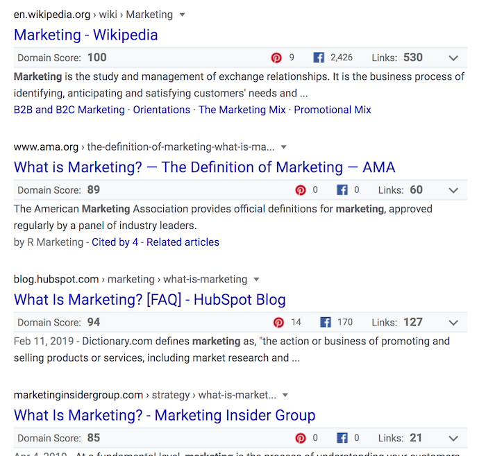
When you are naturally using Google throughout your day and searching for keywords related to your industry, I want you to look at 2 main metrics in Ubersuggest:
Domain score – the higher the number, the more authority a website has.Links – the more links a website has, usually the higher it will rank.
So, when you are doing searches, look for sites that have a lower domain score and fewer backlinks than the competition, but yet still rank high.
Chances are, they rank high because of things like user experience.
Maybe their text is more appealing than the competition, maybe their bounce rate is lower… it could be a wide variety of reasons, but these are the sites you want to look at and analyze.
In the image above, you see that the result from the AMA ranks higher than Hubspot yet they have fewer links and a lower domain score.
So, if you were trying to rank for that keyword, you would want to spend more time analyzing AMA because they are doing something right.
Conclusion
User experience is going to be more and more important over time.
If you love a site and everyone else loves that site, Google will eventually want to make sure that the site ranks high.
On the flip side, if everyone feels a website has a terrible user experience, then Google won’t rank that website as high in the long run.
Just like any algorithm update Google does, expect to see multiple revisions over time. As they learn, they adapt to make their algorithms more effective over time.
But what is unique about this update is you have advanced notice, which is nice. So, take the opportunity and fix any usability issues you may have.
What other ways can you make your website more usable?
The post, Google’s New Algorithm: Page Experience appeared first on Neil Patel.
Source: feedproxy.google.com