
Tag Archives for " pages "

5 Best Landing Page Builders That Will Maximize Conversions
Good landing pages are the lifeblood of any digital marketing campaign.
Without them, visitors don’t know what to do next.
Where can they sign up? Where do they find the product from the ad they just clicked?
Simply driving traffic to your homepage from a search engine, paid ads, or lead magnets won’t work.
That makes landing pages critical for conversions.
However, they can also take hours to build, especially when creating multiple landing pages for a specific keyword or different campaigns.
Trust me. I’ve done it before.
What do you do? You need a landing page builder.
Why Should You Consider a Landing Page Builder?
You’re a busy entrepreneur or digital marketer. I know you don’t have the time or bandwidth to sit and fiddle with back-end code and figure out how to design a beautiful landing page.
What about hiring a web designer or a developer? Let’s face it. While designers and devs are excellent at their jobs, their services aren’t cheap.
This is where landing page builders come in.
You can have a fully responsive, mobile-optimized page designed to convert curious visitors into paying customers within a few hours.
What do you need to input? Your website text, fonts, images, and brand colors.
Everything else is drag-and-drop with dozens of integrations to make capturing leads and sales as straightforward as possible.
However, the best landing page builders don’t stop at page design. The creme-de-la-creme on the market (see below) offers robust analytics to help you figure out what’s working and what you need to send to the trash bin.
The result?
You save hours figuring out how to optimize and improve your conversion rates. Instead of reading blog after blog and getting frustrated, you can go back to focusing on what you do best.
5 Best Landing Page Builders That Will Maximize Conversions
Ready to say hello to efficiency? Here are the top landing page builders for your next digital marketing campaign.
#1 – Swipe Pages
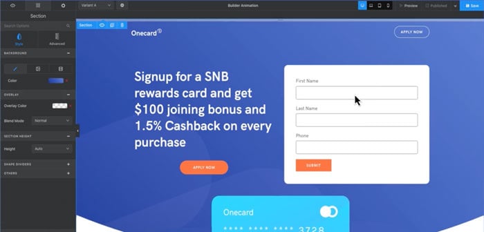
It doesn’t get better than Swipe Pages for an affordable landing page builder. With a few clicks of your mouse, you can create insanely fast, mobile-optimized AMP landing pages.
With no coding required, it’s one of the top options for marketers and entrepreneurs.
The best part? Swipe Page’s landing page templates give your site visitors an app-like experience. You won’t need to worry about elements squishing together or losing sales because your mobile site sucks.
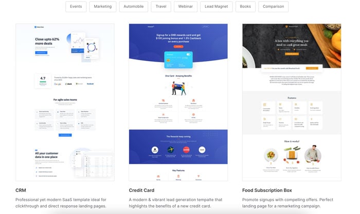
At $29 per month, you’ll struggle to find another builder offering lightning-fast AMP pages at that price point.
Remember, a one-second delay in page loading times can result in a seven percent reduction in conversions.
With Swipe Pages on your payroll, your conversions will go up. Use the A/B split testing feature (more than two variants are possible) to nip what isn’t working in the bud. You can also leverage dynamic text replacement to personalize the site experience for customers.
This is only the tip of the iceberg for Swipe Pages features. Some of the other tools you’ll have at your fingertips include:
- multi-step forms
- Google Analytics & Facebook Pixel integrations
- variant performance analytics
- responsive breakpoints
- performance optimization
- blend modes
- parallax scrolling
Essentially, everything you need to create a landing page that drives visitors to take action and boost your bottom line.
Swipe Pages Pros:
- 40+ high-converting templates
- 80+ pre-built blocks
- AMP (Accelerated Mobile Pages)
- no coding skills required
- fully responsive multi-screen editing
- connect to 1000s of third-party apps like Zapier and Mailchimp1-click Stripe checkouts
- built-in analytics
- offers hosting and a custom domain
Swipe Pages Cons:
- no funnel offering yet (upsells, order bumps, etc.)
- no heatmaps
- server-side A/B split testing is only available on the highest-tier plan
- dynamic text replacement feature is not available on all plans
Swipe Pages Price: Plans start at $29 per month.
#2 – Unbounce
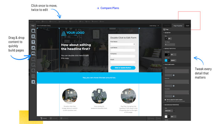
Unbounce is the “OG” landing page builder tool. It comes with excellent drag-and-drop features and a strong focus on conversions with the help of its AI-powered Smart Builder.
You’ll find popups, sticky navbars, and plenty of other options to help a visitor take action. Whatever your landing page goal, Unbounce can help you achieve it.
One of my favorite Unbounce features is Smart Traffic. Once you hit 50 page views, the tool automatically sends visitors to the landing page most likely to convert.
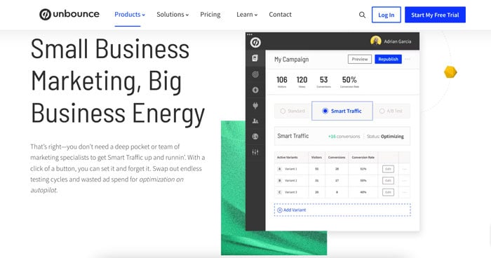
The only downside? It’s not a beginner-friendly tool.
The learning curve is steep with dozens of tools and integrations, but you’ll reap the rewards if you have the time and want an advanced landing page builder.
At $90 per month for the basic plan, Unbounce is one of the most expensive landing page builders on the market and targets enterprises over small businesses.
If you’re not making money from your leads yet, start with one of the cheaper alternatives like Swipe Pages before making a big investment.
Unbounce Pros:
- 100+ AI-powered landing page templates
- integrates with WordPress, Google Ads, Salesforce, Marketo, and other popular emails, CRM, and analytics tools.A/B split testing
- dynamic text replacement for SEM campaigns
- AMP-ready mobile pages
- fast page load speed times
- add sticky headers, pop-ups, maps, scripts, and pixels to pages
- quickly duplicate pages
Unbounce Cons:
- expensive
- high learning curve
- not beginner-friendly
- features like redirects and integrations are only available on the higher tier plans
- built-in forms feature has limited options
- coding skills are required for certain features
Unbounce Price: The Launch plan starts at $90 per month.
#3 – Leadpages
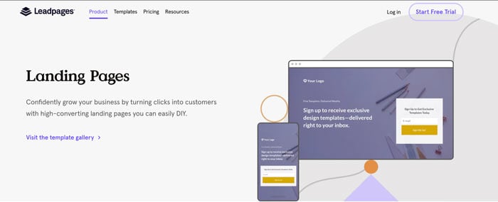
Do you need a landing page for your one-product online store or a simple way to build your email list? Leadpages is the solution for you.
It’s perfect for digital products like ebooks, presets, or courses.
With integrations like OpenTable, restaurants can use Leadpages for reservations, and online coaches have access to Calendly to process payments for strategy calls.
It is versatile enough to create a wide range of web pages (with templates to boot) and the attractive price point makes Leadpages stand out from less intuitive options, like Mailchimp.
To get your page up and running, select a template and start customizing the look and feel of your landing page. You can add videos, images, and forms. Select pre-styled content blocks from the Sections menu for items like a pricing plan or a standout call-to-action.
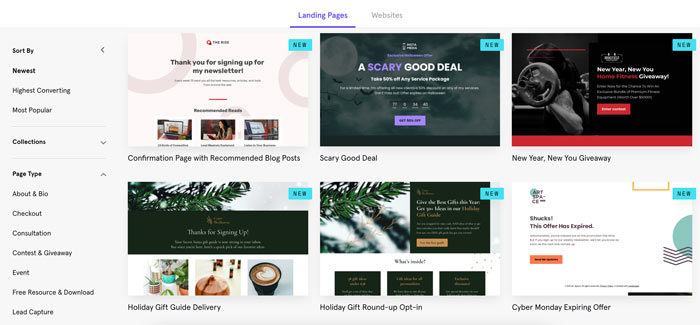
With built-in conversion guidance, Leadpages almost guarantees you’ll create a landing page that will convert visitors into paying customers.
Leadpages Pros:
- 2.4 seconds page load speed
- unlimited page publishing
- 200+ professionally designed templates
- mobile responsive pages
- code-free drag and drop functionality
- built-in lead optimization toolA/B split tests40+ integration
- slow starting price
Leadpages Cons:
- A/B testing, online payments, email triggers, and advanced integrations are only available on higher-tier plans
- low tier support
- not all templates are free
- templates can make all sites look the same, which isn’t great for branding
Leadpages Price: $37 per month for a standard plan and $74 for a Pro account.
#4 – HubSpot
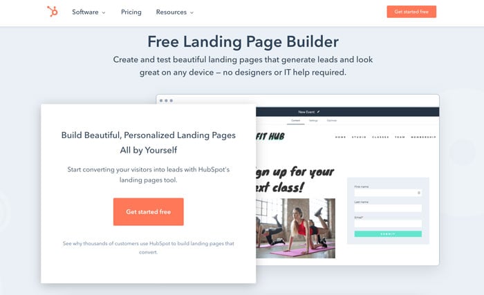
HubSpot is one of the leading tools for digital marketers and salespeople. The platform is an all-in-one solution with CRM management, email marketing, blogging, forms, and a landing page builder.
If you’re searching for comprehensive marketing software on a budget, it doesn’t get better than HubSpot’s Marketing Hub package.
Inside the software, you’ll find HubSpot’s landing page builder. It will help you create beautiful pages that generate leads and look great on any device.
The best part? You don’t need to rely on designers or an IT team to knock it out of the park.
What I love about HubSpot’s landing page builder is the personalization feature. It lets you display different content, CTAs, and forms to improve your conversion rates.
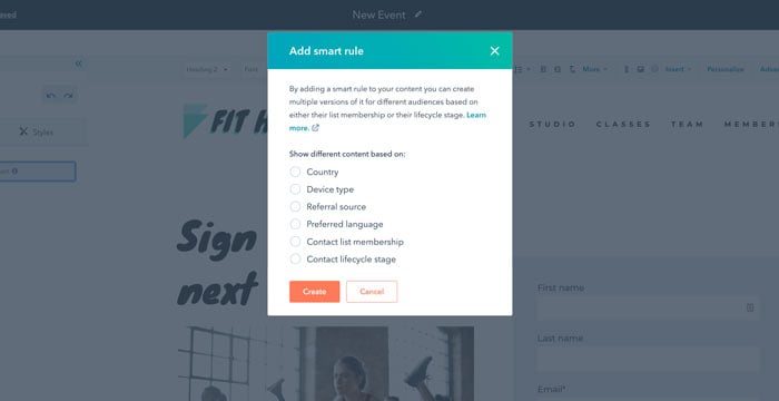
You can showcase personalized content based on visitors’:
- location
- source
- device
- lifecycle stage
Why should you care about adding dynamic pages to your repertoire?
Well, when you increase the number of landing pages, you’re likely to see a 55 percent increase in leads.
However, that only happens if visitors get the right information at the right time. HubSpot’s personalization features give you the power to deliver custom content at just the right moment.
HubSpot Pros:
- built-in library of mobile-optimized templatesA/B split testing
- personalize content based on CRM data
- easy-to-use drag and drop landing page builder
- customized SEO suggestions to improve search performance
- high-quality customer support
HubSpot Cons:
- only available as part of the Marketing Hub platform.
- limited features on lower-tier plans.
- HubSpot branding on the free plan.
Hubspot Price: Free with paid plans starting at $45 per month.
#5 – Wix
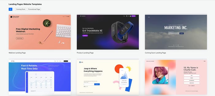
Looking for a landing page builder that’s simple, affordable, and converts visitors into email subscribers?
Wix is one of the best options on the market.
Start with a conversion-optimized template (choose from over 30 options). Use the drag-and-drop editor to add or edit any element on your site. With no coding skills required, it’s an easy process that will have your page up and running in no time.
Once your site is live, Wix has a robust analytics tool to optimize your performance. Connect your Google Analytics, Google Tag Manager, Facebook Pixel, Crazy Egg, or Hotjar to dive deeper into your data, run A/B steps, heatmaps, and gain actionable insights to boost conversions.
The only downside? Wix isn’t the best solution for everyone. The landing page builder targets limited use cases like coming soon pages, webinars, product or app landing pages, and events.
Wix Pros:
- easy to use
- beginner-friendly
- affordable
- free 30+ templates
- connects with third-party apps and sites
Wix Cons:
- limited bandwidth and storage on cheaper plans
- functionality isn’t as robust as other builders
- website builder more than a dedicated landing page builder
Wix Price: Plans start at $4.50 per month
Frequently Asked Questions About Landing Page Builders
Why should I use a landing page builder?
A landing page builder simplifies your business, and the learning curve is low. In a matter of hours, you can design and publish a high-converting landing page without hiring a development team. The drag-and-drop features and integrations make landing page builders easy to use and accessible to everyone.
Is it easy to use a landing page builder?
Yes! The whole point of landing page builders is to make the process quick and easy, no matter your skill level. Most use drag-and-drop functionality and offer pre-made templates to help you create a high-converting page in less than a day.
Can you create a landing page without a website?
Yes, you can create a landing page without a website. Instead of directing traffic to a website, you can use the page to drive sales, email subscriptions, or any other conversion goal.
How much does it cost to create a landing page?
If you hire a digital agency to create your landing page, it can cost $1000+. However, landing page builders make building a landing page more accessible, with prices ranging from free to as little as $29 per month. It’s one of the most affordable ways to start building an email list and generating sales for small or enterprise businesses.
Conclusion: Landing Page Builders
When it comes to an effective digital marketing campaign, landing pages are not the place to scrimp.
They’re the best way to drive tons of targeted, specific conversions.
Without one, your visitors are left to fend for themselves on your site. If you’re bidding on specific keywords, don’t waste your ad spend on directing people to a generic home page and hoping for the best.
A landing page builder makes it easy to create and publish a high-converting landing page.
The best part? It will only take a couple of hours to design and hit publish.
Choose one of the landing page builders above and you’ll be driving more leads in no time.
What’s your favorite landing page builder?
Source: neilpatel.com

How to Use Sales Demos to Strengthen Your Online Reputation
Digitalization has had a huge impact on everyone’s life. In most aspects it has influenced businesses in a good way: They can now go global, discover new marketing channels and broaden their customer base.
But there’s one negative to being online as well: A fragile reputation.
In a world where anyone can complain about any business failure in a public manner, any business is vulnerable. A reputation crisis is always around the corner.
And it is even more challenging in a B2B industry where buying journeys are longer and past failures are harder to erase. B2B customers are good at researching their options, comparing businesses, and making informed decisions. Any past reputation crisis may be standing in your way to success for years to come.
Were you looking for ways to solidify your B2B business online reputation? The solution may be in adjusting your sales demonstrations.

Why Are Sales Demos So Important for Online Reputation?
Let’s face it: When it comes to B2B, sales demos are often the only way to close a sale. It is the only way to demonstrate how your product is solving your prospects’ pain points and prove that your platform is worth investing in.

Product demos are central to any software sales process.
But what does it have to do with reputation?
- Product demos can turn a prospect into a customer, a customer into a believer and brand advocate, and who can better protect your reputation than your brand advocate?
- Professional product demos can rank for your brand name and set positive expectations about your brand. Using your product demo on your landing pages makes you look like a serious and reputable company.
- Making your demo easy to access (without the need to register an account, schedule a call, etc.) will shorten your customers’ buying journeys which means fewer people will compare you to competitors and research your reputation.
- Public demos will add some positive context to your brand and help you control its online sentiment. If done correctly, your sales demo lets you highlight your software’s most important features showing it in a most favorable way. The more demos you market, the more of the context contributes to the whole picture.
So How to Use Demos to Strengthen Your Online Reputation?
Publish Your Product Demos
This is easy: You may have a ton of recorded demos by now. It will likely be easy for you to find some you can publicize for others to see.
If you use Walnut, this process will even be easier.
The tool allows you to use their code-free platform to create various demos, instantly targeting different personas and use cases. This is a great way to create a ton of original content to make public and use on top of your sales funnel.
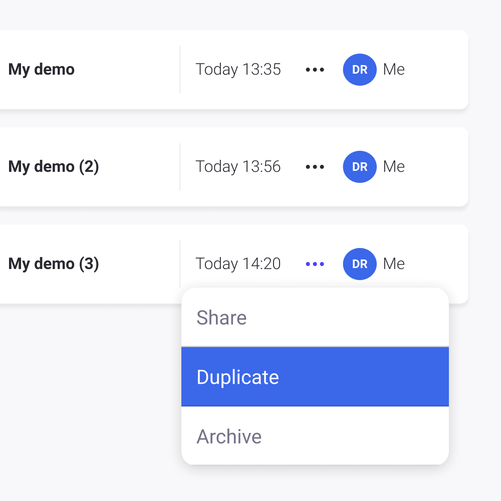
You can even embed your demos on various landing pages allowing your site visitors and prospects to use interactive features to try some features and get to know your product better.
Demonstrating your product demo on your website/landing pages makes you look like a serious and reputable company. This is especially helpful to smaller businesses, as you enable product-lead-Growth (PLG) with your prospects which in turn, makes you appear to be a bigger brand.
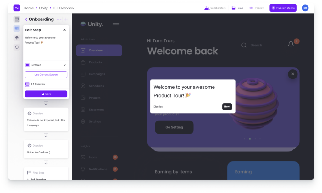
You can then use Walnut’s built-in analytics to understand which parts of your demo seemed to appeal better to your prospects. This gives you lots of insights to create better demos in the future.
Treat Your Demos as Content Assets
Using your demos for reputation management means turning them into top-of-the-funnel content assets. So instead of treating your demos as private assets, start looking at them as your branded digital media.
In other words, you want your demos to rank on Google and get shared around by your prospective customers.
- Research your (or your competitors’) branded keywords
- Break them into groups by search intent, personas, and decision-makers that may be using each keyword (CEO, marketing manager, IT manager, etc.)
- Create landing pages targeting those keyword groups and add your custom demos to each one. The idea is that anyone researching your brand and your products should be able to find answers on your site by watching your demo instead of having to go elsewhere
Obviously, it is a good idea to get your sales team involved in the process as they will likely offer a great deal of insight into your probable decision-makers and buyer personas behind each search query. Collaboration is key to success here.
Note: There’s a cool quiz by Nextiva allowing you to determine whether your company is prepared for collaborations and unified communication. Take it!
Monitor Each of Your Sales Funnels
Obviously, each of those landing pages will become your strong sales funnels, so you want to keep a close eye on those. Again, Walnut will give you lots of insights into how your site visitors are engaging with your demos.
Additionally, you may also keep an eye on traffic channels and buying journeys that started on those landing pages. Finteza will help you build, monitor, and compare those individual conversion channels:
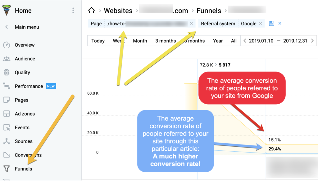
Obviously, Google Analytics can be used for that as well (especially in combination with Search Console that provides keyword data), but it will be somewhat harder to set up and figure out.
Conclusion
Innovating your sales demos comes with lots of benefits including a happier sales team and more sales. It may come as a surprise but sales demos can also boost your brand and solidify your reputation as a reliable niche solution. Good luck!
The post How to Use Sales Demos to Strengthen Your Online Reputation appeared first on Content Marketing Consulting and Social Media Strategy.
Source: convinceandconvert.com

Why Businesses Can’t Ignore Google AMP Stories
The Accelerated Mobile Pages (AMP) project was launched by Google in February of 2016 with the goal of putting mobile performance above everything else on the web. And Google definitely met their goal. AMP powers more than two billion mobile pages and 900,000 different domains. Pages with AMP now load twice as fast as pages without added AMP elements.
If you think you can ignore AMP, you’re wrong. AMP has some pretty awesome features and benefits that can take your content creation efforts to the next level.
If you don’t take the time to understand or use AMP stories, you’re missing out.
Here’s why businesses can’t afford to ignore them.
But first, let’s analyze that, what AMP stories truly are.
What are AMP Stories?
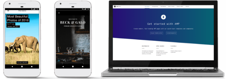
Google’s AMP stories features allow publishers to create content that is very similar to Instagram stories, designed with mobile websites in mind.
But the content created with AMP doesn’t get added to an app. Instead, it’s placed right on search results pages.
AMP is an open-source project that was created in response to the fact that mobile users now spend more time on apps than on websites.
77% of their time, to be exact, according to Statista data.
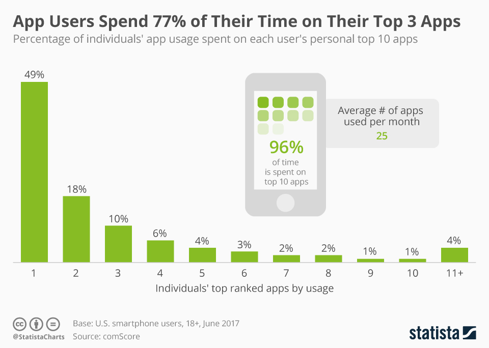
With AMP, content loads extremely fast, which helps keep mobile users on those pages and off of their apps.
Instead of regular search engine results, users receive a swipeable story that’s easy to navigate. The UX is somewhat similar to the popular dating app, Tinder.
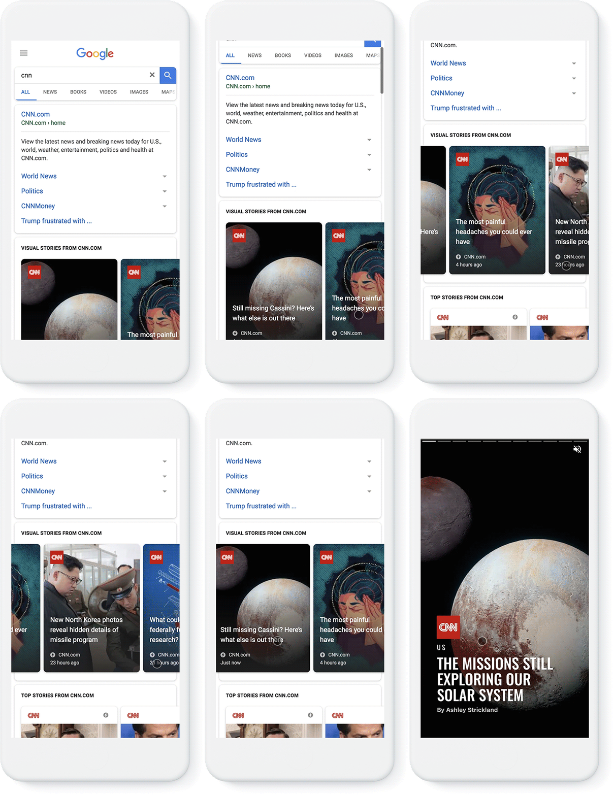
AMP partners include CNN, Mic, Wired, The Washington Post, Mashable, and People.
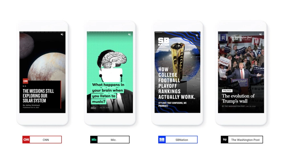
Beyond loading at lightning-fast speeds, AMP Stories can also be shared in the same way news articles are shared.
Here’s a breakdown of how they work.
How Accelerated Mobile Pages Work
Today, JavaScript can be used on almost any web page to modify any portion of it.
But it also slows the loading and rendering of pages. And since page speed is so important (we’ll talk more about that later), that’s something you want to avoid.
AMP only allows for asynchronous JavaScript to run on pages, meaning that the JavaScript code won’t block any other code present on your site.
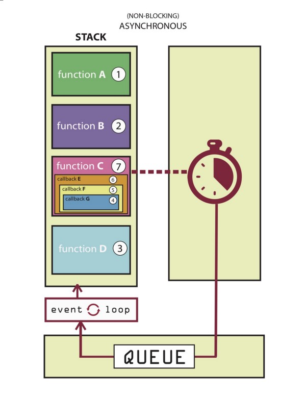
JavaScript written by the webmaster is forbidden on AMP stories, and interactive pages must only contain custom AMP elements.
Custom elements can consist of JavaScript at their core, but they must be specifically designed to make sure that they don’t cause any restrictions on the overall performance of a page.
Third-party JavaScript is also allowed with AMP, but it cannot block page rendering.
AMP also does not allow for any kind of extension mechanisms to block page rendering, but it can be used for Instagram embeds, tweets, or lightboxes.
Because of this, users can swipe through mobile-optimized content on AMP pages without all of the unnecessary distractions.
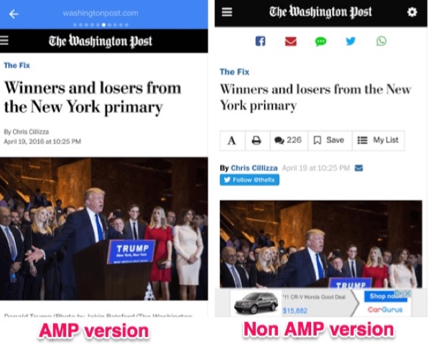
As you can already tell, there are a lot of reasons why AMP stories are growing fast.
Why Should You Use AMP Stories?
Some of your competition is probably consistently using AMP.
If you aren’t, you might as well be accepting defeat.
On the other hand, if you start using AMP protocols before your competitors, you’ll differentiate yourself as a frontrunner in your industry.
Why? Because AMP features can help you tell stories, and storytelling is powerful.
Storytelling is Powerful
Everyone loves a good story.
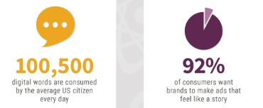
At least 100,500 digital words are consumed by the average U.S. citizen in one day, while 92% of consumers want to view and read ads that feel like stories.
There is some evidence out there that suggests that people view AMP stories much longer than they view traditional alternatives.
This could be because faster loading times make it easier to view more content for a longer period of time.
AMP lets you tell stories in a powerful, fast, unique way. And when you tell a good story well, you’ll be able to reach your audience effectively.
Speak to your readers’ needs, give each piece an interesting arc, and don’t forget to add in all of the hard data needed to prove your point.
Page speed plays a huge role in AMPs success, too.
Page Speed is Important
Site speed is important. Pages that take a long time to load can kill your conversions. If your site takes a while to load, you’ll rack up less and less conversions.
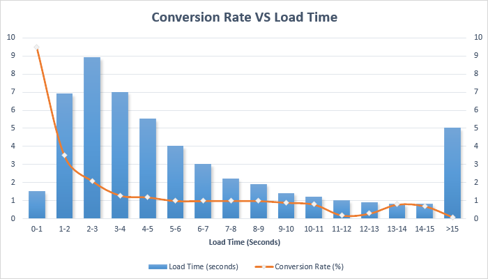
Luckily, AMP pages load about twice as fast as regular mobile pages.
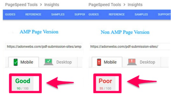
With such quick loading times, customers will be able to get to your content faster than ever before.
This is great news, since the probability of a bounce increases by 32% if a mobile page takes as long as three seconds to load.
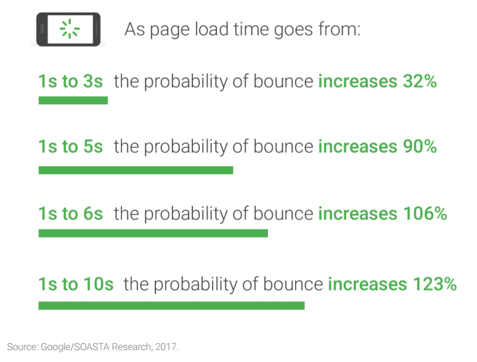
If it takes five seconds, the probability of a bounce increases by 90%.
Because of the quick loading times provided by AMP, users will be more likely to go ahead and buy from you.
When they know they can interact with your brand without any friction or wait time, they’ll be willing to trust you with their money.
To make the case for AMP even stronger, Google tends to give faster loading mobile pages special treatment and better rankings.
Take advantage of the creative design features offered by AMP to keep viewers engaged and intrigued.
Take Advantage of Creative Design
In case you didn’t already know, design is important. And AMP pages let you add in creative elements that take your content to the next level.
Don’t be afraid to add forms, buttons, videos, images, shopping options, or links to your AMP stories.
Your site will look much more sleek and functional, giving you tons of opportunities to attract, engage, and hold your viewers’ attention.
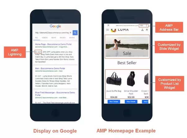
AMP can give your site the SEO boost it needs.
AMP Helps SEO
AMPs give your site a huge visibility boost.
As of right now, a page with AMP protocols won’t increase your site’s page authority or domain authority.
That being said, it does give the page a chance to be featured in the AMP carousel that appears above traditional Google search results.
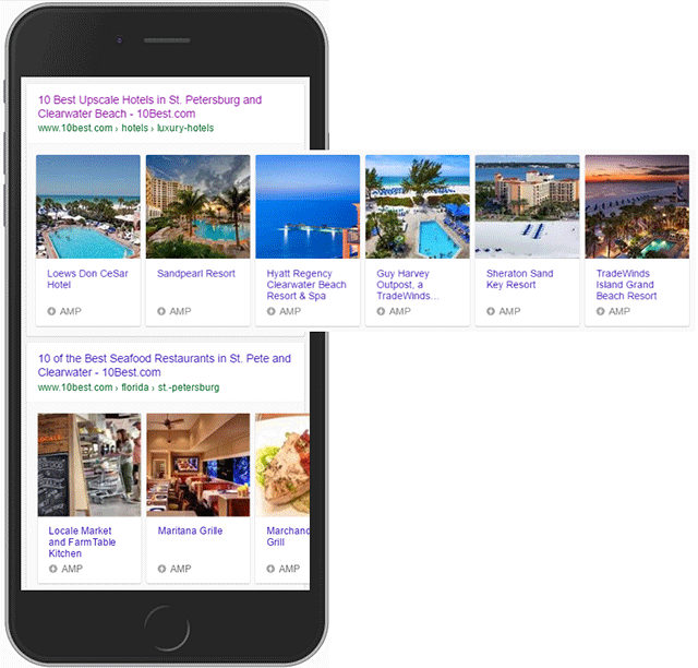
This means that if your site shows up in the carousel, it will appear before the number one placement.
It doesn’t get any better than placing before the number one spot, does it?
This can give you the big boost in organic search results that you need, bringing more traffic to your site than ever before.
Next, let’s break down all of the moving parts that make AMPs so great.
Introducing the AMP Story Features
Traditional AMP content relies solely on text, but the new and improved format includes videos, animation, and images to give users a full experience.
For publishers, you can:
- Embed your stories across apps and websites
- Access stories via both desktop and mobile
- Tell stories without needing to have a ton of technical knowledge
The best part? AMPs are free for everyone to try.
Let’s examine all of the parts involved in completing an AMP story.
Parts of an AMP story
Before you can create your first AMP story, you have to master all of its components.
Every story is structured with individual pages. Each page consists of individual layers that are made up of a combination of HTML code and AMP elements.
Here’s how the components will look when added to your code:
Story = amp-story
Page = amp-story-page
Layers = amp-story-grid-layer
When added to a page, the code might look something like this:
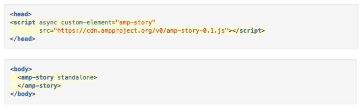
The story component contains your entire AMP story, while the page component contains each specific page that exists within your story.
The layers component contains all of the elements that are present on a page.
Here are some examples of a few AMP stories.
Examples of Google AMP Stories
It’s no secret that Google will link to AMP versions of web pages over traditional ones any time that they’re available because Google prefers them.
Because of this, every AMP partner has used the feature of the service to suit their strengths.
The most commonly known AMP adapters were news organizations since they could use AMPs to get information out quickly and effectively to searchers.
Here are examples of how CNN has utilized AMP stories to share and amplify breaking news:
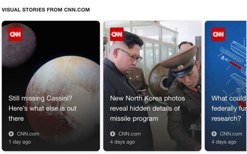
Some publishers have even written AMP stories over the exact same kinds of content (with the same cover photo):
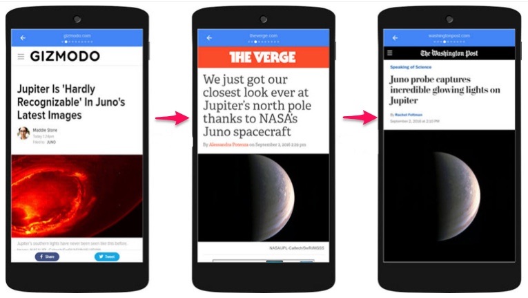
But AMPs aren’t just for news sites. You can turn your long-form content into an AMP if you want to. And you should.
What are people saying about AMP, overall?
What People Are Saying About It
AMP Product Manager Rudy Galfi recently told AdWeek that AMP stories “should make for a really engaging ad format.”
But what does everyone else seem to think about publishing content with AMP?
Econsultancy writer Stuart Shaw says that while AMP pages require some maintenance, the payoff and exposure that they provide is well worth it.
In an April 2018 post, he wrote:
“Sure, all you’ve done is improve things for your mobile users – and only on the few scant pages that you’ve implemented AMP on…But optimization isn’t about making things perfect in an instant It’s a gradual process that must adapt to the ever-changing ‘techscape’ that is search.”
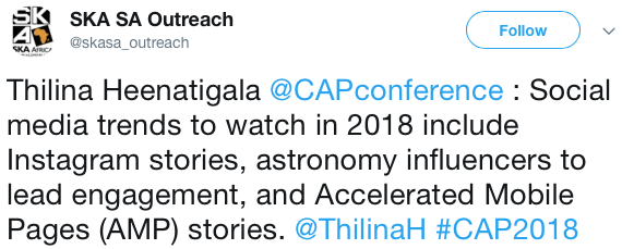
In general, reactions to AMP on sites like Twitter are fairly positive. Some people are calling AMP one of the most important trends of 2018.
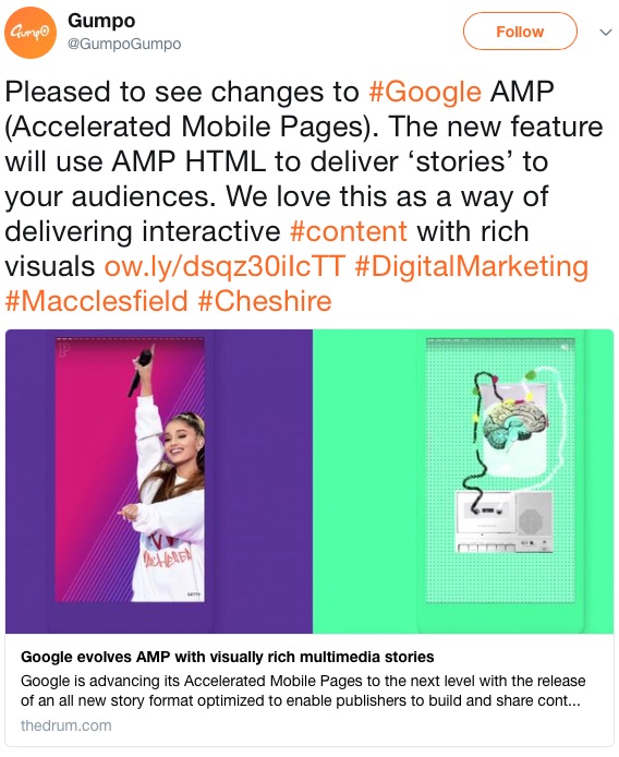
Others really love the recent changes and updates to AMP, like Gumpo, who says “We love this as a way of delivering interactive content with rich visuals.”
In September of 2017, SEO company Optimising had this to say about AMPs on Facebook:
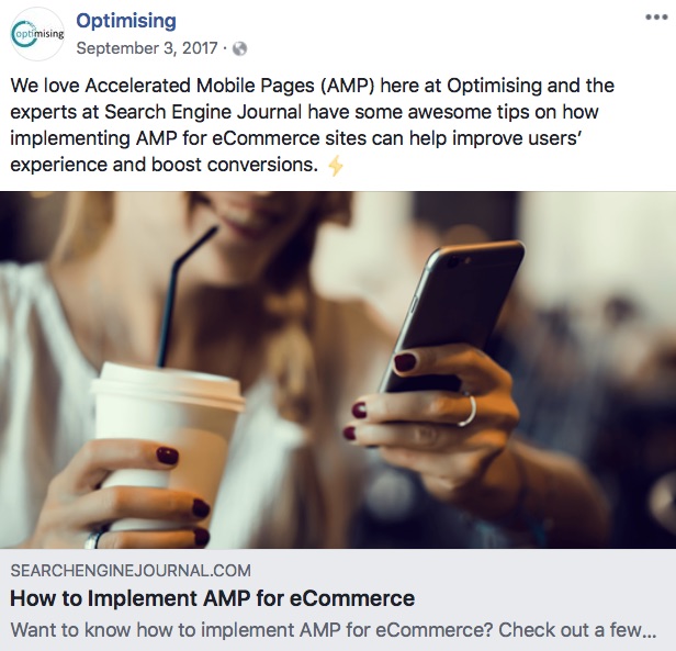
“We love Accelerated Mobile Pages (AMP) here at Optimising.”
The experts at Search Engine Journal have some awesome tips on how implementing AMP for eCommerce sites can help improve users’ experience and boost conversions.”
Overall, it looks like AMP is here to stay.
Here’s how you can get started creating your own AMP stories.
How to Get Started With Google AMP Stories
Now that you know what AMP stories are, how they work, why you should use them, and what people are saying about them, you can get down to business creating your own.
To get started, download the code.
1. Download the code
In order for Google to pick up on the AMP version of your articles, you have to modify the code of the article page.
The original article must have the following tag, which is an AMP canonical tag:
<link rel=”amphtml” href=”http://www.example.com/blog-post/amp/”>
If you want all of the AMP code you need all from one page, click over to the amp-wp GitHub page and select the “Download ZIP” button.
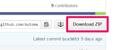
Then, install this code on your WordPress site just like any WordPress plugin.
Alternatively, you can also download the following code from AMP directly and save it to a file with a .html extension.
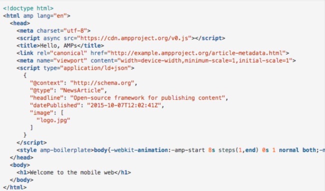
Once your code is downloaded and added, you can run the sample page.
2. Run the sample page
In order to test out your sample page, you’ll need to access your files from a server.
There are a few ways you can create a temporary local webserver to help you test it:
- “Web Server for Chrome” Google Chrome app
- Apache
- A local HTTP Python server
- Nginx
- AMP recommends that you use HTTPS, here, for added security.
After you set up a local web server, you can access your sample article by heading to this URL:
http://localhost:8000/article.html.
If everything looks good, go ahead and create the cover page.
3. Create the cover page
Your cover page is represented with the tag.
You can have more than one component within a story, which contains each of the individual screens for that story.
But the first page that you specify will act as the cover page.
To create a cover page, assign a unique ID for your cover to the first page:
<amp-story standalone>
<amp-story-page id=”cover”>
</amp-story-page>
</amp-story>
That code acts as a shell for your cover page. But you need to specify at least one layer to make it valid.

Layers in AMP work similarly to layers in graphics: they consist of different elements stacked on top of one another.
In the example above, layer one contains the image that serves as the cover photo, while layer two contains the title and byline of the story.
To create layer one, add the <amp-story-grid-layer> element to <amp-story-page>.
If you want the image to fill the screen, add the template=”fill” attribute to the amp-story-grid-layer tag.
Inside the layer, add the <amp-image> element for a cover.jpg file and make sure it’s responsive by adding the tag layout=”responsive”.
Here’s what the code for the first layer should look like when it’s all said and done:
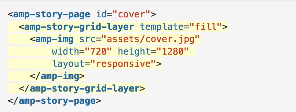
Check how the page displays before moving on.
To add a second layer, use the “vertical template” instead of the “fill template” found here.
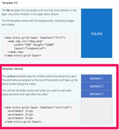
Once your cover page is complete, you can add more pages.
4. Add more pages
Adding more pages is similar to adding your sample page and cover page.
The code you use will depend on the template you choose.
To add text to a layer with the vertical template, add something similar to the following elements:
An <h1> element containing the title
A responsive amp-img
A <q> element that contains all of your text
Your new page should come out looking something like this:

You can also add animating elements to enhance your story.
5. Add animating elements
If you want to take your story to the next level, you can make your title drop into a page, fade in, twirl in, and so on.
The AMP framework currently includes the following preset animating elements:
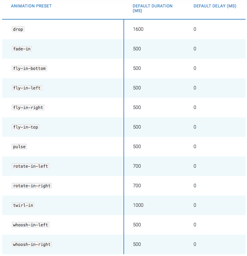
If you want to add an animation to an element, add animate-in=”animationpresetcodehere”.
For example, to use the pulse animation, your code might look like this:
<amp-story-page id=”page3″>
<amp-story-grid-layer template=”vertical”>
<p animate-in=”pulse”>Pulse this text into the page </p>
</amp-story-page>
Once you’ve added animating elements, you’re ready to create the bookend.
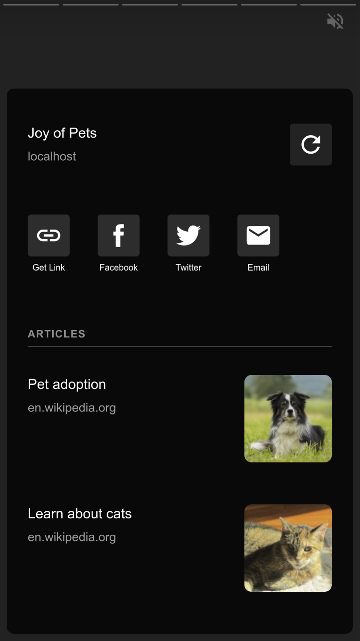
6. Create the bookend
The “bookend” is the last screen that wraps up your story.
You can use it to add related links or social sharing links, too.
In your amp-story elements, add the bookend-config-src attribute. Then, point it toward the bookend.json file.
<amp-story standalone
bookend-config-src=”bookend.json”>
</amp-story>
Your bookend should look something like this when you’re finished:
Finally, you’re ready to validate your AMP HTML.
7. Validate your AMP HTML
There are a number of ways to validate your AMP pages.
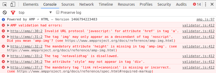
For example, you can use the Chrome DevTools console:
Open your page in a browser
Add “#development=1” to your URL
Open the Chrome DevTools console and check for any validation errors
You can also use the AMP Validator browser extension.
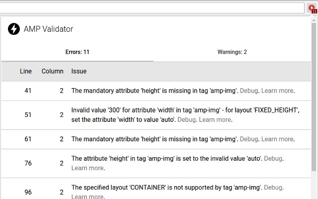
Both tools will show you any issues with your AMP code and describe ways to repair them.
Here are three quick tips to keep in mind when creating AMP stories.
3 Quick Tips
To make a great AMP story, you’ll need to add videos, text, pictures, or all of the above.
Here are some quick and easy ways to save yourself some time in the process.
For videos
It’s not uncommon to add a click-to-play overlay on videos across the web. You can use it to add a custom play icon that matches your page’s style along with the title of your video.

AMP stories don’t come with this feature automatically added.
However, you can easily add it with a tag like:
<div id=”myOverlay”
class=”click-to-play-overlay”>
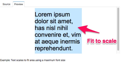
For text, you may want to manage the size or fit to make the certain text fit within a specified area.
For text
The amp-fit-text component lets you manage the size or fit of text within a specified area, which is perfect if you don’t want to play around with font sizes all day.
The component finds the best font size to fit content in the available space automatically, so you don’t have to.
Some HTML image tags can become problematic when it comes to AMP.
For pictures
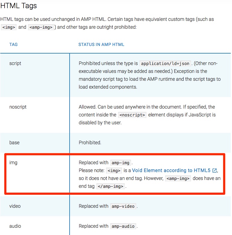
Most HTML tags can be added directly in AMP HTML.
That being said, some tags (like the <img> tag) are sometimes replaced with enhanced AMP HTML tags. A few problematic HTML tags are banned completely.
Instead of the <img> tag, be sure to use <amp-img>, which has an end tag.
You can view the full list of AMP tag conversions here.
Conclusion
AMP was created by Google to put mobile first in search engine results pages and across the web.
AMP stories are similar to Instagram Stories, and tons of well-known companies are dominating the Internet with them. If you think you can ignore them, you’re wrong.
Billions of mobile pages are powered by AMPs. Those pages load twice as fast as before because JavaScript code isn’t allowed to slow them down.
There are plenty of reasons to use AMP stories. They can help improve your storytelling efforts, boost page speeds, improve your site’s creative design, and help SEO efforts.
There are three parts to an AMP story: the story, the page(s), and the layer(s).
Huge media sites like CNN are using AMPs to share breaking news, while other sites are using them to share their long-form or video content.
And the reactions to AMP are positive overall. Most people are calling it the next big thing of 2018. Publishers love it.
To get started creating AMP stories, download the code, run a sample page, create your cover page, add more pages and animating elements, create the bookend, and validate your HTML.
If any issues are uncovered when you validate your AMP code, fix them immediately.
To save some time, there are a few quick tips and tricks you can use when adding videos, text, and pictures to your stories.
Add a custom click-to-play overlay for videos, use the amp-fit-text component to automatically size your text, and never try to use <img> tags. Instead, use <amp-img>.
Now, go forward and put mobile users first on your site, too.
Which piece of content are you going to turn into an AMP story first?
About the Author: Neil Patel is the cofounder of Neil Patel Digital.
Source: feedproxy.google.com

Landing Pages Are Overrated. Here’s Why and What You Should Do Instead
I used to hate building landing pages.
I’ve certainly made mistakes and had to learn some things the hard way.
For a long time, my landing pages just didn’t work. They were weak and barely converted.
Landing pages are being praised as the magic answer to all of our conversion problems, but it’s not as easy as some people think.
Don’t fall into the trap of thinking you can build a landing page and presto, your conversions will skyrocket.
The conversion rate from a landing page varies across industries, but the average is only 2.35%.
This means that for every 50 people you get to your landing page, only one will actually complete the action you’re trying to get them to do.
That’s a little depressing right?
I have good news for you though. I’ve learned from experience that most landing pages can do better.
The majority of landing pages aren’t really optimized to achieve conversions. They look “pretty,” but they’re not living up to expectations because they’re flawed.
I’m going to show you why landing pages are currently overrated and how to change your game to boost your conversions.
But first, let’s talk about what a landing page really is and what it’s meant to be for.
What is a landing page, really?
In the simplest sense, a landing page is a page you land on.
The problem with that answer is that it’s much too simple.
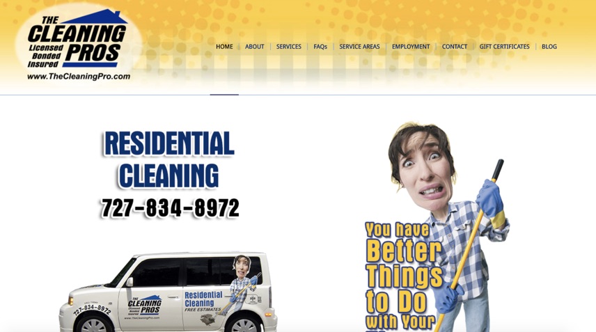
If someone clicks a link in one of your ads and it takes them to your home page, then by this definition your homepage is a landing page.
Some companies are making that mistake.
Let me show you an example.
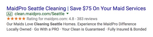
I’m searching for “cleaning services seattle” in Google. I click on the paid ad:
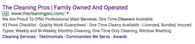
That takes me to their homepage:
Now, here’s an example of a landing page done right.
I click this search result:
And, here is a landing page tailored to my search preferences:
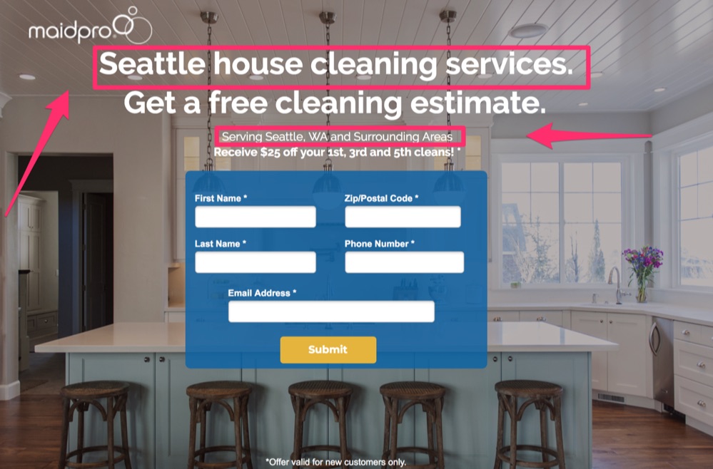
Your homepage might be a good place to send people if you’re just trying to build general awareness, but it’s not where you’re going to have success with conversions.
A landing page is meant to have one singular goal: To convert.
That’s it. It shouldn’t do anything more than that.
Check out this definition from The Landing Page Course:
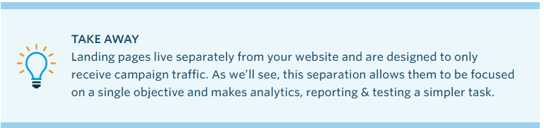
There are two key points here:
- They are individual pages with one, singular goal.
- They are meant for the single purpose of receiving “campaign traffic,” which means the click-throughs from your Ads and campaigns. This could be social media ads, PPCs, or emails.
This means that first, you need to be running a successful ad campaign that is causing the right traffic to click through to your landing page.
After all, if no one is “landing” on your landing page, it’s going to be pretty useless, right?
Assuming that your ad campaign is successful and your CTR is good, then the landing page should have one of two possible purposes:
Capture leads for further communications and to allow you to market to them in the future when they’re further down the sales funnel.
Warm-up your potential customers to get them ready and eager to purchase your product or service before sending them through to close the deal.
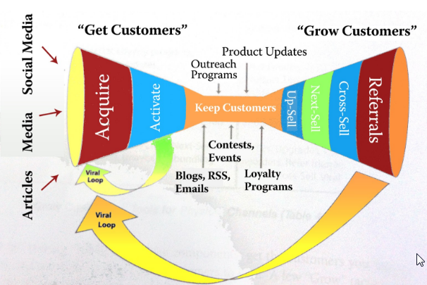
Each of these purposes requires a different type of landing page.
Good landing pages can provide a number of benefits:
They help promote a positive first impression.
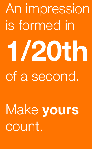
Ion Interactive says first impressions are formed in just 1/20th of a second. Landing pages can be customized and designed to help provide strong positive visual impressions quickly.
They can take advantage of trust elements.
Landing pages with images, videos and graphics can not only help attract people, but they will help you make a lasting impression.
People only remember 20% of what they read, but they remember 80% of what they see.

Landing pages promote customer focus.
It’s easier to capture conversions from a well-designed landing page than it is from a homepage or blog post because they have one singular goal. There is less noise to distract your audience.
All of this means that landing pages are the ideal place to get your audience to convert if they’re done right.
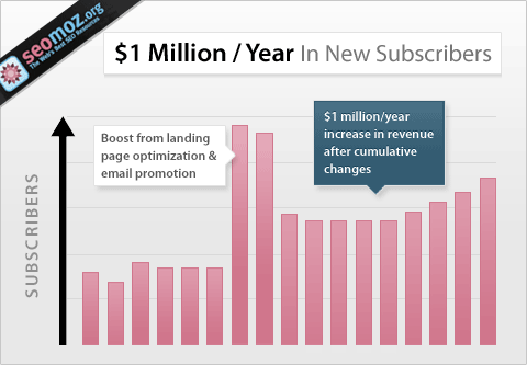
Conversion Rate Experts generated $1 million/ year for Moz simply by improving their landing page and doing some email promotion.
So why are landing pages overrated?
Well, it’s not because they can’t work. It’s just that too often people use a generic template or slap something together that just doesn’t get the job done.
Don’t worry if you’re one of those people. After all, when I started out my landing pages limped along too.
Avoid Common mistakes to Make Sure Your Landing Pages Are Doing Right
But now I’m going to share with you what I learned and what the most common mistakes are so that you can make sure your landing pages are doing their job.
1. Sync it with your ad campaign
Like I mentioned above, the very first step if to have an effective ad campaign.
You need to be targeting the right audience for your landing page, or nothing else matters.
After all, sending people ready to buy through to a lead generation page is not going to be very successful.
But syncing intent is not the only thing you need to focus on.
Your ad and your landing page need to have a consistent look and feel.
Here’s a great example of consistency:
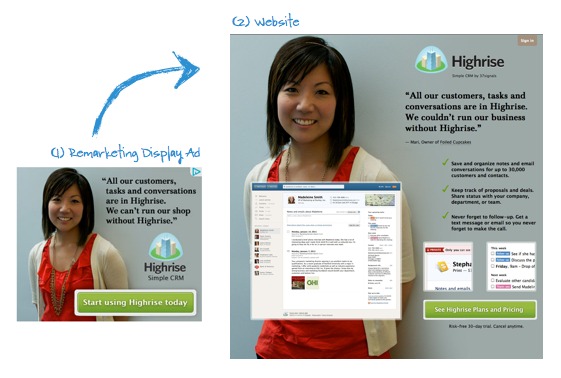
You can see in this campaign from Highrise that the ad and landing page look very similar.
Here are some of the things they made sure to keep consistent:
- The image of the woman is the same.
- The theme is the same, including the background color, logo, font, and look of the CTA.
- The testimonial is the same.
Now, check out this example:
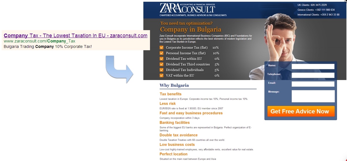
The ad talks about the “lowest taxation in the EU,” then you click through to a page talking about Bulgaria. What?
After reading the fine print, you can see how they tie together but remember that first impressions happen in seconds.
My guess is a lot of people click that end, see a landing page that doesn’t seem to match and instantly hit their back button. I know I would.
2. Make it mobile-friendly
Mobile landing page optimization is vital now that Google has switched to a mobile-first index.
The number of mobile users increases every year. Last year 66% of the population had a mobile phone.
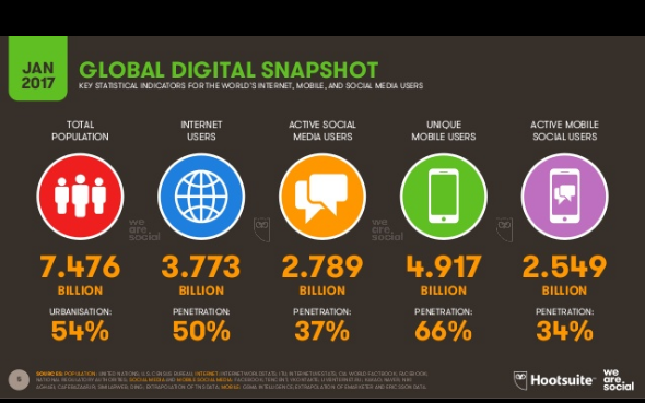
That’s up 5% from the year before. I’m sure when they come out with this year’s stats it will have increased again.
Mobile users are beginning to dominate web traffic.
As of last year, over half of all web traffic is mobile.
Not only that, look at the breakdown by time of day:
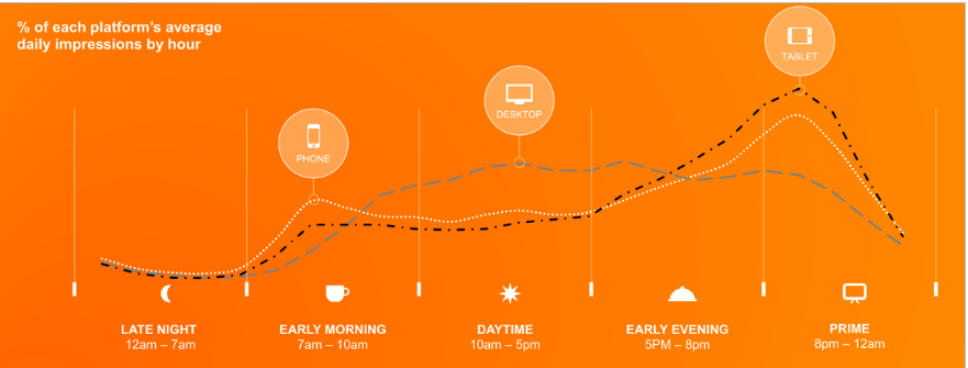
Mobile is dominating the hours when people are typically outside of work.
These are the times people are most likely to be using the web for something other than work, such as browsing the net or shopping.
This means if you want to capture your audience, you need to plan for them being on a mobile device.
When it comes to mobile traffic, the two most critical aspects of your landing page are speed and simplicity.
Let’s talk about keeping it simple first.
Take a look at these two examples:
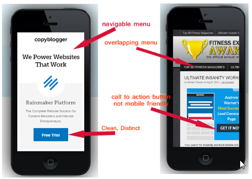
It needs to cut out everything but the absolute necessities, and it needs to be designed for mobile.
Having a CTA that’s only partially visible is going to lower your results.
Making it too difficult to read on a small device is also going to hurt your conversions.
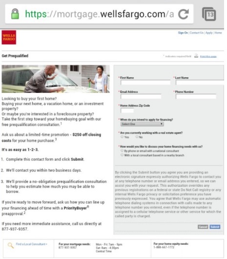
3. Check that your load speed is fast
Page load speed might not be something you first thing of when designing a landing page, but it’s critically important for mobile and desktop traffic.
In fact, Google announced in January that starting July 2018 pagespeed will become one of their ranking factors for mobile searches.
40% of your audience will leave your landing page if it takes longer than three seconds to load.
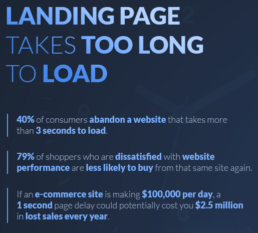
It won’t matter if you get every other step right if no one ever hangs around long enough to actually view your page.
A lot of businesses are struggling with this, especially for mobile.
According to Google, the average time it takes to load a mobile landing page is getting better, but it stills takes an average of 15 seconds.
I just told you 40% of people will leave if it takes longer than three seconds.
When you isolate mobile traffic, that number actually increases to 53%.
So over half your audience will leave in three seconds or less and the average site takes 15 seconds…
Simply fixing your page speed could have a huge effect on your conversions without changing any other thing about your landing page.
Google also found that bounce rate continued to increase the longer page load took.
Here are their findings for mobile traffic:
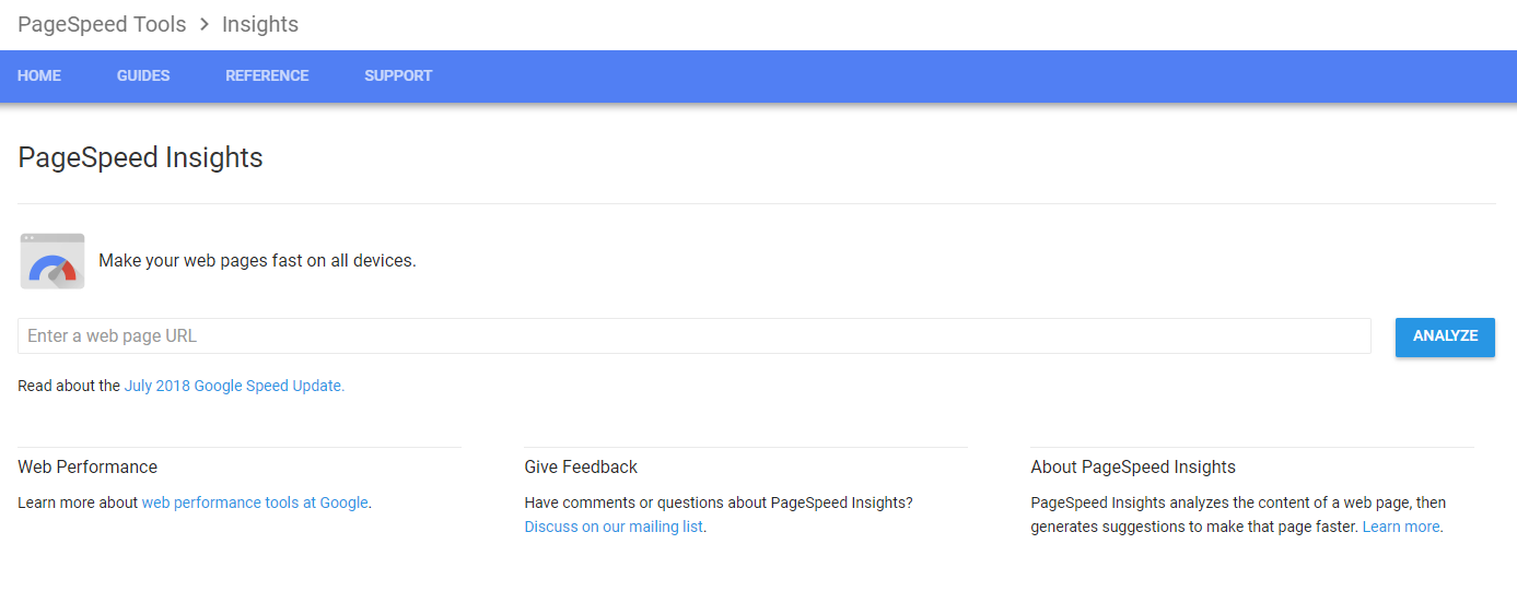
How do you know if your page is too slow?
For desktops, you can test with Google’s PageSpeed Insights.
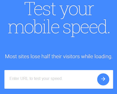
For the mobile version of your site try Test My Site.
If your speeds are not where they should be, then make sure you take the right steps to boost them before worrying about anything else.
4. Make sure your headings work
Once your page loads, one of the first things your audience will notice is your heading and subheading.
When thinking about landing page design, always keep in mind that first impressions count.
Your headline is one of your first impressions. It needs to be clear, attention-grabbing and reflect the purpose of your page.
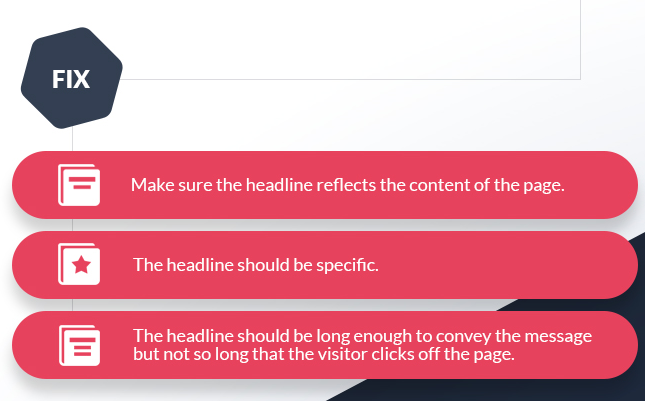
Check out this headline:
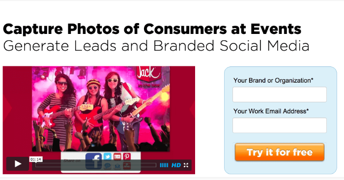
It’s simple, straightforward and you know what they’re selling.
Their subheading reinforces the message and adds more information, without being too long or distracting.
Now take a look at this one:
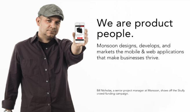
The title is catchy, but it doesn’t give you any idea what the product is.
The only thing that saves this is the subheading is perfect. It provides the context that they’re missing in the headline.
The subheading needs to complement and build on the main heading.
Its purpose is to give your readers a little more information while keeping them engaged and enticing them to continue down the page.
Check out Slack’s homepage:
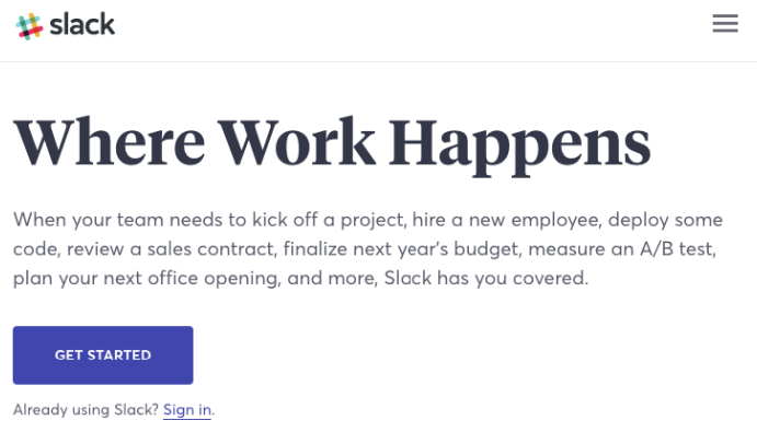
While this is actually a homepage, it captures the key aspects of headings that you should use on your landing pages.
5. Remove all the distractions
One of the key distinctions of landing pages is that they only serve one purpose.
Even though Slack’s homepage is pretty clean, it would fail as a landing page for a couple of different reasons.
The first is that, like any homepage, it has distractions.
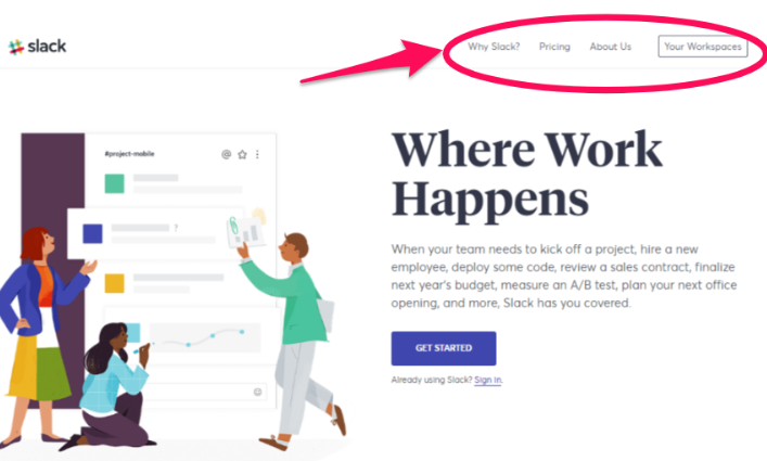
Your landing page shouldn’t have a navigation bar.
Why?
It’s been shown that removing the navigation menu on your landing page can increase your conversions by 100%.
But only 16% of landing pages don’t have navigation bars.
This is a simple fix that more people should be taking advantage of.
Another way you’re distracting your audience is with too many words.
There’s a direct correlation between lower word counts and higher conversions, especially in the health and travel industries.
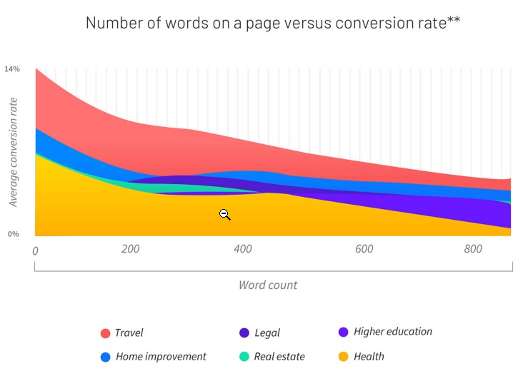
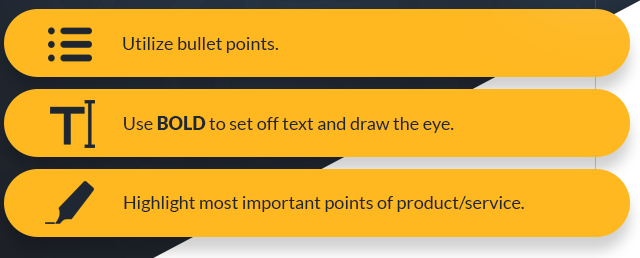
Don’t put too much text on the page. Keep it as visual as possible with bullet points or infographics.
You need to include enough information to make it clear what problem you’re solving for your customer, but in as few words as possible.
I know it’s a bit of an art, which is why it’s crucial to test your landing pages (we’ll get to that later).
6. Use the right CTA
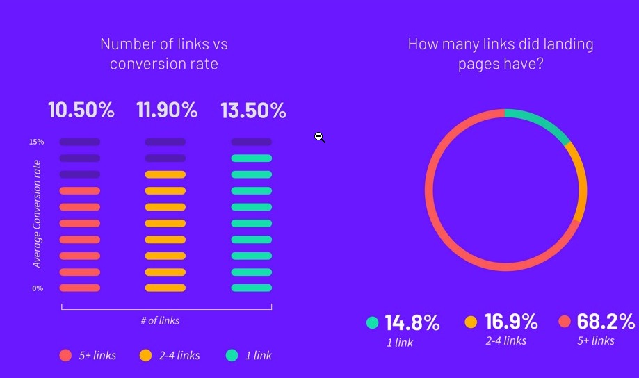
A landing page should have one call to action.
Over 68% of businesses have five or more CTAs and links on their landing page, yet stats show that having only one CTA boosts conversions.
Choose one specific goal and CTA for each landing page and stick to it.

Make sure that your call to action is relevant and consistent with your offering.
Using something vague such as “click here,” “submit,” or “continue” will not convert as well.
Your CTA is the whole reason for a landing page. It is the most important element.
You need to make it stand out.
Choose a bright color, make it a large button with a bigger font.
Draw attention to it, with arrows or other visuals. You want your audience’s eyes to be drawn to it naturally.
7. Limit what you ask for
Landing page abandonment can happen in the same way as cart abandonment.
One of the big triggers for abandonment is asking too many questions.
Most companies want to get as much data as possible. However, there are conflicting results when you reduce form fields.
You don’t necessarily have to limit form fields to some artificial number. But you should just focus on what’s important.
For example, asking your audience for their age immediately drops your conversion rate.
There’s often no point in collecting that data up-front!
Here’s a simple example from Optimizely:
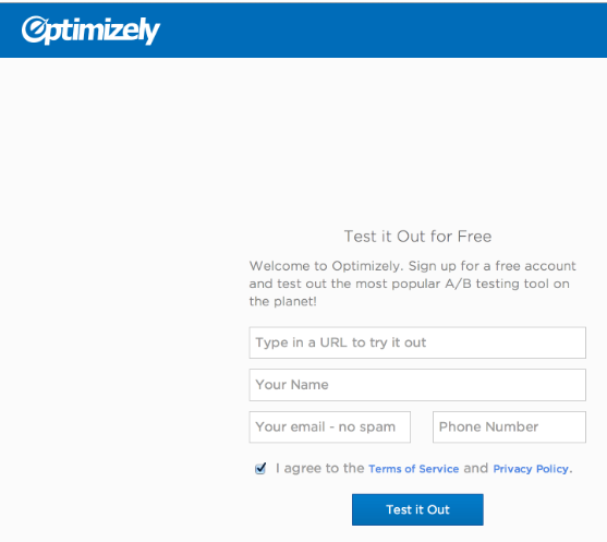
You can also use interactive screens, like Oscar Health, to break up the questions.
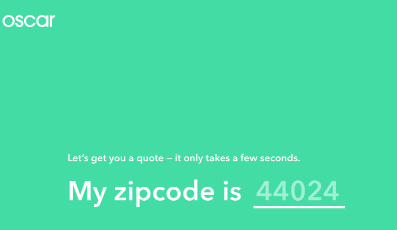
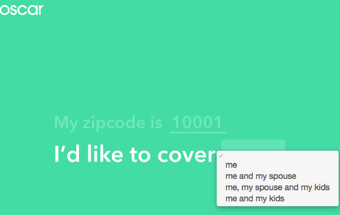
This increases your chances of your audience interacting and completing the form fields without abandonment, since it breaks up the fields, making it seem like less.
Consider adding a progress bar so that your audience knows they’re getting close to the end and the screens don’t actually go on forever.
Also, keep in mind our fields need to be optimized for mobile. If it’s painful to do on a phone, people will flee.
8. Have the right visuals
First, I should be clear that visuals aren’t just images anymore.
I’ve seen video landing pages convert at 56%!
Here are just some of the benefits of putting a video on your landing page:
They increase audience retention. An engaging video keeps people hanging around longer, which allows your message to penetrate.
They also increase trust. Assuming your video includes a real person, it gives your product a life and voice. This will immediately increase your audience’s trust.
Your audience wants to watch videos. Unbounce found that people prefer to watch a video over reading an article, as long as the video is 5 minutes or less.
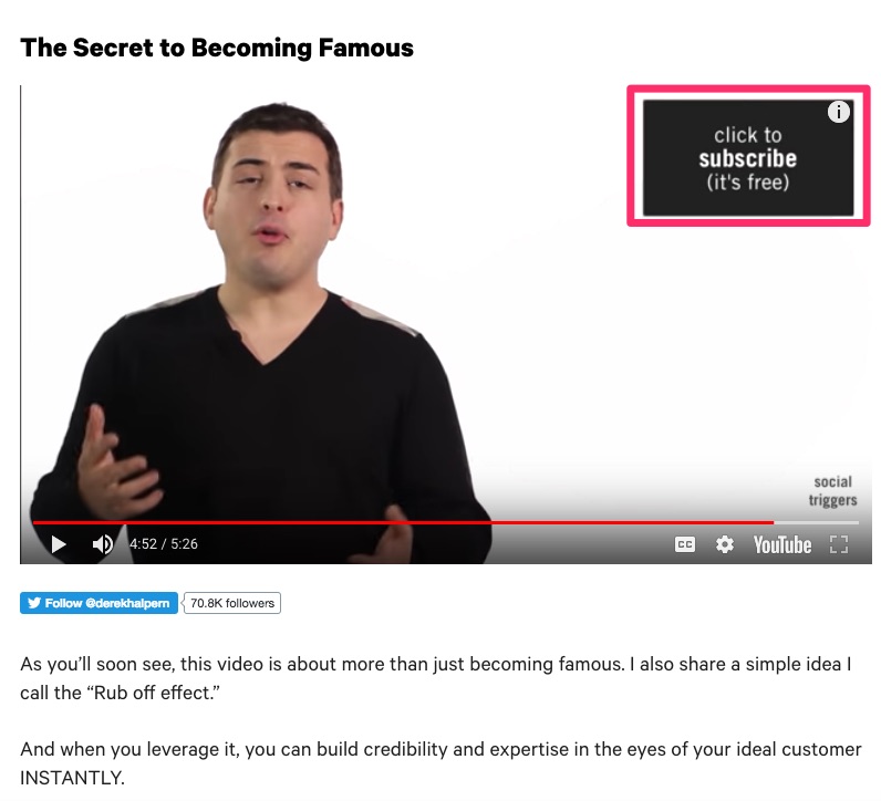
If you’re going to incorporate a video, make sure you embed your call to action within it (as well as elsewhere on your landing page).
Take a look at how Derek Halpern included his CTA:
Videos are also a great way to demonstrate your product.
If you have something that is difficult to assemble or use, videos are ideal.
For example, Long Tail Pro includes a video that walks you through exactly how to use their software.
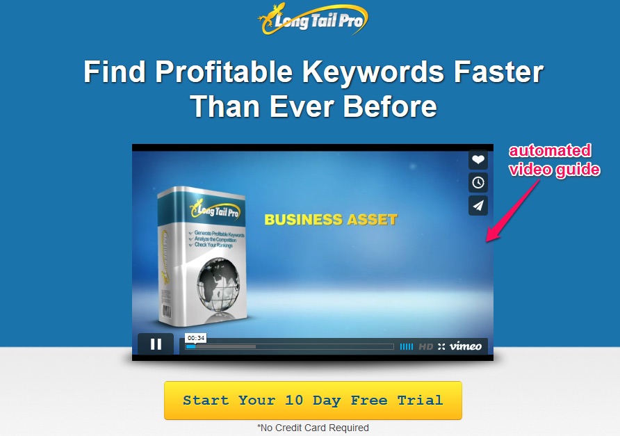
Don’t make it too long; keep your video short, to the point, and useful.
Any images on your landing page should be relevant to your product or service.
Try to choose pictures that meet the following criteria:
- They should be large.
- They need to be relevant to your product or service. Make sure that if you sell a product, there is an actual picture of it on your landing page.
- Don’t ever use stock images.
- All your images need to be high-quality.
Including an image of a person looking directly at your call to action is an easy way to boost conversions instantly.
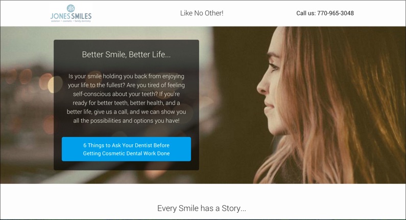
When we see someone looking at something, we’re naturally drawn to look at it as well.
It’s a simple yet effective way to direct the attention of your audience to where you want it.
9. Include reassurance and testimonials
Want to hear something controversial?
The best salesperson in your company isn’t actually the best in my experience.
Instead, the best salespeople are often your past customers.
People want to hear from other people’s experience.
That’s why always make sure to use clients’ testimonials on every single landing page I create.
Testimonials help to build trust in your personal brand. People trust other people more than they trust a company.
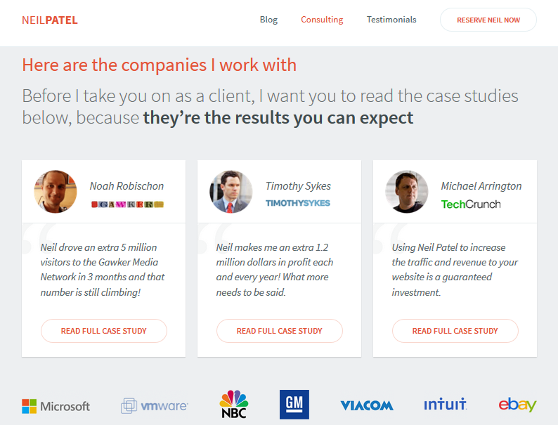
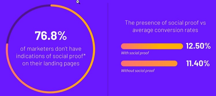
More than three out of four marketers don’t include social proof, yet it can boost your conversion rate by more than 1%.
1% might not seem like a lot, but the average landing page conversion rate is only 2%.
If you’re new and don’t have many testimonials yet, there are other ways to reassure your customers.
Consider showing your trust indicators to reassure users that your site is safe.
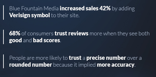
You can also build trust by sticking to the facts and using precise numbers whenever you state any statistics.
Make sure you don’t overstate results.
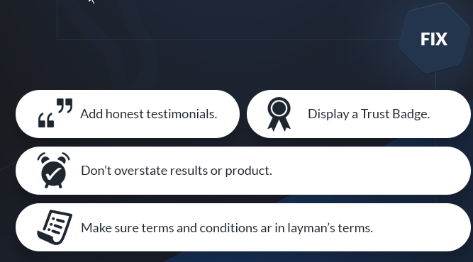
Saying something is the best without backing it up will make people think you’re trying to trick or scam them.
Avoid superlatives like “best,” “fastest,” “cheapest” unless you can prove it with research.
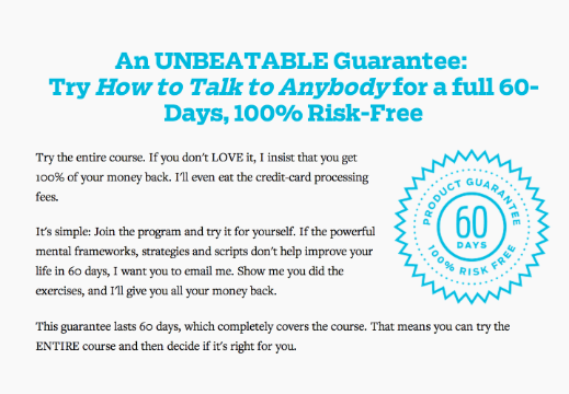
Another way to reassure customers is by offering a guarantee.
Free trials or money-back guarantees help build trust and boost conversions since they’re low risk.
You can also increase customer confidence by providing contact info.
Simply giving people a way to reach you can help reassure them your site and product or service is trustworthy.
10. Add a little pressure or incentive
An additional incentive to encourage customers to click your CTA can help boost conversions, particularly if your landing page is for lead generation.
Offering a free e-book or guide can help increase sign-ups.
Just make sure the content you provide is valuable, or any future marketing efforts toward these people won’t work well.
Whatever free gift you choose should be seen as an investment toward later paid conversions.

Remember the old saying about the carrot or the stick?
The gift is a carrot to entice conversions. You can also use a stick or “threat” to scare people into action.
Now, I don’t mean a real threat.
I mean use language such as “limited time offer,” “only 24 hours left” to increase your conversion rate.
11. Test, test, and retest
There is a science to landing page structure, but there is also an art to it.
To find the best landing page design for each of your campaigns you need to test them.
Many marketing blogs will rave about long-form landing pages. But guess what? Those don’t always convert the best.
The catch is that some companies, like Conversion Verve, have found that shorter pages actually converted better for them.
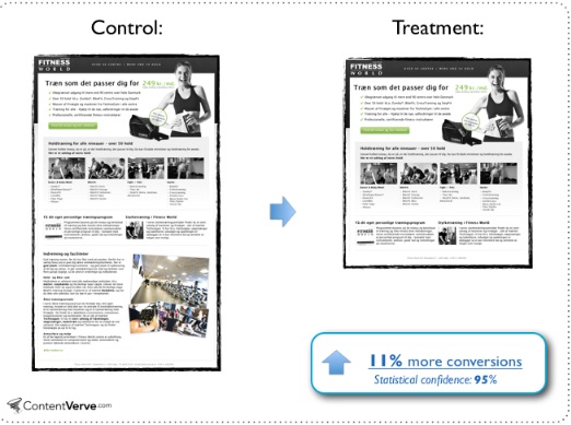
So even when you read about what works best on average, it doesn’t mean it will work best for you.
Sadly, barely half of companies actually test their pages today.
But testing has proven to boost conversion rates.
The companies whose conversion rates have improved year over year are executing 50% more tests on average.
A good way to test your pages is with heat maps.
A heat map gives you a simple visual of where your visitors are looking and clicking when on your landing page.
You can see what areas of your page people are paying attention to and what’s not working.
Of course, I’m a little biased, but my preferred heat map software is Crazy Egg.
All you do is enter the URL of your landing page, create an account, and check out your heat map.
Here’s an example of a scroll heat map:
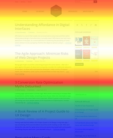
The areas in red are getting the most attention.
In this example, you can see that not a lot of people are making it down to the bottom.
If your CTA were at the bottom, this would be a problem.
You can use heat maps to see where people are clicking:
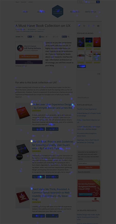
Heat maps can quickly show you if your headlines, content, or CTAs aren’t getting enough attention.
Conclusion
Landing pages are often expected to convert people effortlessly, yet the average rate is around 2%.
Of course, the problem isn’t with landing pages exactly. It’s with how they’re being built and used.
A landing page needs to have one singular goal, and every part of it needs to be designed to move viewers toward that goal.
First, make sure your landing page is consistent with your campaign, then make sure it’s optimized to be fast and mobile-friendly.
Your headings need to be attention-grabbing, and all distractions, noise, and clutter need to disappear.
Use an effective CTA and limit the amount of information you ask customers to provide.
Make sure you use great visuals and provide social proof or guarantees to reassure people it’s low risk to convert.
Remember, you can always offer an incentive or a little pressure to encourage people to click the button.
Finally, always make sure to test your pages. Use A/B testing or heat maps to see what’s working and improve what isn’t.
What tips or tricks haven’t I mentioned that helped boost your landing page conversions?
About the Author: Neil Patel is the cofounder of Neil Patel Digital.
Source: feedproxy.google.com