
Tag Archives for " mobile "

9 Great Mobile App Analytics Tools
You’ve done the incredible—you’ve built an app and started marketing it. While congratulations are in order, making the app is just the first step on your path to app success. The next (and arguably most important) step is optimization.

With consumers spending four and a half hours per day on their phones, it pays to make sure your app is earning some of that heavy time-spend.
And better visibility can pay. On average, consumers spend $120B in the app store and $190B on mobile ad spend.
You can check traffic and user metrics on mobile app analytics to make your app as successful as possible.
Here’s what you need to know about mobile app analytics and which tools are most effective at helping you dig into the data.
Mobile App Analytics
Mobile app analytics aren’t too different from their web counterparts; they track and analyze user activity and events on apps.
Using an app analytics tool gives you access to invaluable insight into how your app works and highlights improvement opportunities.
By seeing how users interact with your app, you can optimize your app to be as user-focused as possible.
Why Analytics Are Crucial for Your Mobile App
Without visibility, your app may fall short of satisfying your users’ needs — regardless of how beautiful or useful your app is.
When that happens, your users will look elsewhere to have their needs met.
By implementing mobile app analytics, you not only equip yourself with the tools necessary to better understand your app’s performance, but you also benefit in these four key areas:
- Real-time ROI assessment: Enhance your app value and, ultimately, increase your ROI by gaining a better understanding of customers through data.
- Data-driven strategies: With increased access to data, you can pinpoint specifics that can drive future campaigns. With clear visualization of past successes and failures, you can recalibrate your approach with data-driven strategies.
- Personalized strategies: By segmenting and targeting audiences with more specificity, you’re more likely to provide them with what they want or need. By using app analytics, you can identify these populations and start targeting them with customized strategies.
- Goal tracking: App analytics allow you to determine which acquisition channels are working for you. By identifying these channels, you can dedicate more focus here and replicate the approach.
While these four areas aren’t the only advantages of implementing a mobile app analytics tool, understanding these categories is vital to overall app success.
What KPIs You Should Track for Your Mobile App Analytics
While it’s easy to get lost in the sheer amount of mobile app analytics available, there are seven crucial key performance indicators (KPIs) you should be tracking to gauge user engagement and your mobile app’s overall success.
- Retention rate: This metric identifies the percentage of customers that continue to use your app. Conversely, this figure also alerts you to the number of customers you’re losing due to churn.
- Lifetime value (LTV): This formula helps you assess what your customers are worth over the “lifetime” of their relationship with your business.
- Uninstalls: Tracking the number of people who uninstall your app is vital to understanding why those people uninstalled your app.
- Cohort Analysis: This analysis focuses on segmenting users by traffic source, country, and device and analyzing the associated metrics.
- ROI: This number represents what you’ve spent versus what you’ve earned on a particular effort.
- Cost per acquisition (CPA): This figure lets you know exactly how much you’re spending per acquisition.
- User growth rate: This figure represents the number of new users within a specific time frame.
While these seven KPIs are by no means the only helpful app analytics you can track, they provide a comprehensive view of your app’s success and highlight areas in which improvement is necessary.
What’s The Difference? SEO vs. ASO
Just like optimizing any web page for SEO is vital to your search success, it is imperative to optimize your app for app store optimization (ASO).
ASO refers to the continuous process of measuring, testing, and assessing existing app store marketing strategies to increase your app’s visibility and driving downloads. The higher your app ranks in the app store, the more likely potential customers are to see your app.
While SEO and ASO processes are similar, they also have some significant differences, including the ways users search the web versus searching an app store.
While the web is primarily used to answer questions, the app store is used to search for a specific product that matches the searcher’s intent.
This means you’ll need to use different strategies to rank high in the app store versus search engines like Google.
This is why you don’t want to just use web-based analytics tools for SEO to track ASO.
Best Mobile App Analytics Tools
With a slew of mobile app analytics tools available, it can be challenging to figure out which ones are the right choice for you. These nine tools represent some of the most effective platforms that can help you make your app climb toward the top of the search bar.
App Annie
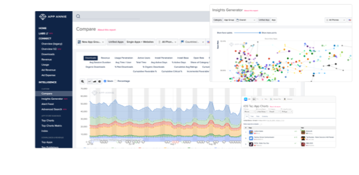
App Annie is a mobile and data analytics platform that provides unprecedented views of both your app’s data and other in-market apps. With both a paid and free subscription option, App Annie can help your app stand out among the digital crowd, whatever your budget.
What Platforms Support It?
What Data Does It provide?
How to Use It?
iOS, Android, Windows Phone.
The free version of App Annie provides ratings, rankings, reviews, charts, and app details, while the premium pricing plan adds ASO options, download and revenue estimates, usage estimates, advertising estimates, and audience estimates.
Use App Annie to access data to help you determine how to best optimize your app. Through the App Annie platform, you gain immediate access to the organization’s technology innovations and data sets, allowing you access to shared data, identify opportunities, and the ability to craft successful campaigns.
App Radar
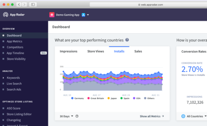
App Radar is all about making your life easier. It offers several tutorials to help you optimize your ASO from the ground up. The mobile analytics app comes with keyword tracking and research functionality, helping you build a solid ASO strategy.
What Platforms Support It?
What Data Does It Provide?
How To Use It?
Android, iOS, Windows Phone.
Key metrics tracking, localization, keyword rank tracking, keyword research tools, and more.
Use App Radar to research keywords and track competitors’ search strategies. As you build your own approach, use App Radar’s suite of tools to optimize your ASO.
Adjust
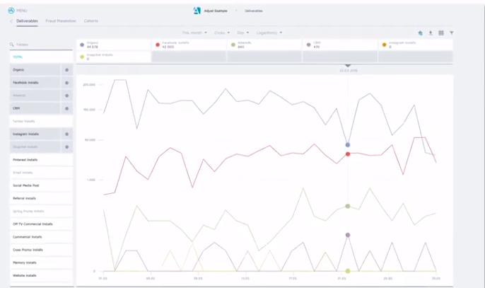
Adjust is a mobile analytics app designed to help you identify and build your user base. This mobile analytics app tracks hourly trends assesses, LTV, and analyzes cohorts.
Adjust also allows you to aggregate lifetime user data in a single dashboard. Also noteworthy is the platform’s Fraud Prevention Suite, which protects your app from fraudulent activity.
What Platforms Support It?
What Data Does It Provide?
How To Use It?
Android, BlackBerry, HTML5, iOS, Windows Phone.
Insights on churn, ROI, in-app interactions, LTV, event funnels, and more.
Use Adjust to view and understand patterns of user behavior. By identifying these patterns and metrics, you can recalibrate your app for your user and extend user engagement with the app.
Firebase
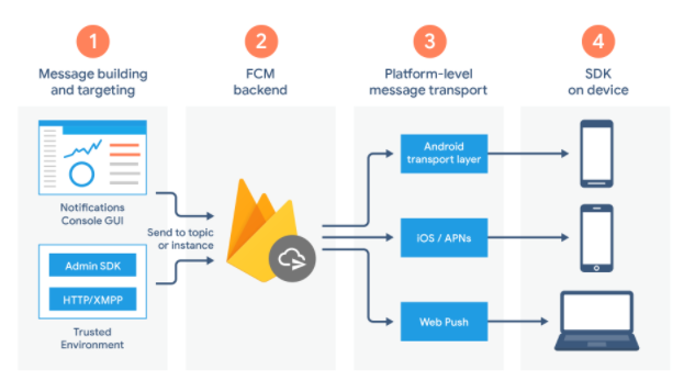
Firebase is Google’s free mobile app analytics platform that supports developing, improving, nurturing, and growing your app by displaying all metrics in a single central location.
The app aggregates user data and shares it via an immersive dashboard, allowing you a unique view of the actions happening in and around your app.
What Platforms Support It?
What Data Does It Provide?
How To Use It?
C++, iOS, Unity, and Android.
The number of users and sessions, session duration, operating systems, device models, geography, first launches, app opens, app updates, in-app purchases.
Use Firebase to identify specific audiences through segmentation. Once you’ve broken out these subsets, you can start targeting these audiences through in-app notifications or other strategies.
App Analytics
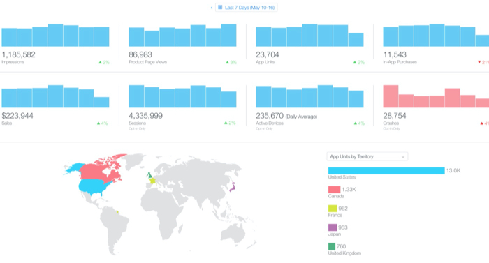
App Analytics is Apple’s mobile analytics app that provides specialized analytics for apps published in the Apple App Store.
This mobile analytics app gives you specific visibility into user interaction within the App Store, relaying how users discover your app.
What Platforms Support It?
What Data Does It Provide?
How To Use It?
iOS
This mobile analytics app provides user engagement, App Store impressions, sales and trends, and user segmentation.
Use this app to understand how users find your app in the store and replicate this experience for your target consumers.
Tune
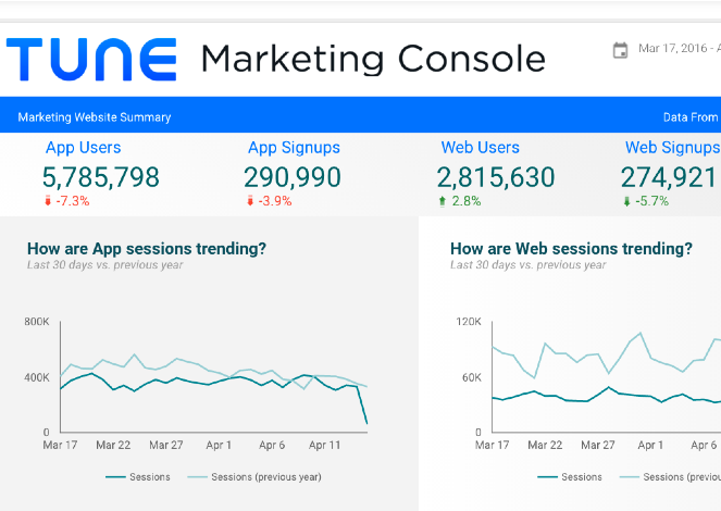
Tune is your solution for measurement and engagement throughout the customer journey, tracking a user’s trajectory by monitoring movement and unifying cross-channel touchpoints.
What Platforms Support It?
What Data Does It Provide?
How To Use It?
Android, iOS, tvOS, Javascript, Windows Phone.
Tune provides ROI, cohort ingestion, impression, click, event measuring, and more.
Use Tune to gain a complete view of the customer’s journey throughout your campaigns. By providing you with real-time data, Tune can help you identify specific improvement points with your strategy.
Kochava
Kochava is a platform designed for tracking engagement, LTV, and user acquisition. Through this mobile app analytics platform, you can view vital data points and build user groups. This platform allows you to analyze ROI through pinpointed data.
What Platforms Support It?
What Data Does It Provide?
How To Use It?
Android, iOS, tvOS, Windows & Xbox One, Unity, ReactNative, Cordova, Adobe Air, Xamarin, Web SDK, Corona Labs, Adobe DPS, Adobe Analytics.
Retention analytics, real-time ROI, location-based marketing, channel attribution, contextual targeting, and much more.
Use Kochava’s data points for real-time visualization of campaign performance and engagement, targeted audience identification and creation, targeting, and prevention of mobile ad fraud.
MixPanel
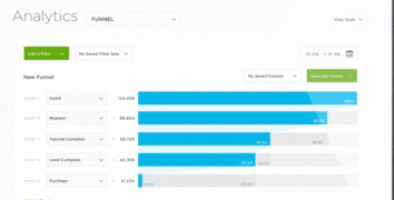
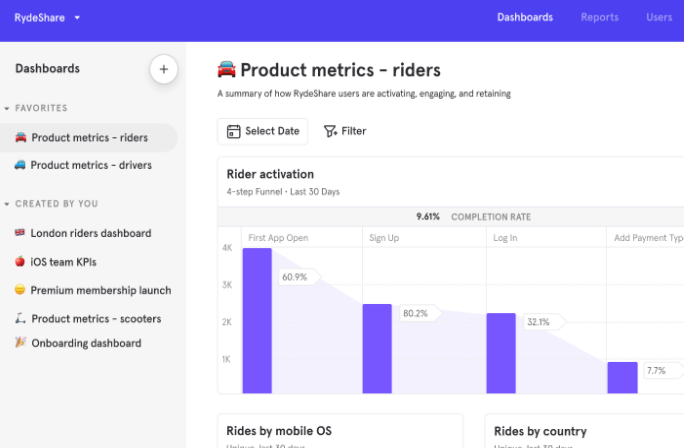
MixPanel is chock-full of unique analytics tools, including a funnel analysis and its uniquely-titled engagement tracker, the Addiction Report. These tools allow you to understand which strategies increase conversion, retention, and engagement.
What Platforms Support It?
What Data Does It Provide?
How To Use It?
iOS, Android.
Retention rate, churn, campaign segmentation, funnel analysis, and more.
MixPanel comes with interactive reports so you can pull data quickly and easily. This interactive feature provides answers to all of your audience engagement questions in seconds.
Flurry
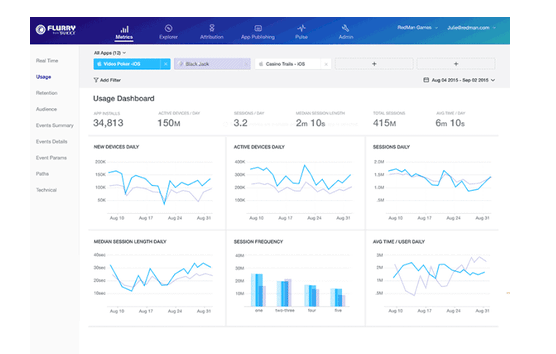
Flurry Analytics is an extension of Yahoo’s Develop Network. This mobile app analytics platform lets you track new users, active users, and sessions via a single dashboard.
What Platforms Support It?
What Data Does It Provide?
How To Use It?
iOS, Android, React Native, watchOS, Unity.
Installs, sessions, time spent, user journeys, custom events, user segmentation, and more.
Use Flurry Analytics to see app performance easily. Flurry also comes equipped with crash reporting, which helps you identify issues and fix them before they impact performance — and customer satisfaction.
Conclusion
Whether you’re just beginning your app-marketing journey and looking to increase visibility, or if you’re looking to delve into the nitty-gritty of advanced data, you need a mobile app analytics tool to help you navigate the realities of ASO.
While there are tons of mobile analytics apps available to choose from, the nine tools I highlighted above offer detailed information about your users and provide unique data points that can highlight patterns of behavior.
Armed with these new metrics, you make your app irresistible for your targeted audience.
What’s your favorite mobile app analytics tool?
The post 9 Great Mobile App Analytics Tools appeared first on Neil Patel.
Source: neilpatel.com

Report: A developer’s checklist for deploying the internet of things
Our library of 1700 research reports is available only to our subscribers.
We occasionally release ones for our larger audience to benefit from.
This is one such report.
If you would like access to our entire library, please subscribe here.
Subscribers will have access to our 2017 editorial calendar, archived reports, and video coverage from our 2016 and 2017 events.
A developer’s checklist for deploying the internet of things by Rich Morrow:
The “things” in the “internet of things” (IoT) encompass a wide range of devices:
- sensors and sensor arrays like the Nest and SmartThings,
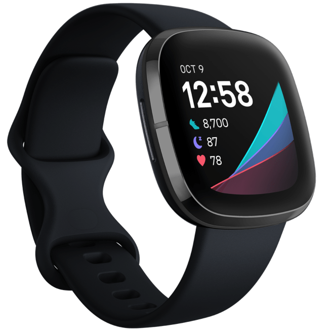
- wearables like the Pebble smartwatch and Google Glass,
- and embedded technologies like Tesla and Ford’s Smart Cars.

Even Samsung, the current leader of the mobile space, has its eyes set on the smart-home market, with refrigerators that will text you (or the Amazon Grocery delivery truck) when you’re out of milk.
The possibilities are staggering, but these “things” represent some significant challenges to app developers.
Developers, in particular, will have to cope with an unprecedented explosion of supported devices and form factors, extensive network optimizations to make both the front end and back end more responsive, highly capable edge devices to which more processing may (and should) be pushed, and finally, a plan to capture, process, and wrangle business value and from all of the data these devices generate.

While each development project will require different skills, and the IoT is still in its earliest stages, there are certain tools with which budding IoT developers should be familiar.
To read the full report click here.
Source: gigaom.com

Landing Pages Are Overrated. Here’s Why and What You Should Do Instead
I used to hate building landing pages.
I’ve certainly made mistakes and had to learn some things the hard way.
For a long time, my landing pages just didn’t work. They were weak and barely converted.
Landing pages are being praised as the magic answer to all of our conversion problems, but it’s not as easy as some people think.
Don’t fall into the trap of thinking you can build a landing page and presto, your conversions will skyrocket.
The conversion rate from a landing page varies across industries, but the average is only 2.35%.
This means that for every 50 people you get to your landing page, only one will actually complete the action you’re trying to get them to do.
That’s a little depressing right?
I have good news for you though. I’ve learned from experience that most landing pages can do better.
The majority of landing pages aren’t really optimized to achieve conversions. They look “pretty,” but they’re not living up to expectations because they’re flawed.
I’m going to show you why landing pages are currently overrated and how to change your game to boost your conversions.
But first, let’s talk about what a landing page really is and what it’s meant to be for.
What is a landing page, really?
In the simplest sense, a landing page is a page you land on.
The problem with that answer is that it’s much too simple.
If someone clicks a link in one of your ads and it takes them to your home page, then by this definition your homepage is a landing page.
Some companies are making that mistake.
Let me show you an example.
I’m searching for “cleaning services seattle” in Google. I click on the paid ad:
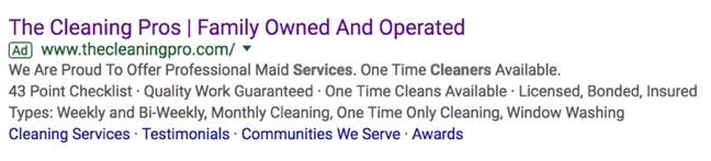
That takes me to their homepage:

Now, here’s an example of a landing page done right.
I click this search result:

And, here is a landing page tailored to my search preferences:
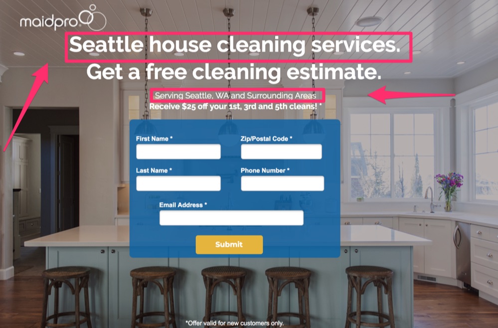
Your homepage might be a good place to send people if you’re just trying to build general awareness, but it’s not where you’re going to have success with conversions.
A landing page is meant to have one singular goal: To convert.
That’s it. It shouldn’t do anything more than that.
Check out this definition from The Landing Page Course:
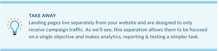
There are two key points here:
- They are individual pages with one, singular goal.
- They are meant for the single purpose of receiving “campaign traffic,” which means the click-throughs from your Ads and campaigns. This could be social media ads, PPCs, or emails.
This means that first, you need to be running a successful ad campaign that is causing the right traffic to click through to your landing page.
After all, if no one is “landing” on your landing page, it’s going to be pretty useless, right?
Assuming that your ad campaign is successful and your CTR is good, then the landing page should have one of two possible purposes:
Capture leads for further communications and to allow you to market to them in the future when they’re further down the sales funnel.
Warm-up your potential customers to get them ready and eager to purchase your product or service before sending them through to close the deal.
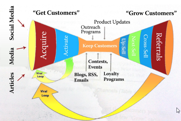
Each of these purposes requires a different type of landing page.
Good landing pages can provide a number of benefits:
They help promote a positive first impression.
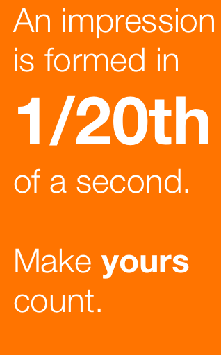
Ion Interactive says first impressions are formed in just 1/20th of a second. Landing pages can be customized and designed to help provide strong positive visual impressions quickly.
They can take advantage of trust elements.
Landing pages with images, videos and graphics can not only help attract people, but they will help you make a lasting impression.
People only remember 20% of what they read, but they remember 80% of what they see.

Landing pages promote customer focus.
It’s easier to capture conversions from a well-designed landing page than it is from a homepage or blog post because they have one singular goal. There is less noise to distract your audience.
All of this means that landing pages are the ideal place to get your audience to convert if they’re done right.
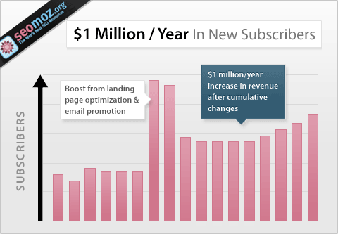
Conversion Rate Experts generated $1 million/ year for Moz simply by improving their landing page and doing some email promotion.
So why are landing pages overrated?
Well, it’s not because they can’t work. It’s just that too often people use a generic template or slap something together that just doesn’t get the job done.
Don’t worry if you’re one of those people. After all, when I started out my landing pages limped along too.
Avoid Common mistakes to Make Sure Your Landing Pages Are Doing Right
But now I’m going to share with you what I learned and what the most common mistakes are so that you can make sure your landing pages are doing their job.
1. Sync it with your ad campaign
Like I mentioned above, the very first step if to have an effective ad campaign.
You need to be targeting the right audience for your landing page, or nothing else matters.
After all, sending people ready to buy through to a lead generation page is not going to be very successful.
But syncing intent is not the only thing you need to focus on.
Your ad and your landing page need to have a consistent look and feel.
Here’s a great example of consistency:
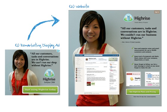
You can see in this campaign from Highrise that the ad and landing page look very similar.
Here are some of the things they made sure to keep consistent:
- The image of the woman is the same.
- The theme is the same, including the background color, logo, font, and look of the CTA.
- The testimonial is the same.
Now, check out this example:
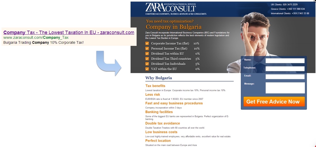
The ad talks about the “lowest taxation in the EU,” then you click through to a page talking about Bulgaria. What?
After reading the fine print, you can see how they tie together but remember that first impressions happen in seconds.
My guess is a lot of people click that end, see a landing page that doesn’t seem to match and instantly hit their back button. I know I would.
2. Make it mobile-friendly
Mobile landing page optimization is vital now that Google has switched to a mobile-first index.
The number of mobile users increases every year. Last year 66% of the population had a mobile phone.
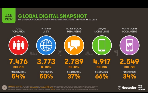
That’s up 5% from the year before. I’m sure when they come out with this year’s stats it will have increased again.
Mobile users are beginning to dominate web traffic.
As of last year, over half of all web traffic is mobile.
Not only that, look at the breakdown by time of day:
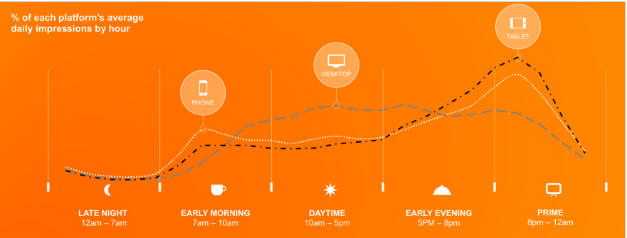
Mobile is dominating the hours when people are typically outside of work.
These are the times people are most likely to be using the web for something other than work, such as browsing the net or shopping.
This means if you want to capture your audience, you need to plan for them being on a mobile device.
When it comes to mobile traffic, the two most critical aspects of your landing page are speed and simplicity.
Let’s talk about keeping it simple first.
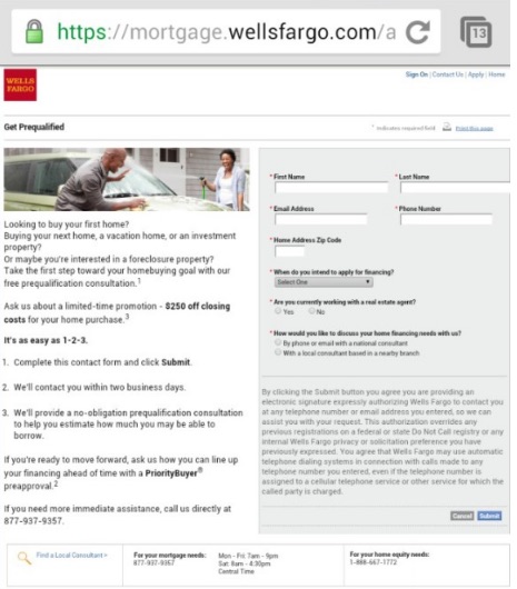
Take a look at these two examples:
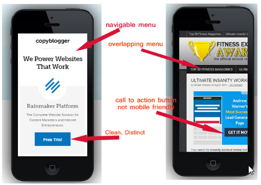
It needs to cut out everything but the absolute necessities, and it needs to be designed for mobile.
Having a CTA that’s only partially visible is going to lower your results.
Making it too difficult to read on a small device is also going to hurt your conversions.
3. Check that your load speed is fast
Page load speed might not be something you first thing of when designing a landing page, but it’s critically important for mobile and desktop traffic.
In fact, Google announced in January that starting July 2018 pagespeed will become one of their ranking factors for mobile searches.
40% of your audience will leave your landing page if it takes longer than three seconds to load.
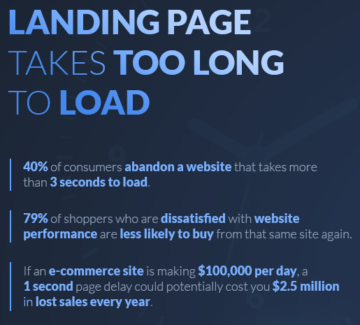
It won’t matter if you get every other step right if no one ever hangs around long enough to actually view your page.
A lot of businesses are struggling with this, especially for mobile.
According to Google, the average time it takes to load a mobile landing page is getting better, but it stills takes an average of 15 seconds.
I just told you 40% of people will leave if it takes longer than three seconds.
When you isolate mobile traffic, that number actually increases to 53%.
So over half your audience will leave in three seconds or less and the average site takes 15 seconds…
Simply fixing your page speed could have a huge effect on your conversions without changing any other thing about your landing page.
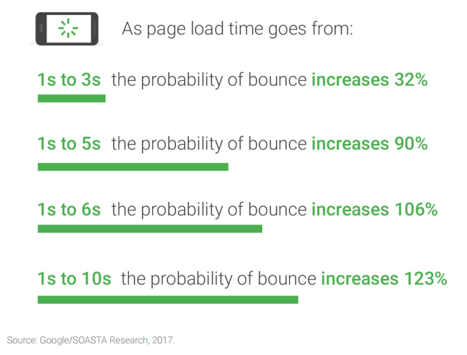
Google also found that bounce rate continued to increase the longer page load took.
Here are their findings for mobile traffic:
How do you know if your page is too slow?
For desktops, you can test with Google’s PageSpeed Insights.
For the mobile version of your site try Test My Site.
If your speeds are not where they should be, then make sure you take the right steps to boost them before worrying about anything else.
4. Make sure your headings work
Once your page loads, one of the first things your audience will notice is your heading and subheading.
When thinking about landing page design, always keep in mind that first impressions count.
Your headline is one of your first impressions. It needs to be clear, attention-grabbing and reflect the purpose of your page.
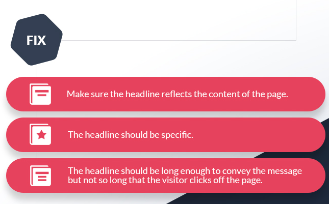
Check out this headline:
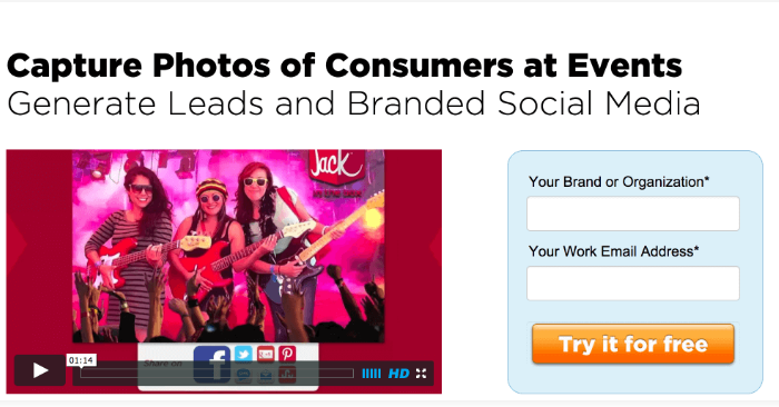
It’s simple, straightforward and you know what they’re selling.
Their subheading reinforces the message and adds more information, without being too long or distracting.
Now take a look at this one:
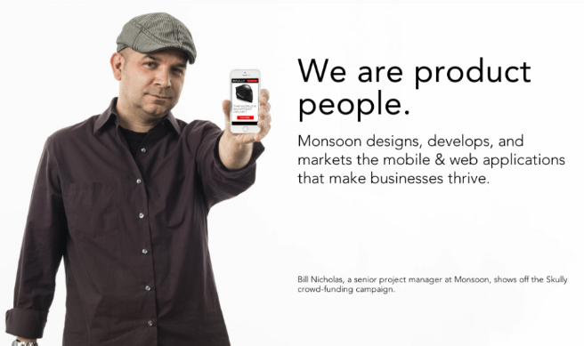
The title is catchy, but it doesn’t give you any idea what the product is.
The only thing that saves this is the subheading is perfect. It provides the context that they’re missing in the headline.
The subheading needs to complement and build on the main heading.
Its purpose is to give your readers a little more information while keeping them engaged and enticing them to continue down the page.
Check out Slack’s homepage:
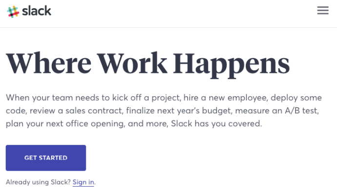
While this is actually a homepage, it captures the key aspects of headings that you should use on your landing pages.
5. Remove all the distractions
One of the key distinctions of landing pages is that they only serve one purpose.
Even though Slack’s homepage is pretty clean, it would fail as a landing page for a couple of different reasons.
The first is that, like any homepage, it has distractions.
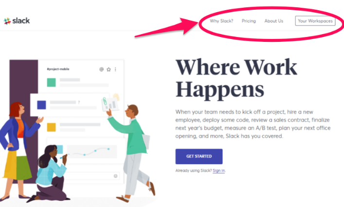
Your landing page shouldn’t have a navigation bar.
Why?
It’s been shown that removing the navigation menu on your landing page can increase your conversions by 100%.
But only 16% of landing pages don’t have navigation bars.
This is a simple fix that more people should be taking advantage of.
Another way you’re distracting your audience is with too many words.
There’s a direct correlation between lower word counts and higher conversions, especially in the health and travel industries.
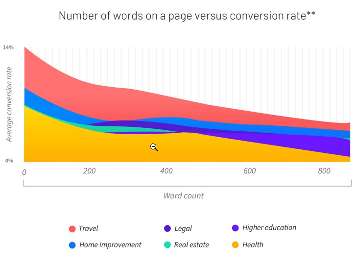
Don’t put too much text on the page. Keep it as visual as possible with bullet points or infographics.
You need to include enough information to make it clear what problem you’re solving for your customer, but in as few words as possible.
I know it’s a bit of an art, which is why it’s crucial to test your landing pages (we’ll get to that later).
6. Use the right CTA
A landing page should have one call to action.
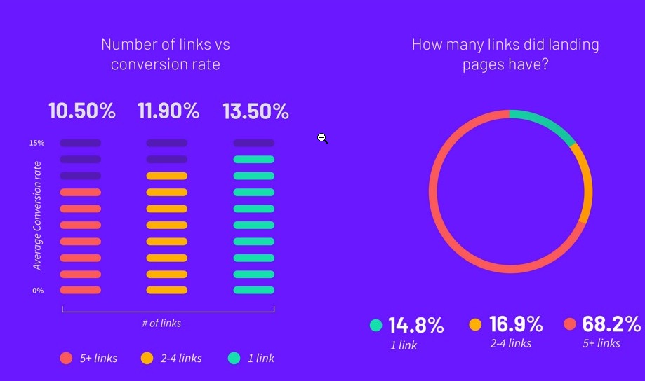
Over 68% of businesses have five or more CTAs and links on their landing page, yet stats show that having only one CTA boosts conversions.
Choose one specific goal and CTA for each landing page and stick to it.

Make sure that your call to action is relevant and consistent with your offering.
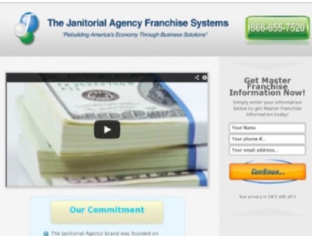
Using something vague such as “click here,” “submit,” or “continue” will not convert as well.
Your CTA is the whole reason for a landing page. It is the most important element.
You need to make it stand out.
Choose a bright color, make it a large button with a bigger font.
Draw attention to it, with arrows or other visuals. You want your audience’s eyes to be drawn to it naturally.
7. Limit what you ask for
Landing page abandonment can happen in the same way as cart abandonment.
One of the big triggers for abandonment is asking too many questions.
Most companies want to get as much data as possible. However, there are conflicting results when you reduce form fields.
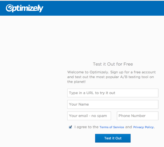
You don’t necessarily have to limit form fields to some artificial number. But you should just focus on what’s important.
For example, asking your audience for their age immediately drops your conversion rate.
There’s often no point in collecting that data up-front!
Here’s a simple example from Optimizely:
You can also use interactive screens, like Oscar Health, to break up the questions.
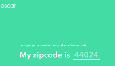

This increases your chances of your audience interacting and completing the form fields without abandonment, since it breaks up the fields, making it seem like less.
Consider adding a progress bar so that your audience knows they’re getting close to the end and the screens don’t actually go on forever.
Also, keep in mind our fields need to be optimized for mobile. If it’s painful to do on a phone, people will flee.
8. Have the right visuals
First, I should be clear that visuals aren’t just images anymore.
I’ve seen video landing pages convert at 56%!
Here are just some of the benefits of putting a video on your landing page:
They increase audience retention. An engaging video keeps people hanging around longer, which allows your message to penetrate.
They also increase trust. Assuming your video includes a real person, it gives your product a life and voice. This will immediately increase your audience’s trust.
Your audience wants to watch videos. Unbounce found that people prefer to watch a video over reading an article, as long as the video is 5 minutes or less.
If you’re going to incorporate a video, make sure you embed your call to action within it (as well as elsewhere on your landing page).
Take a look at how Derek Halpern included his CTA:

Videos are also a great way to demonstrate your product.
If you have something that is difficult to assemble or use, videos are ideal.
For example, Long Tail Pro includes a video that walks you through exactly how to use their software.
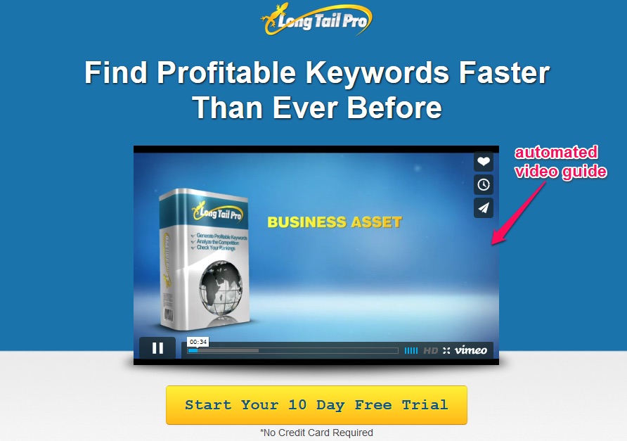
Don’t make it too long; keep your video short, to the point, and useful.
Any images on your landing page should be relevant to your product or service.
Try to choose pictures that meet the following criteria:
- They should be large.
- They need to be relevant to your product or service. Make sure that if you sell a product, there is an actual picture of it on your landing page.
- Don’t ever use stock images.
- All your images need to be high-quality.
Including an image of a person looking directly at your call to action is an easy way to boost conversions instantly.
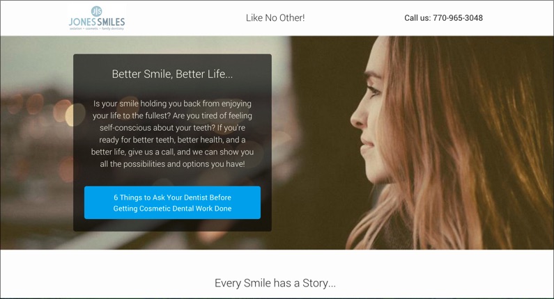
When we see someone looking at something, we’re naturally drawn to look at it as well.
It’s a simple yet effective way to direct the attention of your audience to where you want it.
9. Include reassurance and testimonials
Want to hear something controversial?
The best salesperson in your company isn’t actually the best in my experience.
Instead, the best salespeople are often your past customers.
People want to hear from other people’s experience.
That’s why always make sure to use clients’ testimonials on every single landing page I create.
Testimonials help to build trust in your personal brand. People trust other people more than they trust a company.
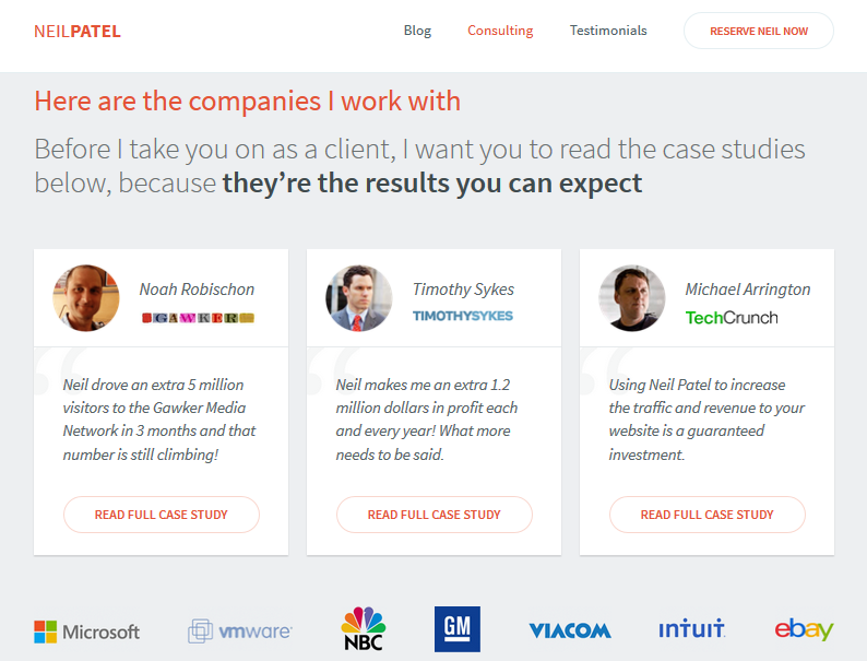
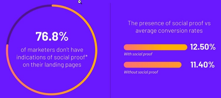
More than three out of four marketers don’t include social proof, yet it can boost your conversion rate by more than 1%.
1% might not seem like a lot, but the average landing page conversion rate is only 2%.
If you’re new and don’t have many testimonials yet, there are other ways to reassure your customers.
Consider showing your trust indicators to reassure users that your site is safe.

You can also build trust by sticking to the facts and using precise numbers whenever you state any statistics.
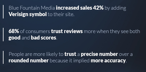
Make sure you don’t overstate results.
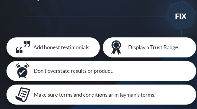
Saying something is the best without backing it up will make people think you’re trying to trick or scam them.
Avoid superlatives like “best,” “fastest,” “cheapest” unless you can prove it with research.
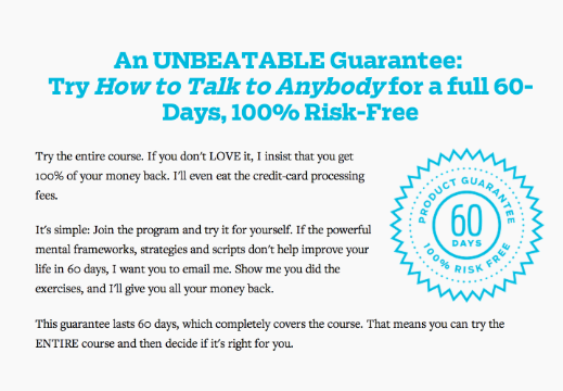
Another way to reassure customers is by offering a guarantee.
Free trials or money-back guarantees help build trust and boost conversions since they’re low risk.
You can also increase customer confidence by providing contact info.
Simply giving people a way to reach you can help reassure them your site and product or service is trustworthy.
10. Add a little pressure or incentive
An additional incentive to encourage customers to click your CTA can help boost conversions, particularly if your landing page is for lead generation.
Offering a free e-book or guide can help increase sign-ups.
Just make sure the content you provide is valuable, or any future marketing efforts toward these people won’t work well.
Whatever free gift you choose should be seen as an investment toward later paid conversions.
Remember the old saying about the carrot or the stick?
The gift is a carrot to entice conversions. You can also use a stick or “threat” to scare people into action.
Now, I don’t mean a real threat.
I mean use language such as “limited time offer,” “only 24 hours left” to increase your conversion rate.
11. Test, test, and retest
There is a science to landing page structure, but there is also an art to it.
To find the best landing page design for each of your campaigns you need to test them.
Many marketing blogs will rave about long-form landing pages. But guess what? Those don’t always convert the best.
The catch is that some companies, like Conversion Verve, have found that shorter pages actually converted better for them.
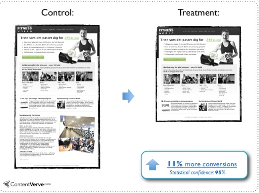
So even when you read about what works best on average, it doesn’t mean it will work best for you.
Sadly, barely half of companies actually test their pages today.
But testing has proven to boost conversion rates.
The companies whose conversion rates have improved year over year are executing 50% more tests on average.
A good way to test your pages is with heat maps.
A heat map gives you a simple visual of where your visitors are looking and clicking when on your landing page.
You can see what areas of your page people are paying attention to and what’s not working.
Of course, I’m a little biased, but my preferred heat map software is Crazy Egg.
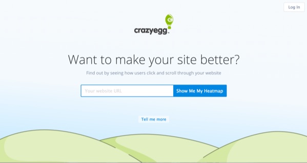
All you do is enter the URL of your landing page, create an account, and check out your heat map.
Here’s an example of a scroll heat map:
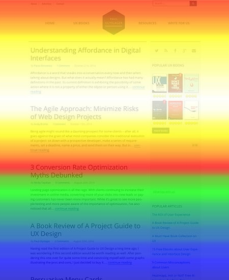
The areas in red are getting the most attention.
In this example, you can see that not a lot of people are making it down to the bottom.
If your CTA were at the bottom, this would be a problem.
You can use heat maps to see where people are clicking:
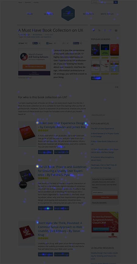
Heat maps can quickly show you if your headlines, content, or CTAs aren’t getting enough attention.
Conclusion
Landing pages are often expected to convert people effortlessly, yet the average rate is around 2%.
Of course, the problem isn’t with landing pages exactly. It’s with how they’re being built and used.
A landing page needs to have one singular goal, and every part of it needs to be designed to move viewers toward that goal.
First, make sure your landing page is consistent with your campaign, then make sure it’s optimized to be fast and mobile-friendly.
Your headings need to be attention-grabbing, and all distractions, noise, and clutter need to disappear.
Use an effective CTA and limit the amount of information you ask customers to provide.
Make sure you use great visuals and provide social proof or guarantees to reassure people it’s low risk to convert.
Remember, you can always offer an incentive or a little pressure to encourage people to click the button.
Finally, always make sure to test your pages. Use A/B testing or heat maps to see what’s working and improve what isn’t.
What tips or tricks haven’t I mentioned that helped boost your landing page conversions?
About the Author: Neil Patel is the cofounder of Neil Patel Digital.
Source: feedproxy.google.com