
Tag Archives for " conversion rate optimization "

15 Conversion Rate Optimization Tips to Boost Your Rankings
Conversion rate optimization, or CRO, is the process of optimizing your website to increase the completion of a specific action. In most cases, the desired action is an actual sale, but not always.
Desired actions could include demo sign-ups, downloading an asset from your website, trying out a new tool, or signing up for your newsletter. If it helps you grow your business, it’s a conversion—and it can be optimized.
The beauty of these conversion rate optimization tips is they work regardless of your intended conversion method.
CRO Tip 1: Add Site Search to Your Website
Up to 30 percent of visitors will use a search box if it’s offered. Unfortunately, nearly 84 percent of companies don’t optimize their on-site search to meet user expectations.
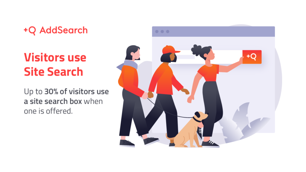
This means if your website doesn’t already include a site search, it’s time to consider adding it.
The main benefit of site search is user experience. However, data from search results can provide valuable insights into user behavior by showing you exactly what they’re searching for.
This information can help you tailor content to meet those needs or add new pages to your site to fill any gaps.
You may even be able to identify users in different parts of the funnel based on the search terms they use. This information can help you to narrow your customer’s most common questions and pain points, helping you tailor the website experience to their needs.
If you use WordPress, you can add a site search using a widget. If you use Webflow, they’ll actually let you customize it. Wix and Squarespace make it easy to add site search as well.
CRO Tip 2: Ensure Forms Are Easy to Fill Out
The average form abandonment rate is 68 percent—which means most people won’t finish filling out your form.
Website forms serve many purposes, including newsletter signup, lead magnet acquisition, and product/service inquiry.
Keep in mind: the easier a form is to fill out, the higher your expected conversion rates.
According to Hubspot research, a typical form has about 5 fields on average—and forms that are A/B tested get about 10 percent higher conversion rates.
In my experience, simple is better.
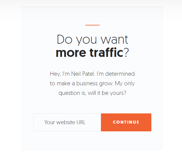
This is an example of a simple form I use on my blog. All the user needs to do is enter their website’s URL and the action is complete. It doesn’t get much simpler than that.
A few ways to ensure your forms are easy to fill out:
- make form names clear use proper HTML formatting
- use relevant sample placeholder text (I used “Your website URL” in the example above)
- have a distinct and easy-to-local submission button
CRO Tip 3: Improve your CTAs
If you want to improve conversions, CTAs are low-hanging fruit. The average CTA click-through rate is just 4.23 percent, but many factors can impact what helps your CTA convert.
For example, if you include more personalization in your CTAs, conversion rates can improve more than three times as much.
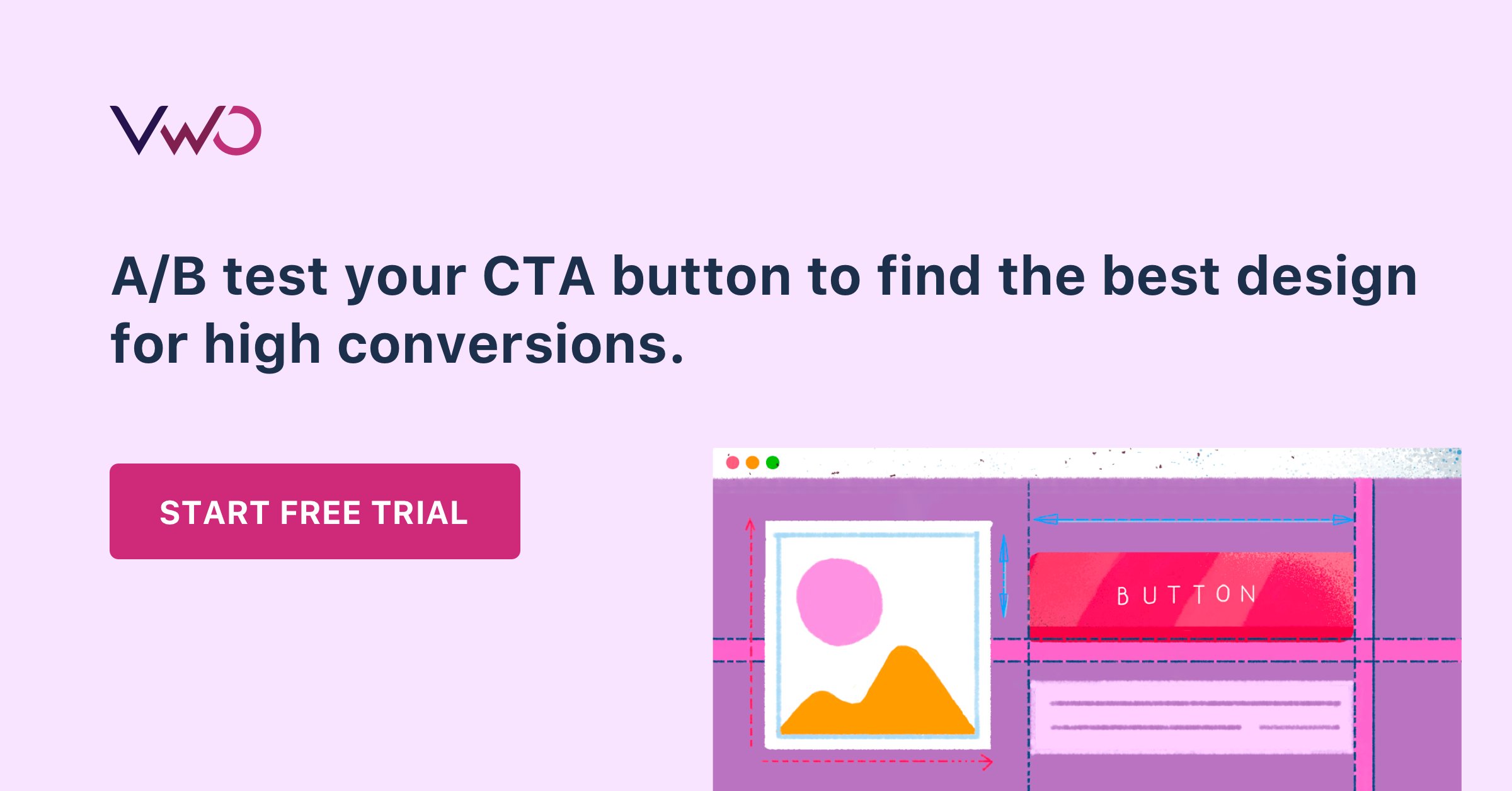
That’s why you should continually test CTAs to see what works and what needs improvement. You’d be surprised at how quickly user preference can change!
Start by testing these CTA elements:
- copy
- colors placement
- button shape
- button size page placement
Consider testing different types of CTAs as well. Here’s how CTA types convert, according to a study by Vye Agency:
- button CTAs have an average CTR of 5.31 percent
- text CTAs have an average CTR of 2.06 percent
- designed CTAs have an average CTR of 3.53 percent
When it comes to branding, consistency is key. However, using colors outside of your branding palette for CTAs is worth trying. Colors within your palette might blend in too well with the rest of your site, making them easy for website visitors to overlook.
CRO Tip 4: Run User Testing
Poor usability can kill your business. 70 percent of online businesses fail because of poor usability.
If you’re in e-commerce, your conversion rates could increase by 35 percent by just improving the design and flow of the user checkout process.
User testing is the way to get valuable data that can help you get more conversions across your website. So it’s important to get this process started as quickly as possible.
One of the most common ways to run UX testing is with heat maps, which show how users navigate your site and what interactive elements they’re clicking on.
You’ll see if they’re looking at your links, navigation bar tabs, CTAs, and so on. Some heat maps even incorporate eye-tracking software to show where your users look first.

There are several heat mapping tools on the market, but my favorites are Crazy Egg and Hotjar. If you decide to use Hotjar, the process for setting them up is very simple and straightforward.
CRO Tip 5: Add More (Better) Social Proof
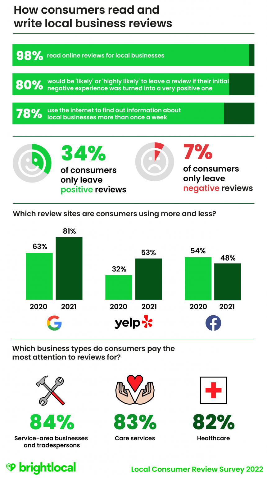
More consumers than ever read social proof. In fact, 77 percent of users say they always or regularly read online reviews before buying.
You want to leverage customer loyalty as often as you can. Why? It’s free marketing and brand exposure. Even better, reviews can drive revenue.
According to Womply, businesses with more than average reviews across earn 54 percent more in annual revenue
It is also easy to create.
Social proof is a simple and great way to leverage user-generated content for your brand. This can include positive reviews and ratings, creative social media posts about your brand shared by customers and influencers, user-submitted content like photography, and more.
The benefit of adding more social proof to your website is it shows other users that other people trust you. Trust and credibility play a big factor in getting more conversions.
To add more social proof, try:
- Send a follow-up email asking for reviews.
- Host a contest with a branded hashtag on social media.
- Include a card with a branded hashtag when shipping physical products.
If you want to do it on a larger scale, consider automated tools like HotFomo and OptinMonster.
CRO Tip 6: Add Chatbots or Live Chat
If you have a question, wouldn’t you rather get the answer fast? That’s the idea behind chatbots. No matter how great your customer service is, sometimes call queues to get long.
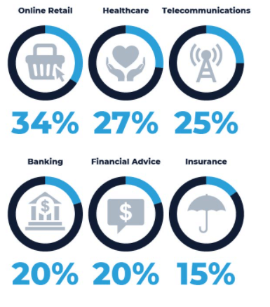
The good news? Users like chatbots. The average satisfaction rate of chatbots is 87.58 percent. They can also reduce customer service costs. One study predicts chatbots will save businesses $8 billion in customer service costs by 2022.
These tools help your brand build an instant connection with customers, making them more likely to purchase your product or service. Here are a few ways to leverage chatbots;
- answer FAQ
- qualify leads
- suggest related products
- troubleshoot common issues
- Share information about new products
- increase your email list
With so many chatbot options available, it can be challenging to find the right one. I recommend focusing on native channel integrations to narrow your search.
If you want an app with widespread integration options, consider Landbot, which offers chat features through the web, WhatsApp, Facebook Messenger, and API.
Perhaps you just need to integrate with Facebook Messenger? In that case, Chatfuel is an affordable solution.
Make sure that whatever chatbot you choose aligns with your business goals.
CRO Tip 7: Review Customer Persona and Adjust Your Messaging
A customer persona is a fictional snapshot of your ideal customer. Personas are commonly used by marketing agencies and businesses to give their target audience a human face. They can help drive leads, increase conversions, and shorten the sales cycle.
According to MarTech, creating a persona can increase email CTR by 14 percent—and conversion rates by 10 percent.

The gap between who you think your ideal customer is and your actual customers may be more significant than you think.
For example, if your personas are businesswomen in their early 30s but your customer base is primarily homemakers in their 50s, there’s going to be a massive disconnect in how you approach your target audience.
Here are six steps you can take to make sure you are targeting the right customer personas:
- Make a list of your highest value customers.
- Use a customer persona template to create a new persona.
- Start adding details from your highest value customers.
- Start with demographics like location, age, budget, education, etc.
- What channels do your highest value customers use to find you?
- Add that to your persona as “methods of communication.” Look at the content they consume—what does that tell you about their motivations?
- Add those to your template.
- Repeat the process for every product or service you offer.
It’s important to realign your customer personas with your messaging, sometimes as frequently as every two or three months. In some cases, this could mean tailoring your brand approach altogether to connect with the new target audiences working.
CRO Tip 8: Use Targeted Lead Magnets
Lead magnets are a free resource (like an ebook or guide) given away in exchange for user data. The most common lead magnets are PDFs or videos, but there are plenty of media types to use.
The best part? They work.
Fifty percent of marketers say lead magnets increase their conversion rates.
The more targeted your lead magnets, the more effective they are likely to be. The key is to get creative with your targeting.
You could even consider creating some more interactive lead magnets like quizzes or online calculators. According to LeadQuizzes, the average quiz has a lead capture rate of 31.6 percent.
The way you target your magnet will depend on your product or service. For example, if you serve a geographical area, it may make sense to target leads based on location. Other websites might target leads based on industry or how they got to the site.
Here are a few other targeting options:
- time on page
- type of content
- whether they’ve purchased before
- industry
- customer persona
- location
- time period (for example, a pop-up for an upcoming event)
Not sure how to add targeting to your lead magnet strategy? These lead magnet tools can help.
Whatever type of lead magnet you decide to create, be sure it aligns closely with your intended customer. Since the goal of lead magnets is to collect user data, you want to make sure the offer is valuable to your intended audience as well as your business.
CRO Tip 9: Use Pop-Ups Carefully
Pop-ups have an average conversion rate of 3.09 percent, which makes them ripe for CRO.
I have a love/hate relationship with pop-ups because they walk such a fine line between being beneficial (for you and your customer) and incredibly annoying. However, when done right, pop-ups can be an invaluable conversion tool.
In fact, Marketing 112 increased its conversion rates by 62 percent by adding a pop-up to its website.
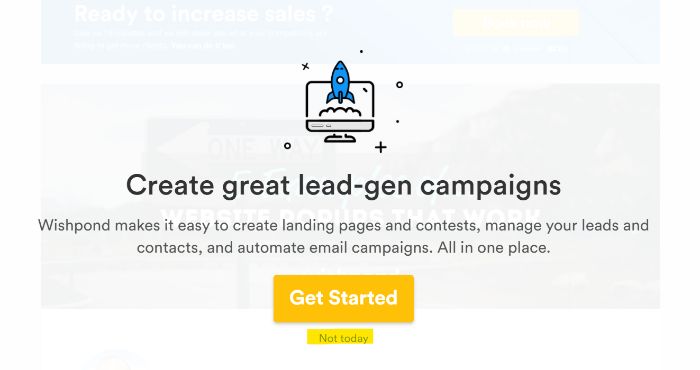
First and foremost, your pop-ups should respect universal UX rules. These include fast load times, visible exit options (like the example from Wishpond below), and platform-appropriate size.
There should also be limits as to how often users see the pop-up. For example, a user who bypasses the pop-up once shouldn’t be bombarded with it on each page of your site they navigate.
When it comes to conversions, keep the messaging short with minimal effort to take the desired action.
You can also implement A/B testing to see how users interact with different versions of the pop-up. This is important for optimizing conversion rates across the board.
CRO Tip 10: Check Your Site Speed
If your site loads slowly, all of the conversion rate optimization tips in the world won’t make a difference. In fact, website conversion rates drop by 4.2 percent for each additional second your site takes to load.
Even more surprising? More than 80 percent of sites don’t meet acceptable speeds.
Fortunately, there are plenty of free sites and tools that let you test your site speed and troubleshoot common issues.
PageSpeed Insights and Pingdom are two of the industry leaders in this domain. These tools have been around for years and offer the most in-depth testing and troubleshooting. They first look at contentful paint, time to interact, and total blocking time to calculate your overall score.
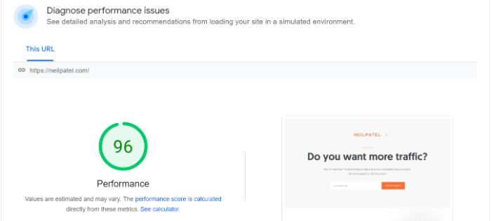
What are some of the most common issues that slow down site speed?
- render-blocking JavaScript
- poorly optimized CSS
- large media files
- bulky code
While some of these may require a database engineer or developer to resolve, you can usually start to tackle some issues (like large media files) on your own.
CRO Tip 11: Recover Lost Sales by Following up on Abandoned Carts
According to the Baymard Institute, the average cart abandonment rate is 69.82 percent. That rate is even higher on mobile where the average shopping cart abandonment rate is 85.65%.

Recovering just a fraction of those missed sales could do wonders for your conversion rate.
If the main benefit of CRO is converting users already on your site, then abandoned cart users are the cream of the crop. They actively started the transaction but didn’t complete the purchase.
There may be some obvious reasons for this, such as a discount code no longer being valid or high shipping rates. Whatever the reason, you should always aim to recover the lost sales using (almost) any means necessary.
In fact, if e-commerce sites just fixed checkout usability issues in their process, they could increase conversion rates by 35.26 percent. This translates into more than $200 billion in recovered sales from the e-commerce industry alone.
Here are some other ways you can recover abandoned carts:
- automated email flow
- son-site push notifications
- retargeting ads
- personal outreach
- automated social outreach
You don’t want to harass potential customers who have abandoned carts, but you do want them to feel wanted. Sending just one email could help you recover up to 29.9 percent of these sales.
You may want to play with your outreach timelines to find the right approach for your customer base.
CRO Tip 12: Make Sure Landing Pages Match Your Messaging
The average landing page converts just 2.35 percent of the time across all industries. If you want to be a top performer in your sector, you should be aiming for conversion rates above 10 percent.
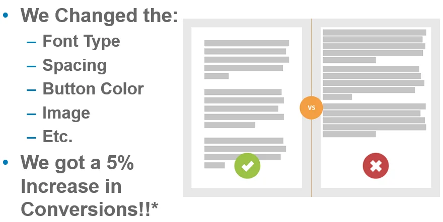
So, how do you increase your landing page conversion rate?
One way is to ensure the messaging on your landing page matches the ad or copy that brought them there in the first place. This creates a more cohesive experience, showing users that your page is the right fit for what they want. It will also help improve your PPC quality score.
Here’s how to match your messaging:
- use similar language in your landing page and ad (especially the main keywords)
- keep branding consistent (include your logo and use brand colors)
- use a clear CTA on both your ad and landing page
Just imagine how off-putting two distinct messaging styles can be to the user. Imagine if you agreed to a job interview for a tech company and found out it was a restaurant when you arrived. It would feel like a bait and switch, right?
While a difference in messaging between an ad and landing page isn’t quite as off-putting, it’s close. The differences can be jarring and steer users away.
When creating your landing pages and ad copy, make sure you have a clear focus in mind. This would start with your keyword research when you select the target phrase for the page. You can include some secondary keywords on the landing page as well if you plan to use them in your ad copy.
CRO Tip 13: Target High Intent Users
High intent users are very close to making a buying decision. According to a report by the CMO Council, 87 percent of B2B buyers say that online content has a major or moderate impact on the vendor they choose.
That means there’s an extremely high opportunity to improve your content to convert these users.
How can you target high-intent users?
As previously mentioned, looking at the internal search terms users interact with on your site is one way to get an idea of content that works. Someone at the bottom of the funnel might be trying to distinguish between different options, so they’ll be looking more closely at shipping timeframes and return policies.
Here are a few other strategies:

- Add high-intent keywords to your ads and landing pages.
- Use the information from your internal search to gauge what keywords are and how your customer base interacts with them.
- Build content that targets customer pain points.
- You can often identify these pain points with SERP analysis of high-intent keywords.
- Pay attention to intent data.
- Contact users who visit your pricing page, return to your site several times, or book a demo but don’t follow up.
High intent users are ready to convert, so don’t leave them hanging.
CRO Tip 14: Optimize Your Content
If your content isn’t performing well, it’s time to re-evaluate and optimize it. The first thing to check is title tags.
According to Backlinko’s research of more than 11 million Google search results, sites that include the main keyword in their title tag are far more likely to rank higher.
Content optimization looks at a number of factors including:
- Make sure the keyword is used several times content length variance (add or remove content)
- check image optimization, such as size and alt tags
- add stats and new research check meta and SEO titles
- add keywords to more headings
- add a frequently asked questions section
- make sure you aren’t cannibalizing traffic from other content on your site
For time and efficiency, you don’t have to do all of the above. Instead, research the top 10 results on Google for your target keyword and see how they are structuring their content.
Their approach is clearly having an impact on their ranking and can provide a path for you to improve your search engine rankings.
CRO Tip 15: Before You Make Changes, See What Works Now
It’s easy to see all of the things that need to be improved, but what about the things that are working?
There are likely some areas of your website that are already working. For those, look for patterns in what the data is telling you, determine what the essential parts that led to the results might be, and come up with an approach to replicate this across your site.
If you aren’t sure how to approach this yourself, you can hire a professional to audit conversions across your website and highlight what is working well. This process alone could uncover a lot of great things you’ve been doing but probably don’t realize.
The last thing you want to do is a major content overhaul that loses conversions from pages or strategies that are already working.
Frequently Asked Questions About Conversion Rate Optimization Tips
What is conversion rate optimization?
Conversion rate optimization (CRO) is the process of increasing the conversion percentage for a website or mobile application. The aim is to increase the number of people taking the desired action in relation to the number of visits by improving customer experience and testing interactive elements.
What is the most effective CRO strategy?
There’s no one way to approach conversion rate optimization. However, a good CRO strategy will focus on user experience optimization, customer journey analysis, and website performance.
Is CRO different for ecommerce?
The benefits of CRO are the same whether they’re being implemented for an ecommerce site or not. However, the processes may differ slightly. When it comes to ecommerce, the conversion funnel has a larger part to play than it might on a non-ecommerce site.
How can conversion optimization affect your return on investment?
In simplest terms, CRO aims to make the most of the site traffic you already have. By increasing the conversion of your existing traffic, you have the potential to lower your customer acquisition costs.
Conclusion: Conversion Rate Optimization Tips
When you consider the fact that customer acquisition is more than half of the battle, it makes sense to focus heavily on conversion rate optimization.
After all, converting more of your existing website traffic could drastically reduce customer acquisition costs.
You’ll notice most CRO tips focus on improving the user experience and enhancing the customer journey. That’s because they tend to have the most significant impact. However, you don’t have to implement all of these CRO strategies immediately. Think about which will have the most significant impact and test those first.
Which of the CRO tips above do you think will have the most impact on your conversion rate?
Source: neilpatel.com

62.41% of All Google Searches Generate 0 Clicks
According to data that we pulled from Ubersuggest, 62.41% of all searches globally get 0 clicks. Literally 0 clicks. But here’s where it gets interesting…

SEO is all about ranking high on Google.
The higher your rank the more clicks you get to your website.
But what if Google starts sending fewer clicks to websites over time, what should you do?
Well, just look at the graph below. It breaks down the last 4 years of click on Google.
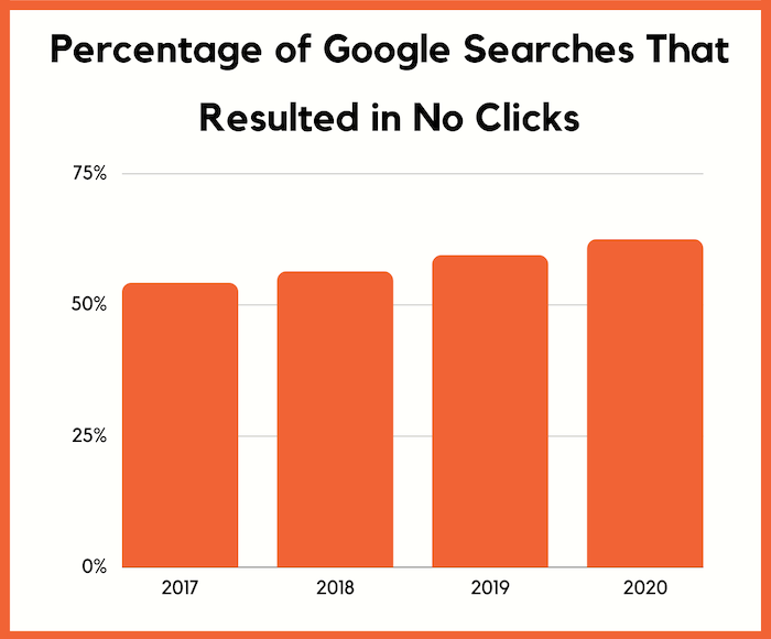
According to data that we pulled from Ubersuggest, 62.41% of all searches globally get 0 clicks.
Literally 0 clicks.
But here’s where it gets interesting…
Expect fewer clicks over time
Over time the number of people that clicked on no result has increased.
It went from 54.11% in 2017 to 62.41% in 2020.
Now keep in mind we don’t have data on every single Google search, as only Google would have that.
But we buy data from a few different providers and we have data on hundreds of millions of searches each year.
So directionally the data is accurate.
Here’s where it gets interesting.
According to Comscore, 50% of the searches are voice searches.
The data providers we get our Ubersuggest data from don’t have access to voice search data yet.
So, you can assume the number of “no clicks” is actually greater than what’s presented above.
Nonetheless, you should expect it to get worse over time as the graph is showing.
Now, why is this?
Well, it’s because Google is answering your questions when you search.
For example, if you type in, “Las Vegas weather”, you’ll see a listing like this:
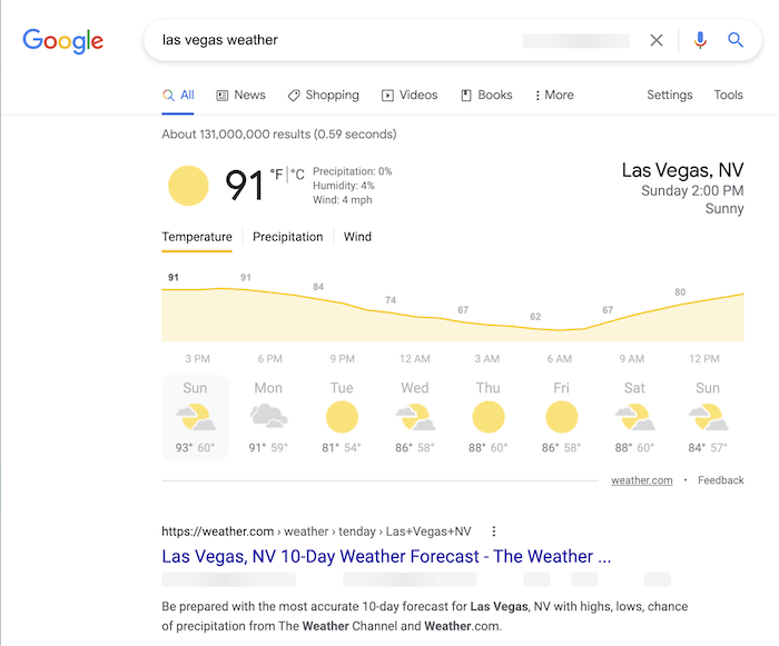
Google’s pulling the data from weather.com, but there really isn’t a need for you to click on over to weather.com.
And as a user, this provides me with a better user experience, so I like it. But if I was a website like weather.com I probably wouldn’t as it decreases my traffic, which decreases my ad revenue.
Expect Google to continually do this more over time as it tends to create a better user experience.
Is it fair that Google does this?
Before I dive more into the data and give you ways to increase your SEO traffic, even though Google is taking away some of your clicks… I want you to keep this in mind.
A lot of marketers and business owners don’t like this, and they complain that what Google is doing isn’t fair.
But hey, it’s up to you if you want Google to even crawl your site.
If you don’t like it, you can always block Google from your site.
I personally don’t have an issue.
Just imagine life with Google, it would suck.
And as a searcher, I don’t want to search for the weather and have to click on a few links to get my answer, I just want to know the weather right now in the least number of clicks.
I recommend that you focus on what you can control versus worries about what you can’t, such as Google’s future plans or random algorithm updates.
So, what can you do?
I want you to look at this as two separate problems.
The first is how can you get more clicks when people are clicking less.
And the second is how can you get more conversions from the clicks you are getting to make up for the loss in traffic.
Typically, with clicks, the main thing that impacts it is your meta tags.
You know your title and meta description.
Here’s what I am talking about… when you perform a search on Google, this is what it looks like:
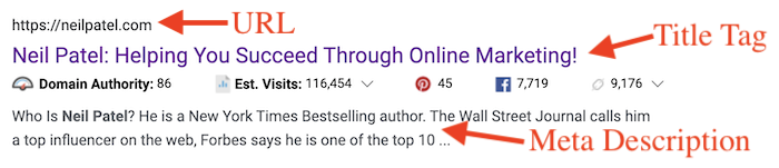
Here are 10 ways to adjust them to help you get more clicks (some of the data came from Clickflow, others from Ubersuggest):
- Questions have a 14.1% higher CTR – For example, your title tag could be, “What is SEO?”.
- 8.6% higher CTRs for 15 to 40 characters title tags – I would recommend that you keep yours closer to the 40 character mark so you can include more keywords.
- 45% increase in CTR when the exact query is in URL – make sure your main keyword is in your URL. It doesn’t have to be in your domain name, just the URL. So if I was trying to rank for the term “SEO” my URL maybe https://neilpatel.com/what-is-seo/.
- Power words increase CTR by 13.9% – some power words examples are: effortless, incredible, best, or amazing.
- 7.3% higher CTR for titles that contained emotions versus ones that didn’t have emotion – an example of an emotional headline is, “Learn how to stand up to your boss (without getting fired)”. You can find more examples of emotional headlines here.
- 5.8% higher CTR if you have a meta description – if you don’t manually create one for each page, Google will just pull one for you.
- Titles with years generate 4.9% higher CTR – a great example of this is “how to start a blog in 2021”. You would want to update year every year to make sure you don’t have an old date in your title tag or it can hurt your clicks.
- Evoking curiosity increased CTR by 5.9% – my favorite example of this is, “The 7 Benefits of Green Tea (#6 Will Shock You)”.
- Titles that resembled education had 10.4% more clicks – think how-to titles. People love learning how to do things step-by-step.
- You’re more likely to be successful if you look at the paid ads – Google uses the quality score to determine where ads should be placed. If an ad gets no clicks Google doesn’t make money. By look at the paid ads, you can get ideas of copy that is appealing for any keyword you are trying to rank for.
Don’t forget to optimize for conversions
As I mentioned above, the second thing you need to optimize for is conversions.
When you do get clicks, you’ll want to drive as many sales as possible.
Here are some articles I wrote that you should read.
They will teach you how to boost your conversions.
- 19 A/B Tests You Should Run on Your Website
- How to Craft and Measure Profitable Funnel Conversions from Scratch
- How to Use the Psychology of Color to Increase Website Conversions
- How to Leverage Storytelling to Increase Your Conversions
- How to Create an Engaging Value Proposition
- 12 Best Landing Page Examples
- How to Increase Conversions by Analyzing Bounce Rate Analytics
- 9 Steps to Creating a Landing Page That Reads Your Prospects’ Minds
Don’t forget about mobile
When optimizing your site, don’t just think about the desktop version of your site either.
It’s even more important to go through this process for your mobile traffic.
According to our Ubersuggest data, 61% of all searches are mobile.
And based on our data providers, the no-click data for mobile is even worse.
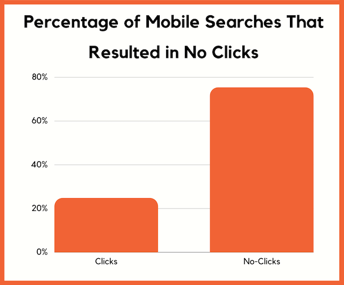
Typically, when it comes to optimizing your meta tags, you don’t have to worry as much as you are going to use the same meta tags for both the mobile and desktop versions of your site as most sites are responsive.
But when it comes to conversion optimization, you’ll want to create a different mobile experience, which you can easily do through a responsive design.
Conclusion
Don’t focus on the fact that Google is driving fewer clicks to websites.
Focus on what you can control and make the best out of the situation.
If I were you, I would do 3 things.
- Optimize your meta tags as I described above.
- Optimize your conversion rate so you can generate more revenue.
- Start creating question-based content because it drives 34.17% of the SEO traffic to popular blogs.
So what do you think of the data I shared above?
Source: feedproxy.google.com

The 8 Best CRO Companies of 2020
SEO is the main source of traffic for your website but without a high-conversion rate optimization (CRO), you might as well retire.

Imagine this…
Your website is ranked for every keyword you can think of.
You are getting enormous levels of organic traffic…
Full of enthusiasm, you rush to your sales manager to check the sales status.
And your jaw drops seeing you’ve got little to none sales from all of that traffic.
If that’s your current situation, then you need to focus on Conversion Rate Optimization [CRO].
SEO is the main source of traffic for your website but without a high-converting funnel, you might as well retire.
No, I’m serious. If ýou can’t convert your traffic, there’s literally no point in getting it.
You have to make consistent sales if you want to scale your business fast.
And all of that depends on your ability to convert your unaware traffic into active customers craving for your next product launch.
Knowing that today we’ll dive into:
The 8 Top CRO Companies in the World
#1 Neil Patel Digital — Best For SEO + CRO
You might think that throwing our own company on this list is a little unfair…
But I dare you to find a company that can bring results even close to the ones we generate weekly.
I am ready to make this bet because I know that Neil Patel Digital is the world’s best choice when it comes to Search Engine Optimization combined with Conversion Rate Optimization.
There’s a reason why our co-founder Neil Patel’s marketing content is ranked so high on google for any term you can think of.
Even for the most competitive keywords, such as “SEO Strategies”, you’ll find 2 of his posts ranking TOP 5 on the first page.
That’s all because of our ability to constantly optimize and improve our methods according to the current trends in the marketplace.
So if you’re looking for the combination of highly-ranked content that will bring you much more organic traffic…
Plus the proven conversion optimization strategies that are going to convert your traffic into actual customers…
You should check out the services of Neil Patel Digital.
#2 Trinity — Best For E-commerce Conversions
Founded in 2006, Trinity has been a constantly growing and result-generating CRO Agency in the E-commerce niche.
Their minimum project size is $5000. For that amount, you can look forward to a big team entirely focused on your results.
Throughout their 14 years of experience in the industry, they’ve gotten countless testimonials from previous customers praising them for being the most trustworthy CRO Company in the world.
So if you’re in the E-commerce space, you should take a look at Trinity’s options and choose the one that fits your situation best.
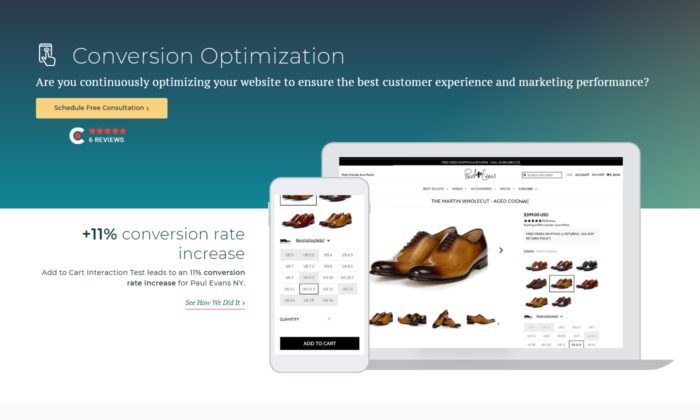
#3 WebMechanix — Best For All-In-One Services
Sometimes CRO just isn’t enough.
If you find yourself in a situation that you need to optimize every little piece of your marketing strategy, then you should make time to check out WebMechanix.
Founded in 2009, they’ve been constantly expanding their team and services.
Their minimum projects start from $10,000.
At this stage, they’re well known for providing top-notch Pay Per Click, Social Media Management, Conversion Rate Optimization, SEO, UH/UI Design, Web Development services.
If you’re looking for the solution to all of your marketing and conversion rate problems, then you can trust WebMechanix.
#4 SiteTuners — Best For Small to Medium Businesses
If you’re in the early stages of your business development, you’ll need a CRO company that is solely focused on helping people in your situation.
With minimum projects starting from $1000, SiteTuners is one of the most well-known CRO companies in the world.
Founded in the mind-blowing 2002 they’ve helped 1500+ clients generate 1 billion dollars. Yes, that’s a B!
They focus on helping every business they can.
No matter if you’re a newly formed start-up or a proven leader in your industry, they will take their time to help YOU achieve your goals.
Their main services include CRO, A/B testing, Consulting, Conversion Audits, Website Audit, Business Strategy, Funnel Optimization, Cart Abandonment Strategies.
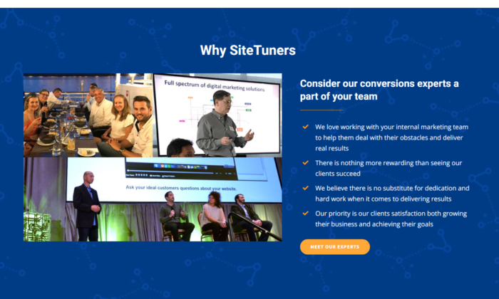
#5 Invesp — Best For Dedicated CRO
I can say, hands down, this is the most reliable CRO Company in the world.
Focused entirely on Conversion Rate Optimization, Invesp is the team that’s going to help you achieve any conversion dreams you have.
But be prepared, their 100% CRO dedication comes with a price.
With minimum projects starting at $10,000, they are one of the little CRO companies that work for $150 – $199 / hour.
And with these premium prices, you can expect premium results for your business.
They’ve got a big team of CRO experts working every hour of the day completing every project on time.
So if you’ve got a really big business on your hands, this company will easily increase your monthly revenue in no time.
#6 Inflow — Affordable Multi-Service E-commerce Option
Inflow is a widely known Agency helping E-commerce businesses expand all of their marketing efforts.
Their Unique Selling Proposition is that you don’t communicate with project managers.
You have direct access to the industry veterans you’re looking for.
That gives you more control for rapid, fast-paced decisions.
They offer a lot of highly-profitable services, all of which very affordable.
Mostly, their services shine when it comes to mid-tier businesses.
Of course, they work both with small and big businesses, but their proven track record comes mainly from businesses that are already stable and running profitably.
Their services include Search Engine Optimization, Conversion Rate Optimization, Pay Per Click, Digital Strategy, and Social Media Marketing.
Their project rates start at $1000 and just like Trinity, they mainly focus on helping E-commerce stores optimize their conversions.
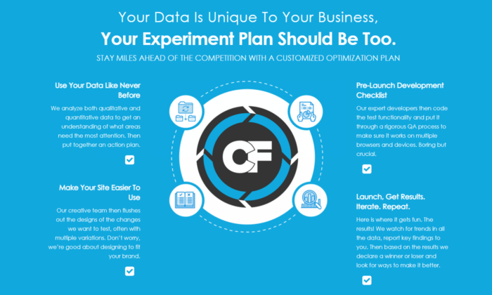
#7 Conversion Fanatics — Best For CRO + SMM
Looking for a company that can guarantee great Conversion Rate Optimization [CRO], while also growing your Social Media Marketing?
Then your best choice is signing with Conversion Fanatics.
They are a famous CRO company helping businesses increase their conversions and social media presence since 2014.
With minimum projects starting from $10,000, Conversion Fanatics are your best choice if you’re serious about growing your Social Media.
And nowadays people are mainly on social media.
That’s why it can be extremely powerful to have consistently growing media channels that lead to conversion-optimized sales pages built by the same people that got you the social media traffic in the first place.
So if you’re serious about getting your brand out there while converting all of your new followers, Conversion Fanatics is the choice for you.
#8 Linear Design — Best For PPC + CRO
Linear Design is another great choice if you’re looking for a combination of 2 services.
This time we’ve got Pay Per Click [PPC] and Conversion Rate Optimization [CRO].
This is a powerful combination because that way they are responsible both for your advertising and on-page conversions.
Having access to all the advertising data helps them optimize and get the best conversions possible.
Many businesses hire a FB ad manager and a copywriter for the landing page.
But the secret to creating a high-converting landing page is having a tight connection between your ads and the page.
And if you split these 2 services apart, you’re going to experience troubles.
It’s best if they are handled simultaneously and Linear Design is dedicated to getting the best results for both of them.
3 Characteristics That Make a Great CRO Company
After looking at this detailed list of the best CRO companies of 2020, you’re probably wondering how to choose the best one of them all.
And that’s a valid question given that all of them have their strong and weak sides.
The right answer 100% depends on what YOU need from a CRO Company.
Is it CRO only… Is it CRO and one more service to go with it… Or maybe 5 separate services all at once?
You can either choose one of our top choices or go look on your own.
But in both cases, you need to know what to look for in a great CRO company.
So here are the 3 Characteristics that make a CRO company great:
Reliable, Fast Communication
You are bound to face roadblocks while scaling your business.
So if you’re going to be paying for a company to operate a portion of your business…
You need them to be good communicators.
You’re not speaking with a freelancer that takes days off whenever he wants.
Here you’re playing with the big dogs.
These are professional multi-team companies that are here to support you and your business throughout the whole journey.
So before choosing the company that’s going to help YOU, make sure their communication is 100% on point.
Dedicated Services
Look now. I know it might be tempting to outsource your whole funnel to a result-oriented company with a proven track record.
But the sad reality is that no one cares about your business as much as you do.
So when hiring the CRO company that’s going to help you achieve all your goals, please choose someone that is dedicated mainly to the services you need.
And don’t get me wrong here.
A CRO company can offer up to 10 different services and still bring fascinating results for all of them.
But if you’re going to hire a company to manage 3-10 different parts of your business…
You’ve got to make sure they have a separate team operating each part of the project.
If the company has 2-9 employees and promises to bring results for 6 different services, then you probably want to stay away until they get a bigger team.
If you’re looking specifically for Conversion Rate Optimization, the best option is to hire a company that specializes only in that area.
The same goes for if you need 3 services. Hire a company that specializes exactly in these 3 services.
This is the easiest way to sleep nerveless at night.
Price Range
 Businesswoman holding piggy bank drawing the front of a blackboard
I know this one is obvious… But many people make a great mistake here.
They see the best companies that charge $10-20k+ and think that hiring them automatically means that the profits to come will pay for the next month.
But that’s not reality. I’m not saying it’s impossible to happen.
It all depends on the company you’re running, the stage you’re on right now, and the CRO opportunities you’ve been missing out on.
But the chances of this happening in the first month are close to none.
Instead what you should do is focus on the long-term growth of your conversions and sales.
If you can’t pay 3 months of CRO services upfront, then you should look for a cheaper alternative.
Keep in mind, that you can always upgrade to more premium plans or companies that give out more possibilities in the future.
But first, solidify that you get real results and you can pay for the services you need.
What To Expect From a Great CRO Company
Even after reading this whole post, the decision of choosing the right CRO Company is 100% up to you.
I shared with you the top companies and what they’re best for.
And still, there’s a slim chance that you make a mistake when choosing your CRO company.
That’s nothing you should fear of course. After all…
Mistakes are an opportunity to learn and grow!
But in case you’re not sure whether you made the right choice today, there’s a couple of things you can look out for while working with your CRO Company to make sure they perform optimally.
As mentioned previously, great communication is a MUST.
But there’s more than that…
At the end of the day, you’re not looking for a friend, you’re looking for RESULTS!
So here’s a couple more things you need to look for while working with a CRO company:
- quick turnaround
- meeting deadlines
- weekly/monthly reports
- constant strategy optimization
- 100% straight forward
You need people that work fast.
And keep in mind, that if they miss deadlines occasionally, that means there are major holes in their business operations.
This is a big red flag. You must be on the lookout for quality drops and more problems.
The easiest way to avoid that is to call them out.
If they miss a deadline 1-2 times, you go ahead and tell them that the third time is going to be a contact breaker.
That way they’ll make sure you get your projects done in time.
If they keep missing deadlines even after the first notice, you should start looking for a new company.
You also need weekly/monthly reports for what’s going on inside your business.
Everything that’s been done, optimized, and the results that go with it.
Marketing strategies are never constant.
If you want to scale optimally, you need to jump on new trends and also level-up your strategy according to everything that’s happening around you.
And last but NOT least, they should always be 100% straight forward with you.
If you feel like they’re informing you only on the things that work well, while swiping the bad news under the rug, you should watch out.
They should always be honest about everything that works and especially for the stuff that doesn’t.
To sum up:
If you’re getting good traffic but no conversions to go with it, you most definitely need to hire a Conversion Rate Optimization [CRO] Company to help you convert your passive visitors into active, paying customers.
Treat your choice today as if your money and future livelihood depend on it… Because they do! You need an absolute professional that can bring you real results!
Let me know in the comments, which company would you choose? Also, have you had any previous experience with one of our winners?
The post The 8 Best CRO Companies of 2020 appeared first on Neil Patel.
Source: feedproxy.google.com

Why Good Site Architecture Is The Only CRO You Need
When you hear the words “site architecture,” the first thing that comes to mind is probably SEO. It doesn’t take much digging into SEO best practice to learn that Google loves a site with clearly defined architecture that’s easy to crawl and index. But if you stopped your site architecture planning with just your SEO, then you’ve missed out on the greater picture.
Site architecture isn’t just an effort to game search engines into ranking your site higher.
It does help with SEO, but it’s so much more than that.
Ultimately, your site architecture should be a strategic effort that allows your organic or paid visitors to navigate easily and use your site for its intended purpose.
That means that site architecture is the older brother of conversion rate optimization.
So in this post, I want to show you exactly how site architecture simultaneously supersedes and enables traditional conversion rate optimization efforts.
And to start things off, I want to dig a little deeper into why so many conversion rate optimization efforts fail.
Why conversion rate optimization doesn’t always work
When dialing in your conversion rate optimization, it’s easy to want to focus on the more traditional efforts.
Typical conversion rate optimization efforts require brands to set up competing versions of the same page in order to see how they can improve them.
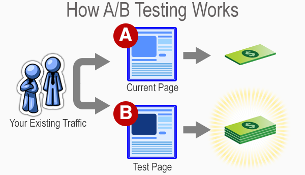
It’s like a battle royale for website pages.
After a week or two of waiting and measuring, the best-performing page wins.
One of them stays up, while the others are discarded for all eternity.
From there, more experimentation occurs based on the winning page’s performance to see if anything else can be improved.
Sometimes, brands will even get brave and conduct some multivariate tests to see if changing multiple elements can yield improvement.
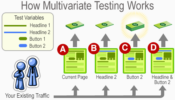
Much like a traditional A/B test, the results hinge on a last-man-standing approach.
Brands can be the loser, and the winner stays up as the subject of more experimentation.
All of this is an ongoing effort to see how you can improve conversions over time.
Many frequent blogs about this practice, which even has its own career field in the marketing industry.
But these types of tests aren’t always the most dependable for small brands that need to optimize as efficiently as possible.
And even some large businesses fall prey to common A/B testing mistakes.
For example, elements like sample size can drastically skew the results of conversion rate testing.

Simply put, if you’re not getting enough traffic, then you’ll be making changes and concluding off of insufficient amounts of data.
That means you could be making the wrong moves and ultimately hurting your brand’s performance.
Or you could also be testing something silly, like colors on your website.
To put it in ConversionXL’s Ott Niggulis’ words:
“There is no universal best color. What works on one site, doesn’t necessarily work on another.”
And that’s part of the point as well.
Many conversion rate optimization trends rise on the backs of a brand or two saying they saw good results from a particular experiment.
Then everyone does it, and confusion results when improvement doesn’t follow.
And then to make matters worse, many brands often don’t allow a proper amount of time to see if their results end up sticking.
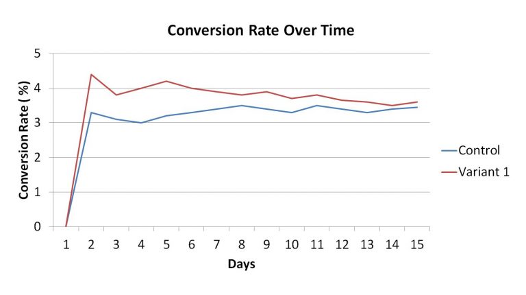
If your variable regresses back to your control’s average, then there’s a good chance that dropping your control could be a bad idea.
Many brands will prematurely make a decision in the first few days, which ultimately hurts them in the long run.
People call this the small win mentality. It ultimately leads to poor optimization and potentially undermines your results.
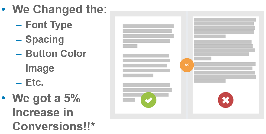
So with all of the potential pitfalls of traditional conversion rate optimization, can site architecture create a more foolproof way to ensure that your website sees plenty of conversions?
To answer that, I want to break down some of the basics of site architecture and show you how it correlates to your conversion rate optimization.
How site architecture creates conversions
Your site’s architecture focuses on building a platform that is easier for your users to navigate.
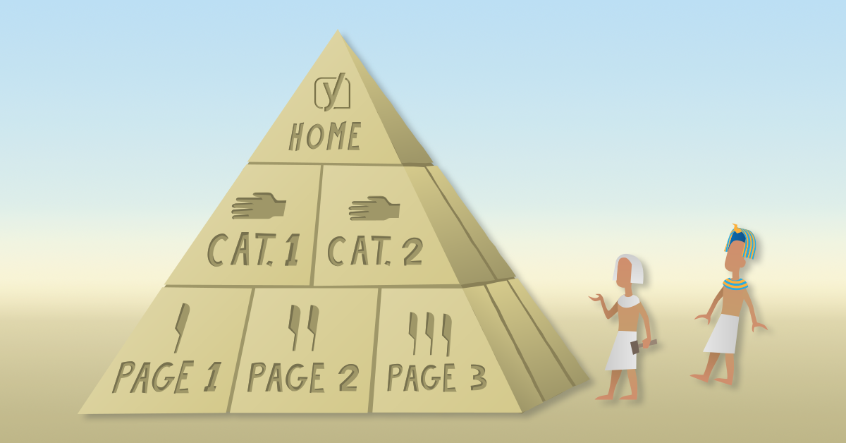
When you look into what site architecture actually is, you’ll typically see a graph that offers a genealogy-like depiction of how pages on your site interact.
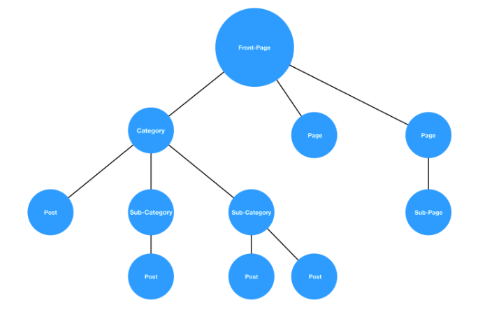
While there’s a good chance no two sites will be exactly alike, this hierarchy style is a pretty standard example.
You start from a homepage and then navigate through a series of categories and subcategories until you’ve found what you’re looking for.
If this process is fluid, as in the graph above, then your users will have no issues.
But if the architecture is muddled, and it’s hard to find a page that should fall under a natural category, then it’s increasingly more likely that your users will leave.
In other words, the idea is to create a fluid user experience that ultimately leads to trackable and accurate conversion testing.

If you implement this correctly, you’ll have a site that’s easier to improve on in the long run.
But does site architecture have a genuinely positive effect on your conversions?
A brand called Voicer reported a 75% increase in conversions by correcting some “small” user experience flaws in their site.
If they can see that kind of improvement from small changes, imagine what would happen on a site that has significant user experience problems.
And yet another brand reported a 112% increase in revenue by improving the usability of their site.
So, good site architecture that leads to a good user experience can clearly act as a solid basis for conversion rate optimization.
But breaking down the user experience of your website isn’t a simple process.
It requires a great deal of data gathering and analyzing to get to a point where you can indeed create a site architecture that works well for conversions.
Thankfully, there’s a method called the honeycomb model that shows you how exactly user experience can be broken down to help optimize your conversion rates.
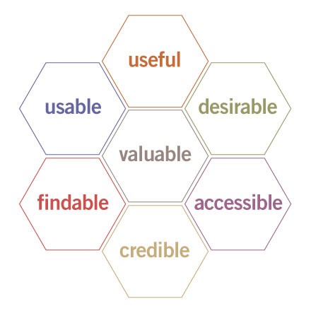
This methodology provides a simple framework that helps brands create websites with the following characteristics:
- Useful: Serve the purpose for which they created it.
- Usability: Simple and easy to use.
- Accessible: Anyone can use it.
- Desirable: Provides positive emotion and is pleasant to use.
- Findable: Navigation is intuitive, and solutions are easy to find.
- Credible: Conveys in a believable or trustworthy manner.
- Valuable: Delivers on a promised value.
If you can fulfill all of the requirements in the honeycomb model, then you optimize your sales funnel paths naturally for conversions.
So for the rest of the article, I want to show you some ways that you draw a direct line between user experience, site architecture, and conversion rate optimization.
Site Architecture for Lead Generation
You’ll see without a doubt that site architecture is a viable path to increase your lead generation.
Reason #1: It gives your site utility
The first steps of the honeycomb model rely on creating a website that is useful and usable.
This addresses the utility and the function of your site in a few ideas that are easy to understand.
But just because they’re easy to understand doesn’t mean they’re easy to implement.
When building out your site’s architecture, you need to create an experience that helps your user find what they came for.
This natural flow is the first place to start when addressing the usability and usefulness of your website.
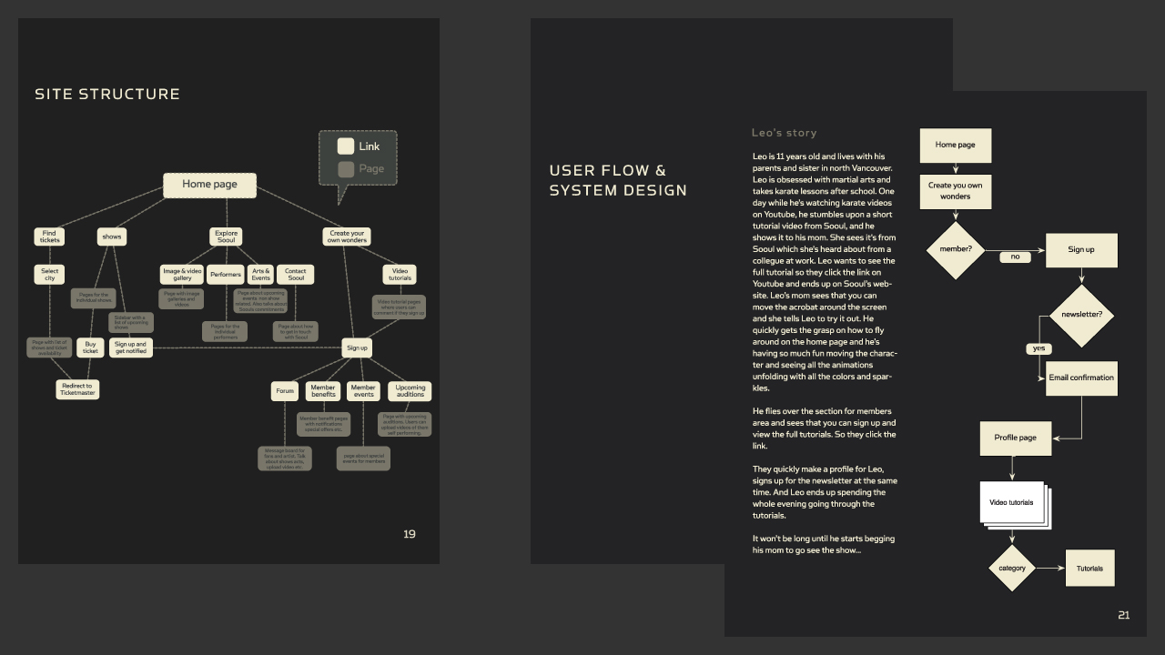
This ultimately determines how people interact with your website.
And how they interact with your website will, in turn, determine how many conversions you get in the long run.
Think of it in terms of an example involving a site that sells power tools.
On a well-designed website, this would be a logical flow of thought:
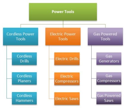
Users can navigate based on the type of tool that they want to find. The site then presents individual products according to whether they are cordless, electric, or gas powered.
Now imagine if you were to switch some of the products around.
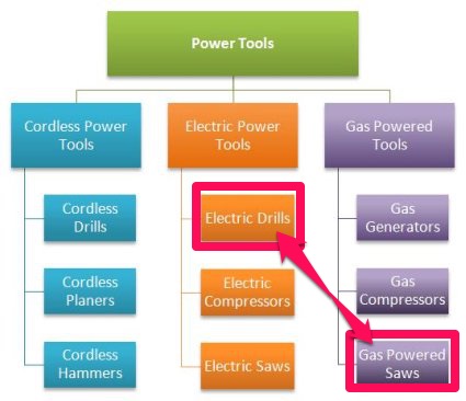
In this case, if you were trying to find a gas-powered saw, you would naturally look under the gas-powered tools.
If you misplace this in your site’s architecture, a user might navigate to the logical page but still be unable to find a product you actually have.
That means no matter how much you optimize the page, your organic traffic will struggle to navigate your site and may ultimately leave.
So when linking site architecture to conversion rates, the first place most brands start is with a mockup of what they want their users to achieve.
The purpose is to base the entire website design process on actual data and user behavior.
In the words of Paypal UX designer Larry Sawyer:
“They say a picture is worth a thousand words, but a mock-up is worth even more than that.”
So this design process typically follows a flow of testing, analysis, definition, ideating, prototyping, and then validating.
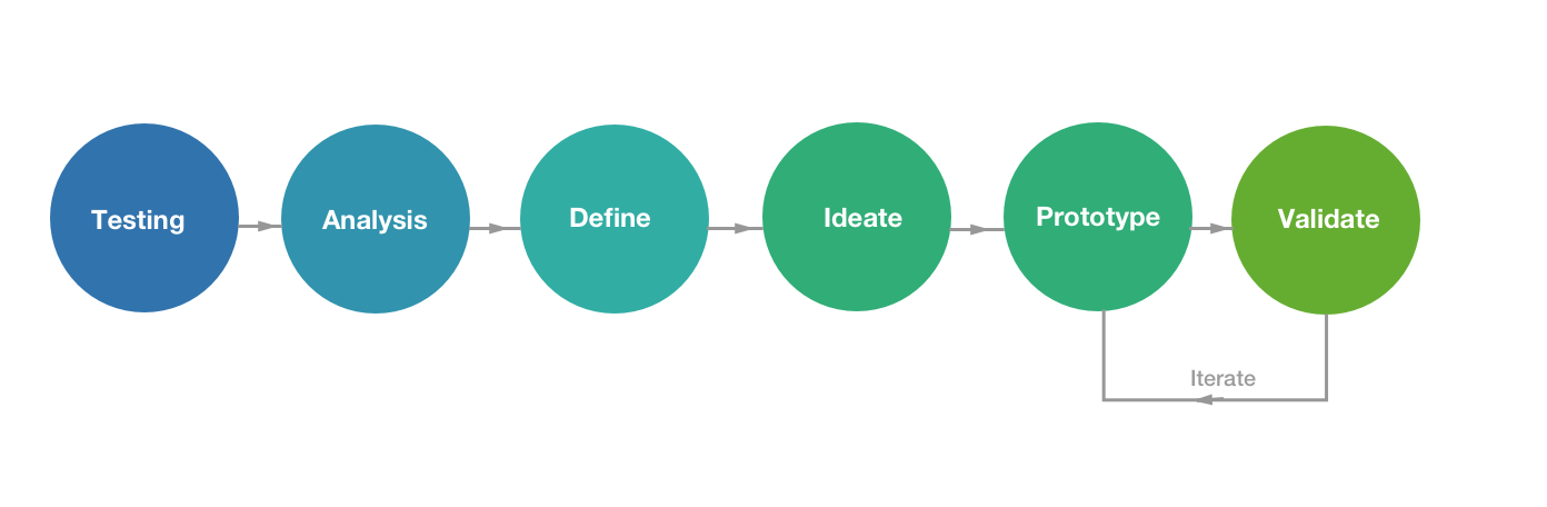
If you follow this particular model, you’ll be able to create a website that is usable by anyone in your audience and thus inherently useful to all parties.
So your initial goal is to optimize your site according to what visitors are doing.
You then take that information and analyze their behavior to see what stands out.
How they use your site defines what is essential, which further provides you the ideas you need to test if you want to improve your conversions.
From this information, you create a prototype of your website, and then validate your findings with additional testing.
If the prototype is invalid, you rinse and repeat until your site is in complete working order.
Keep in mind that this style of UX design does typically involve more design than just site architecture.
But for our purposes, we want to focus on the bigger picture.
So when finally creating your site’s architecture mockup, many brands start with a comprehensive markup of how the elements of every page contribute to the user experience.
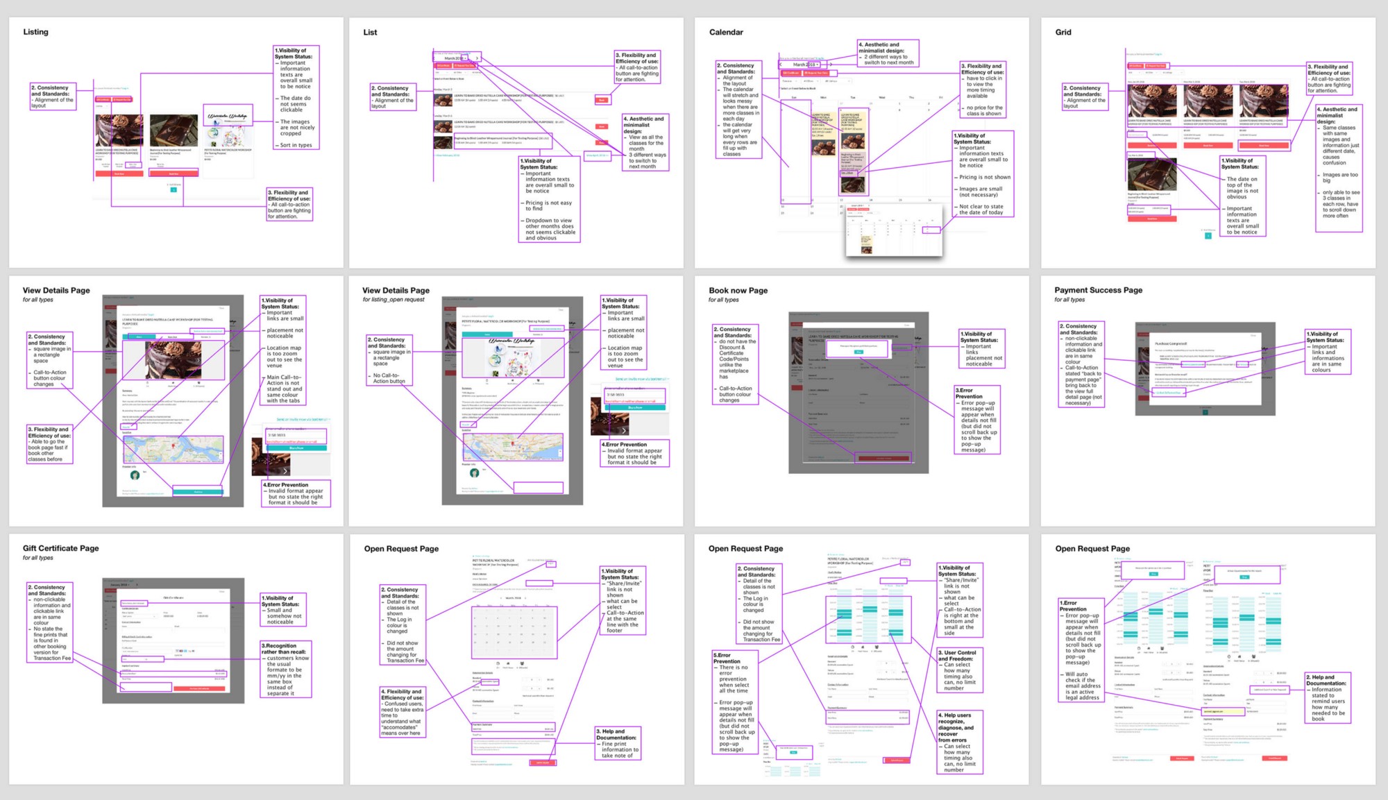
As this professional breakdown demonstrates, you can draw out and improve every aspect of your site.
From this exercise, you can create a basic outline of what your users should achieve on every page of your site.
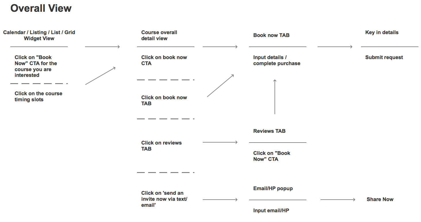
The purpose here is to take a vast amount of data from your original design and then strip it away until only a series of user actions remain.
This, in turn, dictates your site’s architecture as it is a direct representation of how you want your user to use your site.
From this simplified design, one then typically creates a more comprehensive wireframe mockup.
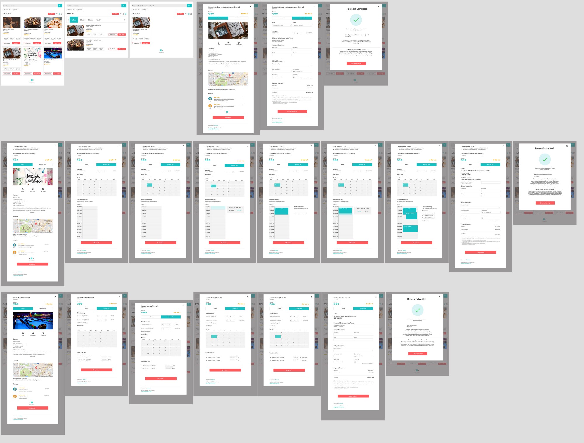
Once you’ve completed the wireframe, you only need to finalize your imagery, copy, and calls to action.
You can then test your new prototype site to see if your user experience is positively affected.
If this simplifies the actions your users take, then you truly aligned your site’s architecture with the intent of your audience, thus fulfilling the usefulness and usability criteria.
This process can be tedious, but it’s a great illustration of how data-backed and conversion-oriented your site architecture really is.
If you can successfully do this with your site, you’ll be one step closer to creating a better overall conversion funnel that will help your brand for years to come.
Reason #2: It creates positive momentum
As we move deeper into the user experience and site architecture connection, the next layer according to the honeycomb model hinges on creating positive momentum.
That means according to the honeycomb model it needs to be desirable, accessible, and findable.
So once you’ve established a flow and created a site that’s usable on any device, the next step is to move beyond and create a pleasant experience.
It may surprise you to learn that one in three users will leave a site because they can’t find a product.
That means your site architecture can hurt conversions in a very direct way.
So your goal at this point should be to create a site that’s both easy to navigate and that builds natural forward momentum.
If you strive to emphasize the architecture of your site with compelling storytelling, the natural result will be that more users complete actions on your site.
That means finding a way to create a site whose architecture naturally lends itself to being informative, interactive, and even at times entertaining.
Consider the example of the site My Grandmother’s Lingo.

This award-winning website helps users learn new words from one of the oldest language in the world.
The creators designed the website for use and utility but even took that effort a step further by making it compelling and engaging.
The tantalizing idea of learning something both old and new hooks the user, and then sends them on a 10-minute journey where they learn something.
In the end, the primary goal is to help spread awareness of these ancient languages and provide a platform for future preservation.
How do they achieve this? Through vivid storytelling and clear site architecture that’s geared toward positive momentum.
But momentum isn’t just about storytelling.
It also relies on where you position yourself, like on mobile.
More than ever, users are browsing with a mobile device.
That means that the architecture of your site needs to be conducive to both a desktop user and a mobile user.
If you only focus on one or the other, you are missing a significant portion of your potential audience, and thus you are losing conversions.
And if someone comes to your mobile site only to find it isn’t optimized, then all positive momentum is gone.
But momentum has to start even further back with your SEO.
And site architecture plays a critical role in bringing organic traffic to your site and providing forward momentum.
In one study, a brand was able to increase their site’s organic traffic from 800 visits per month to over 3,600 per month by focusing on the user experience their website gave.
That’s a growth of 350%.
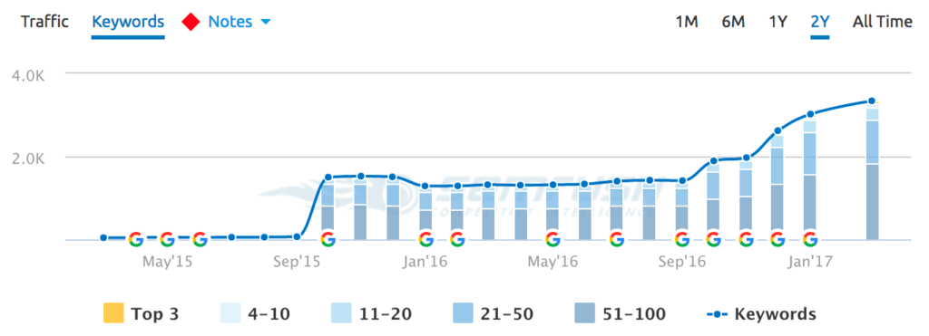
They achieved this by focusing entirely on the information architecture of their site and its contents.
So it’s clear that site architecture can lead to more traffic.
If your traffic can access across any device, then your momentum continues.
Moreover, if your storytelling is engaging, you further the momentum again.
And all of this links back to your site’s architecture and how well both Google and your audience utilize it.
Reason #3: It ultimately clarifies the value
The final reason that links your site’s architecture to your efforts concerning conversion rate optimization hinges on your site being credible and valuable.
Another way you could say that is, “How does your site’s architecture help you deliver on your promise?”
If you fail to deliver a promise by creating a muddled and confusing site, then you’re never going to be able to see any real improvement from an A/B test.
And according to the LIFT model of CRO, the clarity and relevance of your value proposition will ultimately take your brand to new heights.
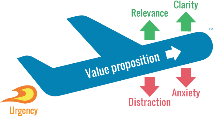
The key to remember here is that users don’t always come to your website via your homepage.
There’s a good chance they could enter at any given point, so long as they have the right URL.
For example, how do you potentially sell – via your site’s architecture – to a visitor who first visited your blog?
If you don’t have a way for them to get their bearings and navigate your site immediately, you could potentially lose a lead before the process even begins.
Your goal then, with your site’s architecture, is to provide value at every stage.
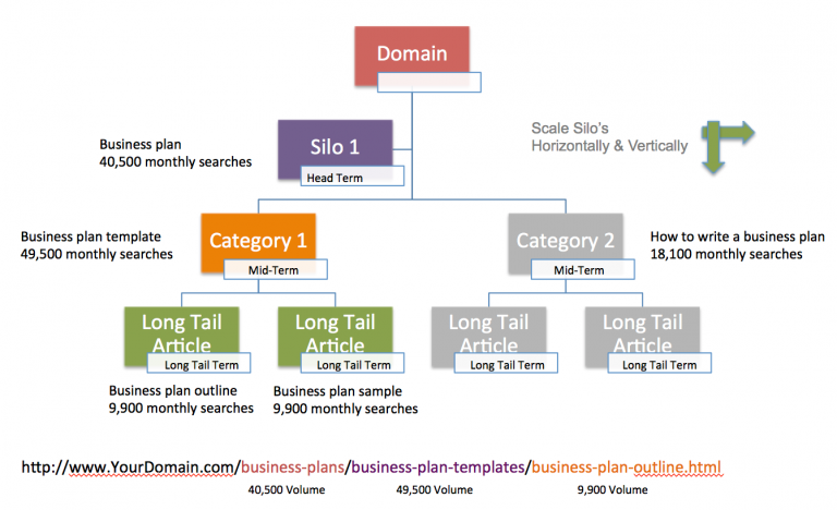
That means that when someone comes to your site, they should immediately know where they are.
Elements such as your permalink structure even play a role in helping your visitor understand where they are and what value your site offers.
If you parse your site out into easily understandable silos, like the example above, users will see your site as much more credible and ultimately more useful.
Take for example the Merge and Purge case study that sought to boost organic traffic and improve user experience.
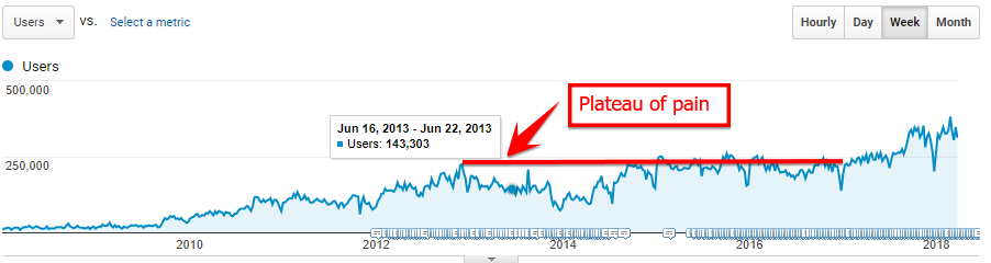
In this case, the focus was on taking disparate pieces of content created over many years and compiling them into understandable content silos.
When the site was simplified, they saw a 32% increase in organic traffic.
And as we’ve already seen, organic traffic is part of the site architecture conversion machine.
So in this case, by clarifying the value of their site by creating a cleaner content architecture, the brand was able to achieve a big win.
Brands should always seek to clarify their value proposition, and in this case, the answer is simple:
Your site architecture is the best place to start.
Conclusion
Conversion rate optimization is a nuanced and technical field.
It takes a lot of time and effort to learn the ins and outs of what works and what doesn’t, and that often trips up brands that seek to experiment and grow their online presence.
A/B tests fail very often, and the resulting frustration often turns businesses away from conversion rate optimization as a whole.
But if you were to focus on creating robust site architecture, the results can be very different in the best possible way.
Site architecture is the backbone of conversions, and following the honeycomb model to help improve your user experience is the best course of action.
If you do, your site will have much more utility, and your site’s users will be able to navigate with ease.
From there, you can use your architecture to build positive momentum and keep people engaged with your brand.
And finally, you’ll have a clearer and more appealing value proposition that users can find from any entry point.
You’ll be much better suited to grow and convert new leads by merely creating a solid site architecture.
How has your site’s architecture helped or hurt your brand?
About the Author: Neil Patel is the co-founder of Neil Patel Digital.
Source: feedproxy.google.com