
Tag Archives for " sites "

25 Review Sites to Get More Reviews for Your Business
Reviews aren’t just about finding out what consumers think you’re doing right or where you can improve. They’re a highly useful marketing tool for drawing traffic, generating leads, and making conversions.

What’s in a review?
A lot, it turns out.
Reviews aren’t just about finding out what consumers think you’re doing right or where you can improve. They’re a highly useful marketing tool for drawing traffic, generating leads, and making conversions.
Let me show you why you should be scoping out reviews for your business.
Why It’s Important for Your Business to Get Reviewed
With over 31 million small businesses in the US, consumers have a massive amount of choices. For businesses, this means it’s crucial to find ways to set your brand apart from competitors.
How Customer Reviews Can Help You?
Reviews can help in three primary ways.
1. Purchasing Decisions
Reviews directly affect purchasing decisions:
- Around 95 percent of consumers check out online reviews before buying anything.
- It’s not just your average consumer who cares about reviews, though.
- Over 41 percent of businesses use review websites before purchasing software—so reviews matter for B2B work, too.
- Reviews empower buyers to make better-informed choices.
2. Brand Awareness
Generate traffic and build hype around your brand through customer reviews.
According to BrightLocal, roughly 87 percent of customers read reviews to help them find local businesses, especially new restaurants, hotels, or clothing stores.
What’s more, just one business review on a high-profile site can boost your traffic by 20 percent, and 10+ reviews generate up to 127 percent more traffic.
Think of online reviews as the new word of mouth.
3. Customer Trust
Consumers want to know they can trust your brand, so who better to rely on than happy customers?
The more (positive) reviews and testimonials you have, the more likely prospective customers are to put their faith and money in your services.
Here’s another interesting fact. The BrightLocal research linked above shows 73 percent of customers don’t look at reviews more than a month earlier.
This tells us we need to pursue reviews at every opportunity and incentivize customers to leave reviews if they haven’t received online feedback in a month or so.
25 Review Sites to Earn More Customer Reviews
While there’s no need to limit yourself to just one review site, don’t feel like you need to target every site on this list. Instead, pursue the ones best aligned with the services you offer and your target audience.
To help, I’ve broken this list into B2C and B2B review sites, depending on your target buyers.
Let’s start with B2C.
B2C Review Sites
“B2C” businesses sell goods and services directly to consumers. If you’re a B2C business, opt for popular, high-traffic review sites to maximize your exposure. Here are 15 of the best.
1. Amazon Customer Reviews
Amazon isn’t just one of the first platforms to accept customer reviews. It’s also one of the most trusted sources for consumers looking for more info before buying something online.
- Open an Amazon Seller Account and encourage buyers to leave feedback.
- Amazon deducts a referral fee from every sale you make through the platform.
2. Which?
Which? is an independent platform in the UK for reviewing everything from flooring to savings accounts.
It’s one of the most trusted review sites online, so it’s worth targeting if you have products to sell.
- The audience is consumers looking for impartial, reliable reviews from an expert team.
- You can’t submit items for review, but you can contact the Which? team to give them more information about your products.
3. Angie’s List
Consumers can’t leave reviews without signing up for a paid account on the US-based Angie’s List, so the reviews are usually worthwhile—they have to really think before they sign up and write.
- Businesses must be certified home service providers to sign up.
- You can easily request feedback and reviews straight through the platform.

4. ConsumerReports
At ConsumerReports, unbiased experts test out tech products and write up informative, impartial reviews.
- If you have a physical product to sell, ConsumerReports can review it.
- Since it’s an independent nonprofit, consumers trust this platform.
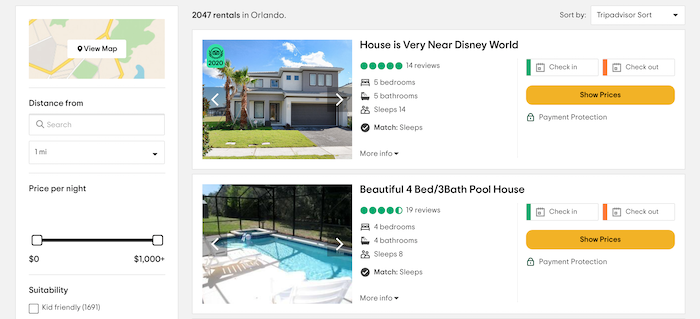
5. Tripadvisor
If you’re in entertainment, travel, or hospitality, check out Tripadvisor.
- It’s the world’s biggest travel website, trusted by audiences worldwide.
- That said, it’s hard to verify reviews and remove potentially fraudulent ones.
6. Yelp
Yelp is a popular platform known for local business reviews.
- It’s free to list on Yelp.
- Yelp is especially useful if you’re in the home and local services market.
7. Google Customer Reviews
If you sign up for Google Customer Reviews, verified buyers can rate and review your services.
- Sign up for a Google Merchant Account to get started.
- Add the Google brand badge and your seller rating to your website for enhanced credibility.
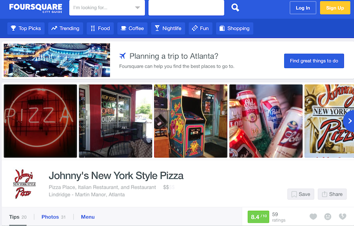
8. Foursquare
Own a bar or restaurant? Chances are, someone’s already reviewed your business on Foursquare.
- Optimize your listing with social media links and menu details to help persuade customers to choose your business.
- The downside? It’s not always easy to identify and remove “fake” bad reviews.
9. The Yellow Pages
Yes, the “real” Yellow Pages (YP) is still around, though it’s online now rather than in hardcopy.
- The YP is still a popular search option, especially for older populations.
- It’s free to list on the YP, though you can pay for a top spot in the search results.
10. The Better Business Bureau
The Better Business Bureau (BBB) checks all businesses against a predetermined set of “best practices” for customer service. Companies receive ratings from A+ to F based on the business size compared to the number of positive reviews and customer complaints.
- More than five million companies are already listed with the BBB
- .An A+ BBB rating can boost your credibility among consumers.
11. Manta
If you’re a small B2C business looking to grow your customer base, Manta can help. If you’re one of 36 percent of small businesses without websites, it could boost your web presence.
- Manta works best for small businesses targeting local consumers.
- It’s free to list, so even if you use other platforms like Google My Business, there’s no financial harm from signing up.
12. ConsumerAffairs
From collecting reviews to engaging with consumers, ConsumerAffairs helps you manage all your customer service needs.
- Start the process by opening a free business account.
- It’s most suited for SMBs offering financial or subscription-based products, like home insurance or gym memberships.
13. Citysearch
Citysearch helps consumers find the best local businesses in their community, from restaurants to nail salons. If you’re a US business, it’s worth checking out this popular review site.
- It’s free to sign up, but it’s a little convoluted. You need to sign up on Data Axle.
- It takes around two months for your listing to go live.
14. Yahoo! Local Listings
Yahoo! has partnered with Yext to create Localworks. It helps you manage business listings across over 70 directories, from Facebook to MapQuest, so you can quickly scale your marketing reach.
- Pursue reviews across multiple sites and manage them from the Localworks platform.
- Standard packages start at $23.30 per month, and it’s quick to get started.
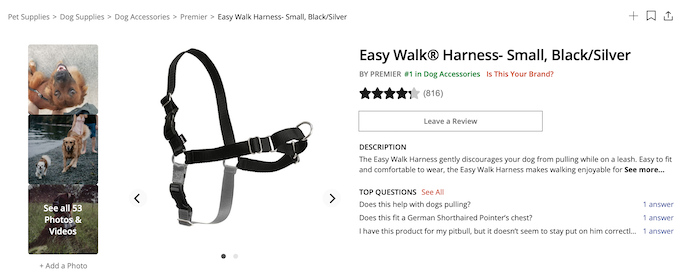
15. Influenster
Influenster partners with brands to support product launch campaigns.
- You can run highly-targeted sampling programs to help generate buzz around your products and brand.
- If you’re targeting younger audiences and product campaigns align with your marketing strategy, sign up with their parent company, Bazaarvoice, to get started.
B2B Review Sites
B2B companies target other businesses, not ordinary consumers. Since you’re targeting a different audience, it makes sense to pursue alternative review sites.
If there’s one thing these alternative sites have in common, it’s this:
- They’re highly credible.
- They’ve built their reputation on being a trusted source of verifiable information for professional audiences.
With that in mind, here are 10 top B2B review sites to pursue, depending on your product type.
16. FinancesOnline
FinancesOnline has two goals: Help vendors like you find clients and match businesses with the SaaS tools they need to grow their business.
- Reviews are verified, unbiased, and comprehensive.
- There’s no guarantee you’ll be listed on the site. You need to apply to create a listing, and the team will get back to you.
17. CompareCamp
Catered towards the SaaS marketplace, CompareCamp brings together multiple expert reviews and turns them into comprehensive product guides and educational materials.
- CompareCamp offers the kind of rounded, deep-dive into your software that’s hard to find elsewhere.
- It’s a leading, highly respected B2B product review platform.
- Simply contact the team to request a review.
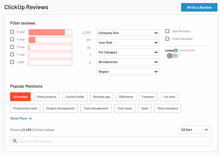
18. G2 Crowd
Do you sell software? Then get on G2 Crowd. With over four million visitors and one million+ review, it’s a lively platform known for its reliable product reviews.
- G2 users are highly engaged and love giving opinions on all aspects of your software.
- Turn your best reviews into social media posts to draw more traffic.
It’s quick and easy to claim your free profile.
19. TrustRadius
Like G2 Crowd, TrustRadius is great for gathering feedback and using it to inform your product development.
- It’s best for enterprise-level SaaS tools.
- The audience is more niche than G2.
- TrustRadius makes it easy to engage your most active buyers and bring them onboard to leave reviews.
20. GoodFirms
GoodFirms is geared toward helping software firms and IT vendors manage their online reputations. If you’re a small business trying to build hype around your product in a competitive market, GoodFirms can help.
- Although paid packages are available, there’s still a lot on offer if you opt for a free plan.
- There’s no free trial if you opt for the more expensive, paid plans.
21. Capterra
On Capterra, users share their software experiences with potential buyers. It’s an active community offering great exposure for vendors.
- Capterra is part of the Gartner Digital Markets group, so the sign-up process is similar to SoftwareWorld and GetApp.
- It’s not easy to distinguish between companies with five-star ratings but very few reviews and four-star companies with hundreds of reviews.
22. Glassdoor
Glassdoor offers everyone, from budding employees to prospective investors, a glimpse into what it’s like to work for a company.
- Glassdoor is one of the world’s most popular jobseeker’s websites.
- It’s free to open an account.
- You can quickly track reviews and respond to feedback.
23. SoftwareWorld
At SoftwareWorld, businesses search for products based on their needs, such as workflow automation or sales management.
- It’s simple to sign up, and listing benefits include social media promotion and press release publishing.
- If your product fits into multiple search categories, you can increase your exposure.
24. GetApp
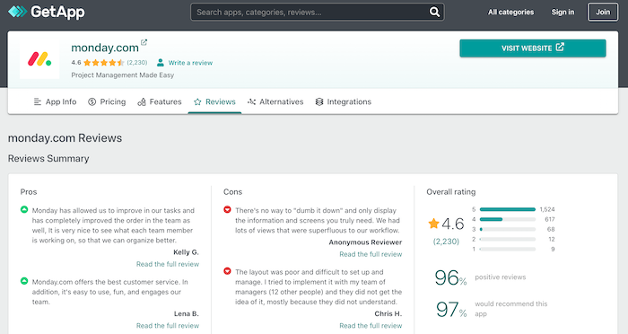
With GetApp, users can shortlist business apps based on their budget, requirements, and current software stack. They can then read verified customer reviews to help them decide between the shortlisted options.
- With a free listing, you’ll be shown on Gartner Digital Markets, but a premium listing gives you access to analytics, including buyer insights.
- Reviews are divided into “pros” and “cons,” so some negative feedback is almost inevitable.
25. Software Advice
Businesses trust Software Advice for their personalized software recommendations and one-on-one telephone consultations.
- What’s unique about this platform is the team matches you with prospects.
- If a qualified lead contacts them, they pass the details to you to complete the sale.
- You only pay for whichever leads meet your specific requirements.
Conclusion
Whether you’re running a B2C or B2B business, customer reviews can help increase your credibility with buyers and attract new prospects.
There’s no reason to limit yourself to just one or two review sites, either, so explore multiple options and decide which platforms are right for your marketing strategy.
If you need help deciding which sites to target, check out my consulting services.
Which review sites are you pursuing?
The post 25 Review Sites to Get More Reviews for Your Business appeared first on Neil Patel.
Source: feedproxy.google.com

Why Good Site Architecture Is The Only CRO You Need
When you hear the words “site architecture,” the first thing that comes to mind is probably SEO. It doesn’t take much digging into SEO best practice to learn that Google loves a site with clearly defined architecture that’s easy to crawl and index. But if you stopped your site architecture planning with just your SEO, then you’ve missed out on the greater picture.
Site architecture isn’t just an effort to game search engines into ranking your site higher.
It does help with SEO, but it’s so much more than that.
Ultimately, your site architecture should be a strategic effort that allows your organic or paid visitors to navigate easily and use your site for its intended purpose.
That means that site architecture is the older brother of conversion rate optimization.
So in this post, I want to show you exactly how site architecture simultaneously supersedes and enables traditional conversion rate optimization efforts.
And to start things off, I want to dig a little deeper into why so many conversion rate optimization efforts fail.
Why conversion rate optimization doesn’t always work
When dialing in your conversion rate optimization, it’s easy to want to focus on the more traditional efforts.
Typical conversion rate optimization efforts require brands to set up competing versions of the same page in order to see how they can improve them.
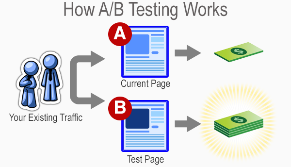
It’s like a battle royale for website pages.
After a week or two of waiting and measuring, the best-performing page wins.
One of them stays up, while the others are discarded for all eternity.
From there, more experimentation occurs based on the winning page’s performance to see if anything else can be improved.
Sometimes, brands will even get brave and conduct some multivariate tests to see if changing multiple elements can yield improvement.
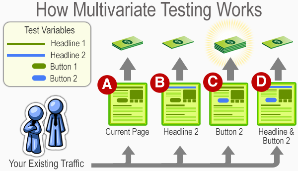
Much like a traditional A/B test, the results hinge on a last-man-standing approach.
Brands can be the loser, and the winner stays up as the subject of more experimentation.
All of this is an ongoing effort to see how you can improve conversions over time.
Many frequent blogs about this practice, which even has its own career field in the marketing industry.
But these types of tests aren’t always the most dependable for small brands that need to optimize as efficiently as possible.
And even some large businesses fall prey to common A/B testing mistakes.
For example, elements like sample size can drastically skew the results of conversion rate testing.

Simply put, if you’re not getting enough traffic, then you’ll be making changes and concluding off of insufficient amounts of data.
That means you could be making the wrong moves and ultimately hurting your brand’s performance.
Or you could also be testing something silly, like colors on your website.
To put it in ConversionXL’s Ott Niggulis’ words:
“There is no universal best color. What works on one site, doesn’t necessarily work on another.”
And that’s part of the point as well.
Many conversion rate optimization trends rise on the backs of a brand or two saying they saw good results from a particular experiment.
Then everyone does it, and confusion results when improvement doesn’t follow.
And then to make matters worse, many brands often don’t allow a proper amount of time to see if their results end up sticking.
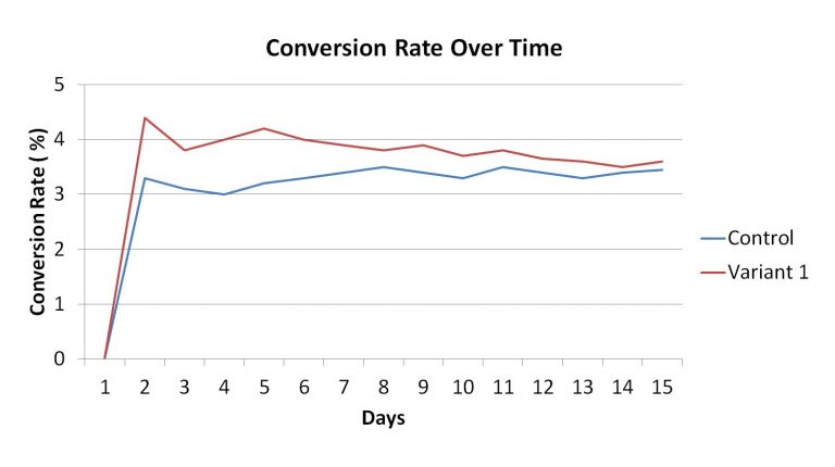
If your variable regresses back to your control’s average, then there’s a good chance that dropping your control could be a bad idea.
Many brands will prematurely make a decision in the first few days, which ultimately hurts them in the long run.
People call this the small win mentality. It ultimately leads to poor optimization and potentially undermines your results.
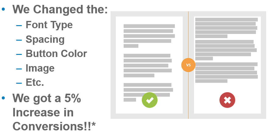
So with all of the potential pitfalls of traditional conversion rate optimization, can site architecture create a more foolproof way to ensure that your website sees plenty of conversions?
To answer that, I want to break down some of the basics of site architecture and show you how it correlates to your conversion rate optimization.
How site architecture creates conversions
Your site’s architecture focuses on building a platform that is easier for your users to navigate.
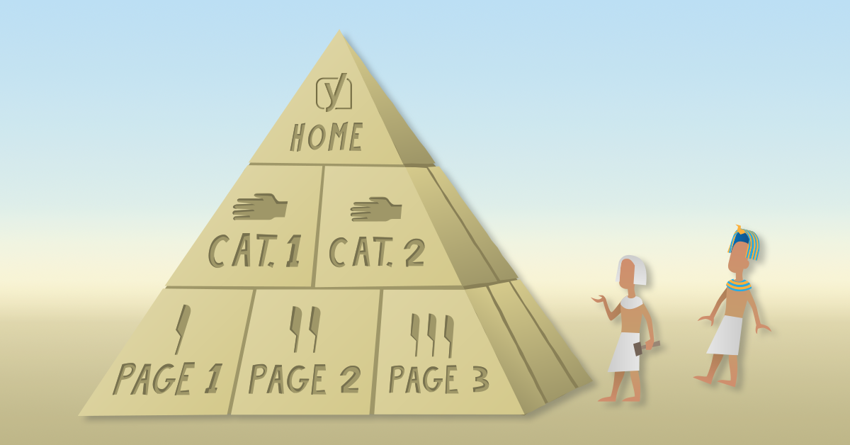
When you look into what site architecture actually is, you’ll typically see a graph that offers a genealogy-like depiction of how pages on your site interact.
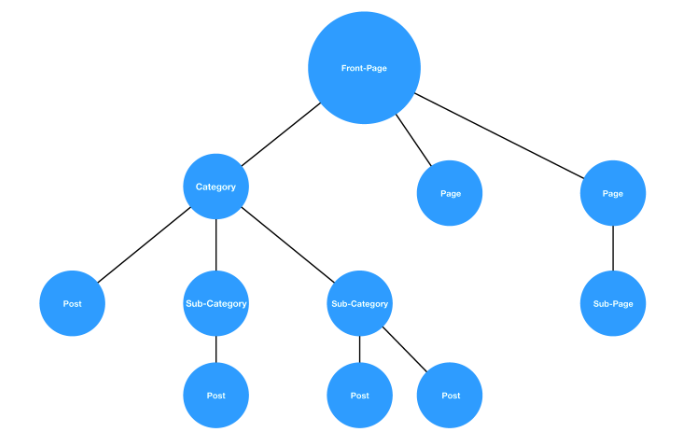
While there’s a good chance no two sites will be exactly alike, this hierarchy style is a pretty standard example.
You start from a homepage and then navigate through a series of categories and subcategories until you’ve found what you’re looking for.
If this process is fluid, as in the graph above, then your users will have no issues.
But if the architecture is muddled, and it’s hard to find a page that should fall under a natural category, then it’s increasingly more likely that your users will leave.
In other words, the idea is to create a fluid user experience that ultimately leads to trackable and accurate conversion testing.
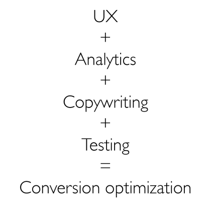
If you implement this correctly, you’ll have a site that’s easier to improve on in the long run.
But does site architecture have a genuinely positive effect on your conversions?
A brand called Voicer reported a 75% increase in conversions by correcting some “small” user experience flaws in their site.
If they can see that kind of improvement from small changes, imagine what would happen on a site that has significant user experience problems.
And yet another brand reported a 112% increase in revenue by improving the usability of their site.
So, good site architecture that leads to a good user experience can clearly act as a solid basis for conversion rate optimization.
But breaking down the user experience of your website isn’t a simple process.
It requires a great deal of data gathering and analyzing to get to a point where you can indeed create a site architecture that works well for conversions.
Thankfully, there’s a method called the honeycomb model that shows you how exactly user experience can be broken down to help optimize your conversion rates.
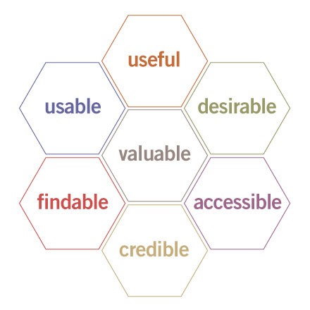
This methodology provides a simple framework that helps brands create websites with the following characteristics:
- Useful: Serve the purpose for which they created it.
- Usability: Simple and easy to use.
- Accessible: Anyone can use it.
- Desirable: Provides positive emotion and is pleasant to use.
- Findable: Navigation is intuitive, and solutions are easy to find.
- Credible: Conveys in a believable or trustworthy manner.
- Valuable: Delivers on a promised value.
If you can fulfill all of the requirements in the honeycomb model, then you optimize your sales funnel paths naturally for conversions.
So for the rest of the article, I want to show you some ways that you draw a direct line between user experience, site architecture, and conversion rate optimization.
Site Architecture for Lead Generation
You’ll see without a doubt that site architecture is a viable path to increase your lead generation.
Reason #1: It gives your site utility
The first steps of the honeycomb model rely on creating a website that is useful and usable.
This addresses the utility and the function of your site in a few ideas that are easy to understand.
But just because they’re easy to understand doesn’t mean they’re easy to implement.
When building out your site’s architecture, you need to create an experience that helps your user find what they came for.
This natural flow is the first place to start when addressing the usability and usefulness of your website.
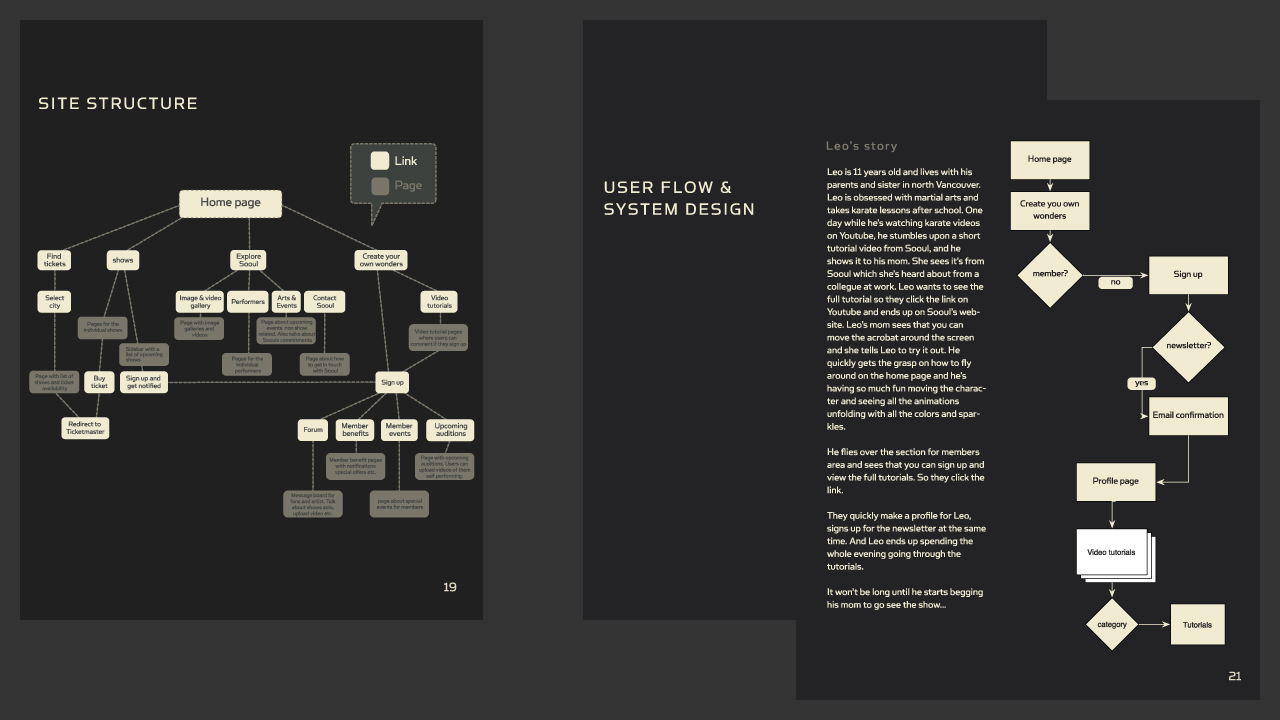
This ultimately determines how people interact with your website.
And how they interact with your website will, in turn, determine how many conversions you get in the long run.
Think of it in terms of an example involving a site that sells power tools.
On a well-designed website, this would be a logical flow of thought:
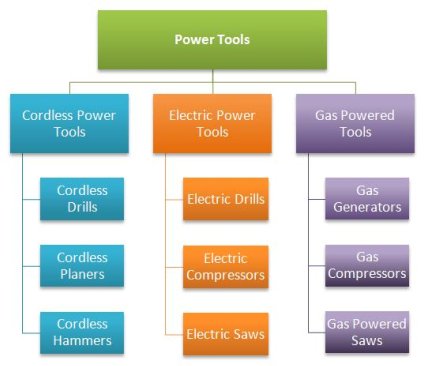
Users can navigate based on the type of tool that they want to find. The site then presents individual products according to whether they are cordless, electric, or gas powered.
Now imagine if you were to switch some of the products around.
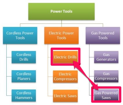
In this case, if you were trying to find a gas-powered saw, you would naturally look under the gas-powered tools.
If you misplace this in your site’s architecture, a user might navigate to the logical page but still be unable to find a product you actually have.
That means no matter how much you optimize the page, your organic traffic will struggle to navigate your site and may ultimately leave.
So when linking site architecture to conversion rates, the first place most brands start is with a mockup of what they want their users to achieve.
The purpose is to base the entire website design process on actual data and user behavior.
In the words of Paypal UX designer Larry Sawyer:
“They say a picture is worth a thousand words, but a mock-up is worth even more than that.”
So this design process typically follows a flow of testing, analysis, definition, ideating, prototyping, and then validating.
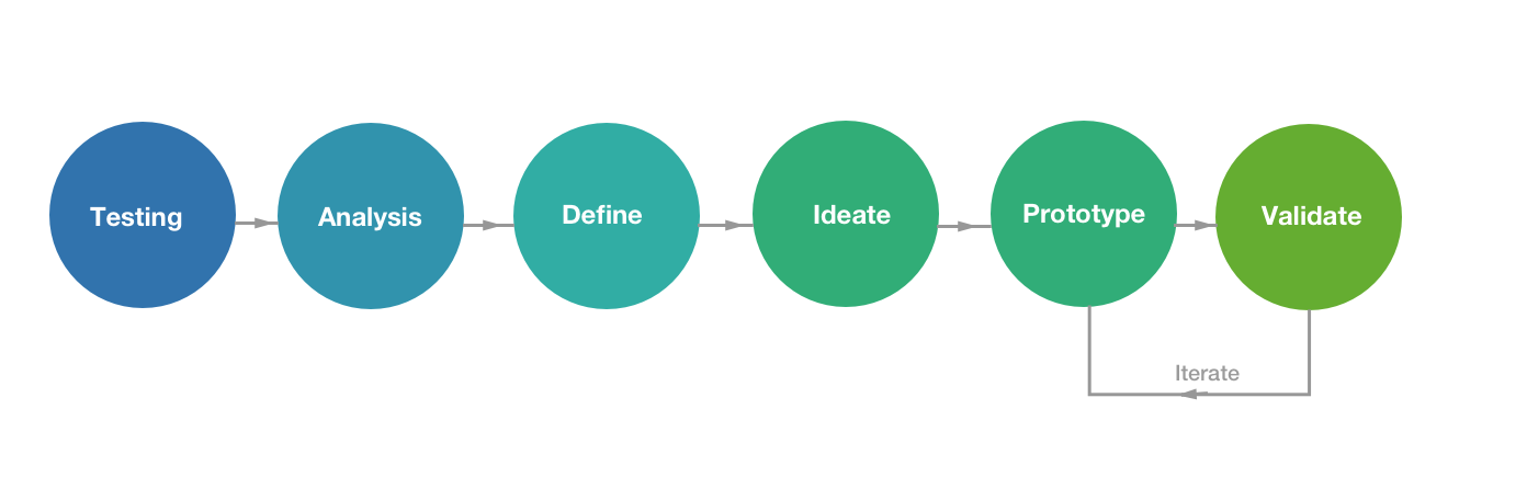
If you follow this particular model, you’ll be able to create a website that is usable by anyone in your audience and thus inherently useful to all parties.
So your initial goal is to optimize your site according to what visitors are doing.
You then take that information and analyze their behavior to see what stands out.
How they use your site defines what is essential, which further provides you the ideas you need to test if you want to improve your conversions.
From this information, you create a prototype of your website, and then validate your findings with additional testing.
If the prototype is invalid, you rinse and repeat until your site is in complete working order.
Keep in mind that this style of UX design does typically involve more design than just site architecture.
But for our purposes, we want to focus on the bigger picture.
So when finally creating your site’s architecture mockup, many brands start with a comprehensive markup of how the elements of every page contribute to the user experience.
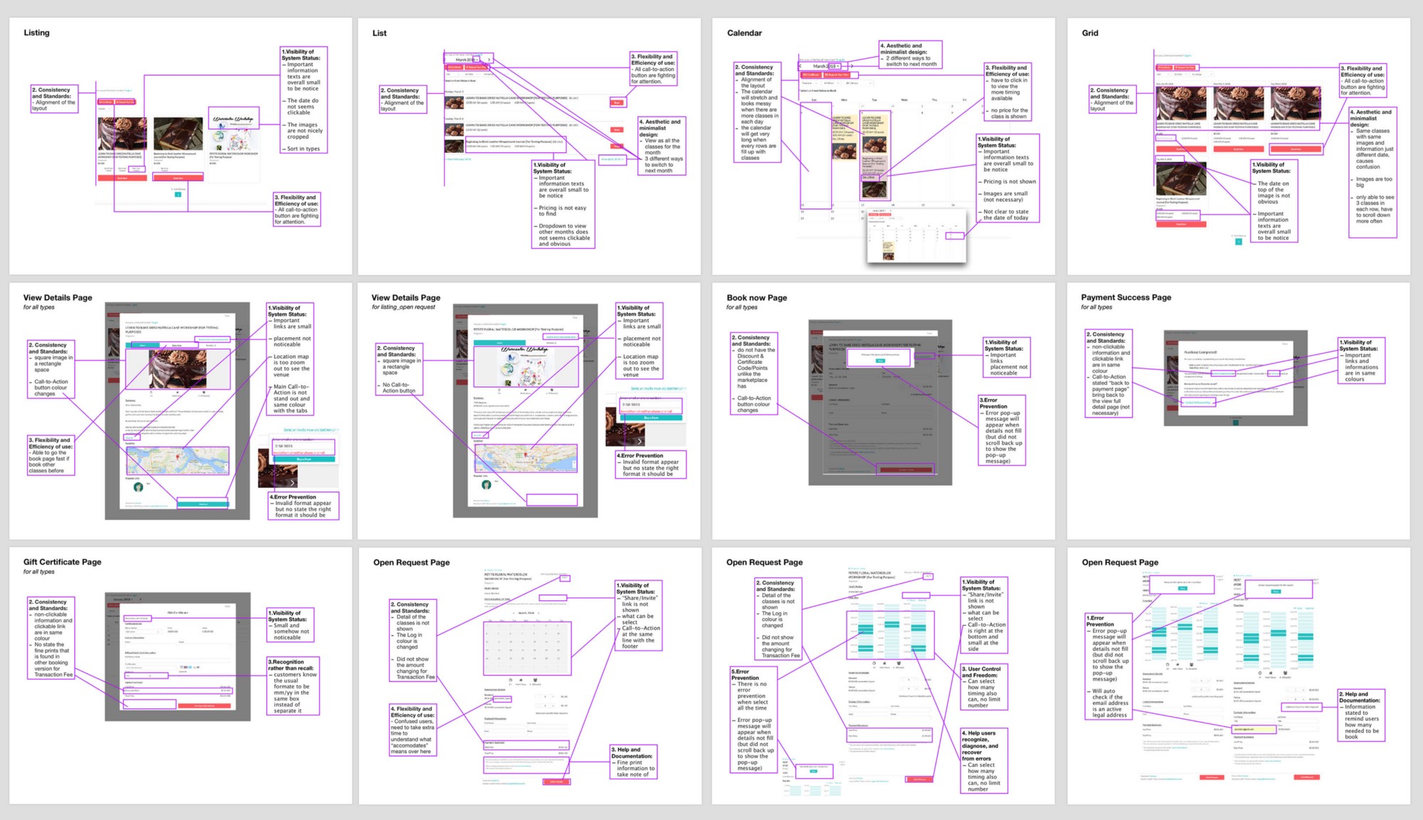
As this professional breakdown demonstrates, you can draw out and improve every aspect of your site.
From this exercise, you can create a basic outline of what your users should achieve on every page of your site.
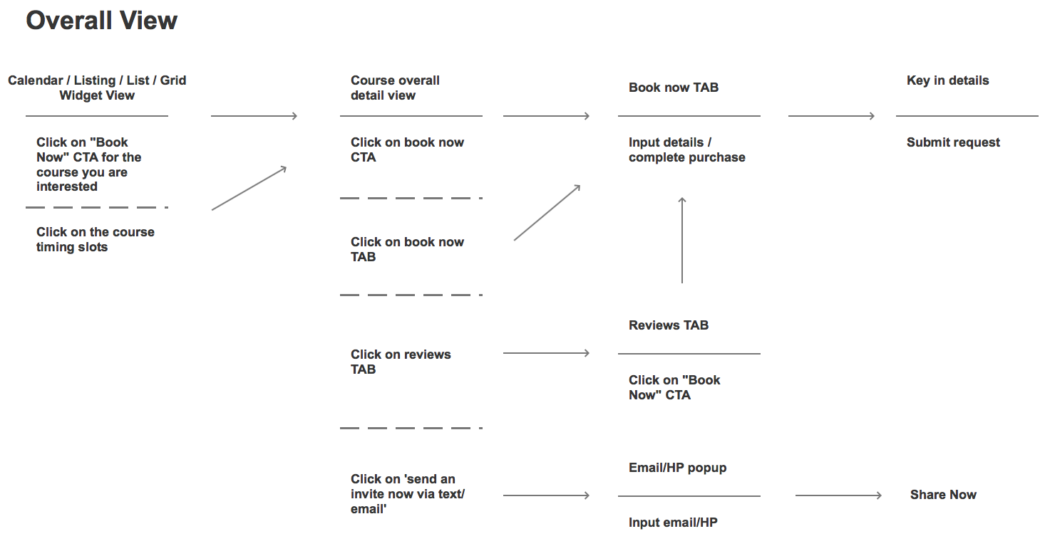
The purpose here is to take a vast amount of data from your original design and then strip it away until only a series of user actions remain.
This, in turn, dictates your site’s architecture as it is a direct representation of how you want your user to use your site.
From this simplified design, one then typically creates a more comprehensive wireframe mockup.
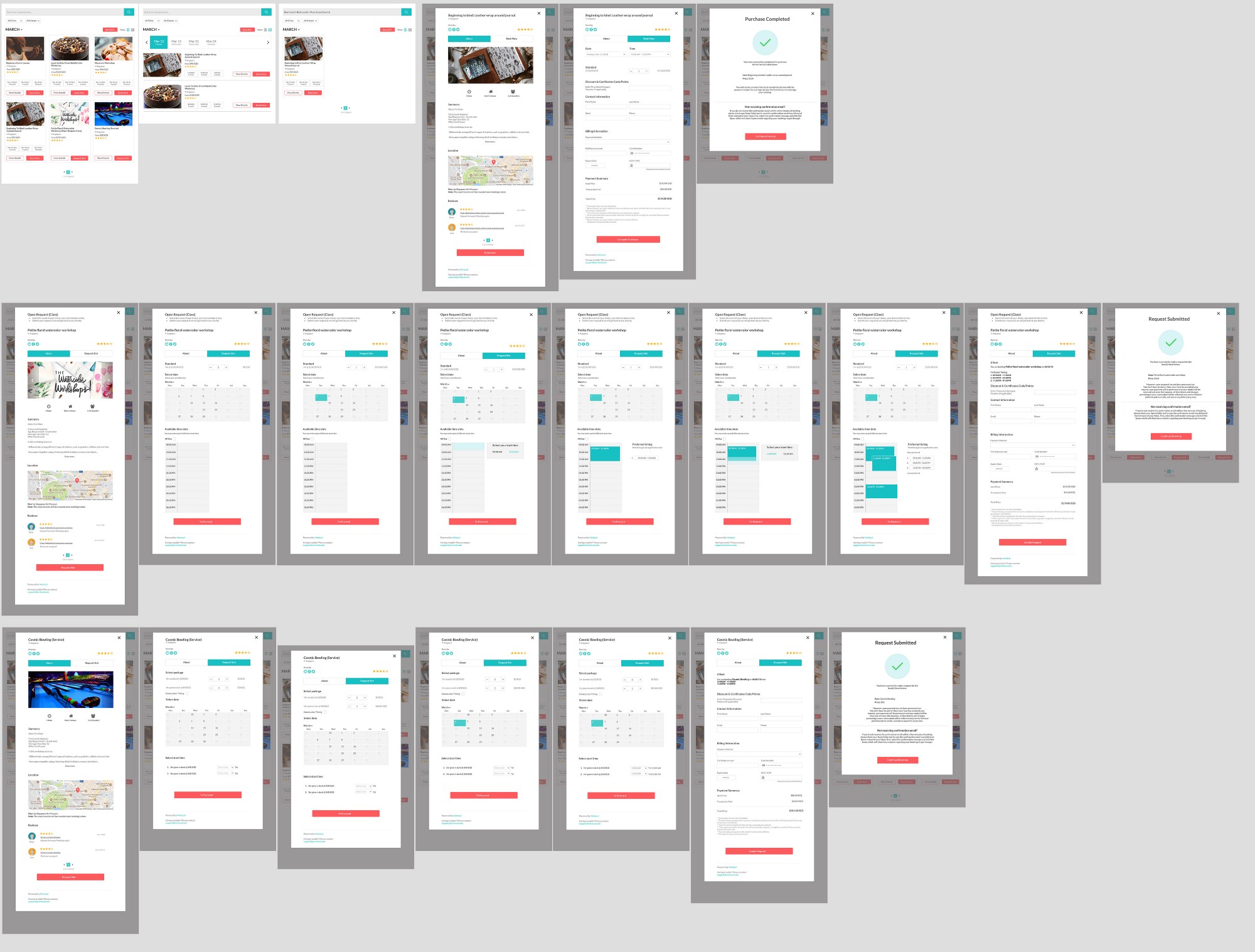
Once you’ve completed the wireframe, you only need to finalize your imagery, copy, and calls to action.
You can then test your new prototype site to see if your user experience is positively affected.
If this simplifies the actions your users take, then you truly aligned your site’s architecture with the intent of your audience, thus fulfilling the usefulness and usability criteria.
This process can be tedious, but it’s a great illustration of how data-backed and conversion-oriented your site architecture really is.
If you can successfully do this with your site, you’ll be one step closer to creating a better overall conversion funnel that will help your brand for years to come.
Reason #2: It creates positive momentum
As we move deeper into the user experience and site architecture connection, the next layer according to the honeycomb model hinges on creating positive momentum.
That means according to the honeycomb model it needs to be desirable, accessible, and findable.
So once you’ve established a flow and created a site that’s usable on any device, the next step is to move beyond and create a pleasant experience.
It may surprise you to learn that one in three users will leave a site because they can’t find a product.
That means your site architecture can hurt conversions in a very direct way.
So your goal at this point should be to create a site that’s both easy to navigate and that builds natural forward momentum.
If you strive to emphasize the architecture of your site with compelling storytelling, the natural result will be that more users complete actions on your site.
That means finding a way to create a site whose architecture naturally lends itself to being informative, interactive, and even at times entertaining.
Consider the example of the site My Grandmother’s Lingo.
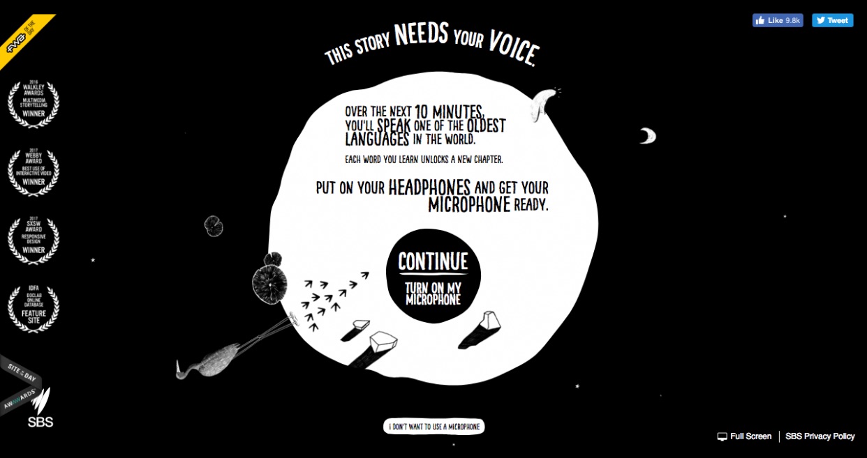
This award-winning website helps users learn new words from one of the oldest language in the world.
The creators designed the website for use and utility but even took that effort a step further by making it compelling and engaging.
The tantalizing idea of learning something both old and new hooks the user, and then sends them on a 10-minute journey where they learn something.
In the end, the primary goal is to help spread awareness of these ancient languages and provide a platform for future preservation.
How do they achieve this? Through vivid storytelling and clear site architecture that’s geared toward positive momentum.
But momentum isn’t just about storytelling.
It also relies on where you position yourself, like on mobile.
More than ever, users are browsing with a mobile device.
That means that the architecture of your site needs to be conducive to both a desktop user and a mobile user.
If you only focus on one or the other, you are missing a significant portion of your potential audience, and thus you are losing conversions.
And if someone comes to your mobile site only to find it isn’t optimized, then all positive momentum is gone.
But momentum has to start even further back with your SEO.
And site architecture plays a critical role in bringing organic traffic to your site and providing forward momentum.
In one study, a brand was able to increase their site’s organic traffic from 800 visits per month to over 3,600 per month by focusing on the user experience their website gave.
That’s a growth of 350%.
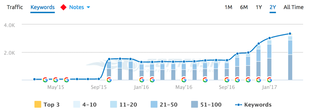
They achieved this by focusing entirely on the information architecture of their site and its contents.
So it’s clear that site architecture can lead to more traffic.
If your traffic can access across any device, then your momentum continues.
Moreover, if your storytelling is engaging, you further the momentum again.
And all of this links back to your site’s architecture and how well both Google and your audience utilize it.
Reason #3: It ultimately clarifies the value
The final reason that links your site’s architecture to your efforts concerning conversion rate optimization hinges on your site being credible and valuable.
Another way you could say that is, “How does your site’s architecture help you deliver on your promise?”
If you fail to deliver a promise by creating a muddled and confusing site, then you’re never going to be able to see any real improvement from an A/B test.
And according to the LIFT model of CRO, the clarity and relevance of your value proposition will ultimately take your brand to new heights.
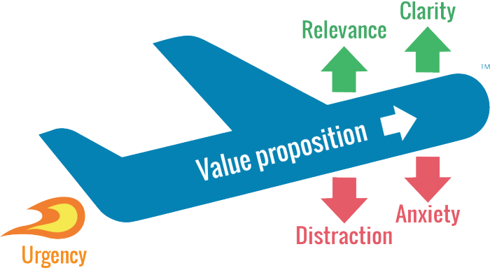
The key to remember here is that users don’t always come to your website via your homepage.
There’s a good chance they could enter at any given point, so long as they have the right URL.
For example, how do you potentially sell – via your site’s architecture – to a visitor who first visited your blog?
If you don’t have a way for them to get their bearings and navigate your site immediately, you could potentially lose a lead before the process even begins.
Your goal then, with your site’s architecture, is to provide value at every stage.
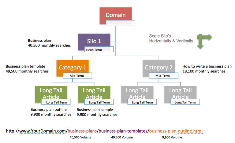
That means that when someone comes to your site, they should immediately know where they are.
Elements such as your permalink structure even play a role in helping your visitor understand where they are and what value your site offers.
If you parse your site out into easily understandable silos, like the example above, users will see your site as much more credible and ultimately more useful.
Take for example the Merge and Purge case study that sought to boost organic traffic and improve user experience.
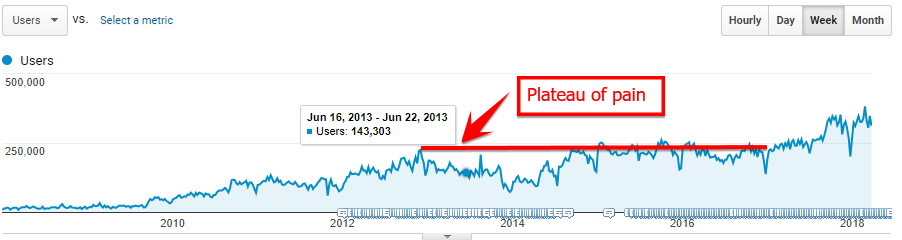
In this case, the focus was on taking disparate pieces of content created over many years and compiling them into understandable content silos.
When the site was simplified, they saw a 32% increase in organic traffic.
And as we’ve already seen, organic traffic is part of the site architecture conversion machine.
So in this case, by clarifying the value of their site by creating a cleaner content architecture, the brand was able to achieve a big win.
Brands should always seek to clarify their value proposition, and in this case, the answer is simple:
Your site architecture is the best place to start.
Conclusion
Conversion rate optimization is a nuanced and technical field.
It takes a lot of time and effort to learn the ins and outs of what works and what doesn’t, and that often trips up brands that seek to experiment and grow their online presence.
A/B tests fail very often, and the resulting frustration often turns businesses away from conversion rate optimization as a whole.
But if you were to focus on creating robust site architecture, the results can be very different in the best possible way.
Site architecture is the backbone of conversions, and following the honeycomb model to help improve your user experience is the best course of action.
If you do, your site will have much more utility, and your site’s users will be able to navigate with ease.
From there, you can use your architecture to build positive momentum and keep people engaged with your brand.
And finally, you’ll have a clearer and more appealing value proposition that users can find from any entry point.
You’ll be much better suited to grow and convert new leads by merely creating a solid site architecture.
How has your site’s architecture helped or hurt your brand?
About the Author: Neil Patel is the co-founder of Neil Patel Digital.
Source: feedproxy.google.com