
Tag Archives for " site "

What We Can Expect from Core Web Vitals in 2022
2021 was a big year for SEO. We saw Google’s rollout of indented results, where sites can have multiple relevant pages shown on a Search Engine Results Page (SERP); its continuous scroll update to mobile search, which automatically loads the next batch of results when users scroll to the bottom of a search page; and its title tag rewrites, where it replaces a site’s title with its H1 tags or other elements.
Were all these changes met with thundering applause? Not quite, but it’s Google’s SERP world, and we’re living — and trying to rank — in it.
Another release that wasn’t an immediate hit was the Page Experience Update, based on Google’s Core Web Vitals metrics.
These new metrics “prioritize” (more on this later) the user experience by analyzing a web page according to three signals:
- Largest Contentful Paint
- First Input Delay
- Cumulative Layout Shift
URLs that pass each Core Web Vitals threshold are supposedly more likely to rank than URLs that don’t, and vice versa. However, Google has seemingly changed its mind over time on how big of impact sites will see and how many thresholds they ought to pass.
Google’s goal with this release? Get site owners to improve their website’s performance. Unfortunately for Google, though, they didn’t take the bait.
Core WebVitals Aren’t Going Anywhere
Although it received a lackluster response, don’t expect Core Web Vitals to go quietly into the night. Heading into 2022, we can expect Google to ramp up its importance for ranking.
In fact, I’d wager that there’ll be more of a ranking disadvantage for sites that fail one or two of the thresholds — as opposed to just those failing all across the board, as is currently the case.

This means that sites need to start optimizing pages collectively for each Core Web Vitals signal, so they’re not left behind if and when their competitors’ sites begin ranking higher.
Effective marketing requires visibility and reach, and there’s no better option than ranking high on SERPs. This means adhering to Core Web Vitals is a must. But when venturing to do so, it’s best to know ways to optimize sites and what shortcuts to avoid that could hinder a site’s usability.
Understanding Each Core Web Vitals Signal
Core Web Vitals essentially put user experience at the forefront by measuring a site’s performance in three parts: visual stability (Cumulative Layout Shift), interactivity (First Input Delay), and loading performance (Largest Contentful Paint).
Let’s briefly define each signal:
- Cumulative Layout Shift: The maximum change to the layout of a page within a five-second session.
- First Input Delay: How long it takes from a user’s first click on an interactive element (such as a link or button) to when processing happens on that click.
- Largest Contentful Paint: How long it takes the largest element on a page to load. Note: the largest element varies, depending on the device used.
What Not to Do When Optimizing a Site for Core Web Vitals
Core Web Vitals are supposed to enhance a website for the user experience, but how SEOs go about it can do more harm for usability than good. The metrics for Core Web Vitals are fragile, allowing them to be passed easily even with terrible optimizations.

Let’s take these two scenarios:
One way the Largest Contentful Paint threshold can be passed is by making text larger on a page. This metric measures how long the largest element on a screen takes to load — the quicker it loads, the better the metric.
Since text loads faster than an image, making it bigger would allow a site to pass this threshold. But this tactic won’t improve the site’s user experience, and the larger text may be an eyesore to an otherwise visually-appealing site.
Because visuals are essential to marketing, it’s easy to see why this wouldn’t be a good idea.
Another bad optimization example that passes a Core Web Vitals threshold is removing valuable links. First Input Delay measures the time it takes to process a user’s click on an interactive element on a site.
For example, let’s take blog pages, which consist of an image, a title, a summary and a “read more” CTA for each post. Typically, SEOs make both the image and CTA linkable to the full blog post, and users have come to expect it.
If an SEO removes the links from these interactive elements, users will still click them (because they’ll assume they link somewhere), but nothing will happen. The user will eventually find a functioning element, but later than they would otherwise.

As a result, the clock for First Input Delay won’t start until the page is fully loaded, which will improve metrics for this signal but ruin the user experience in the process.
A crucial part of marketing is putting the consumer first. Configuring a site to adhere to Core Web Vitals while simultaneously slowing down the user experience achieves the opposite. Mindful optimizations are what every site needs to truly care about the user experience.
What To Do When Optimizing a Site for Core Web Vitals
There are ways to enhance a website for each signal, although Core Web Vitals haven’t been well received. Consider these options to improving a site for Core Web Vitals:
- Cumulative Shift Layout: Use facades for late-loading content. Facades hold the place for content that will appear once a page finishes loading. Let’s say a site has product images it’s showcasing on its home page. Facades will hold their place as they’re loading so that the page won’t get rearranged once they do, because they’re the focal point and probably larger than other elements on a page.
- Largest Contentful Paint: Drop large elements beneath the fold. This allows more unstable elements, such as embedded content (images, ads, Tweets, etc.), to appear gradually as page loads. If an ad needs to be displayed on a page, leaving it beneath the fold will help improve this metric.
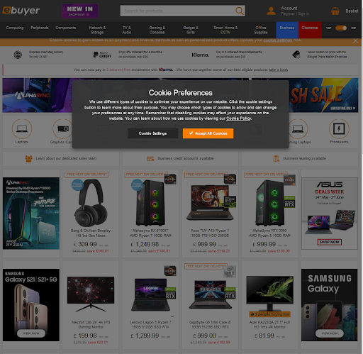
- First Input Delay: Add interactive elements early on that serve a purpose. If a page has an element that needs to be clicked before users can view a site, it will cause a delay since the page is still loading in the background. One example of this type of interactive element is a cookie preferences overlay.
Pass Every Threshold
Core Web Vitals are here to stay. As we head into 2022, any site that hopes to rank needs to make sure they’re passing every threshold. Not doing so will cause a free fall from the ranks, which no marketer wants.

There’s a right way to go about optimizing pages for Core Web Vitals. Once we do, we’ll make the SEO world better for both ranking and user experience.
About the Author:
Tom Capper is the Senior Search Scientist at Moz. He’s a thought-leader with a penchant for challenging industry norms and developing unique SEO strategies and tactics. His focus is on designing new research to help Moz solve complex and technical issues for SEO professionals at every stage in their careers.
The post What We Can Expect from Core Web Vitals in 2022 appeared first on Content Marketing Consulting and Social Media Strategy.
Source: convinceandconvert.com

SEO for a New Site: Checklist
Starting SEO for a new site is overwhelming, especially if you haven’t done it dozens of times already.
In fact, the process can be quite intimidating, as there are so many technical tasks involved.
SEO for a new site is one of those most intimidating tasks new site owners tend to shy away from and set aside.
SEO for a New Site: Checklist
Here’s a guide that will make it doable for you:
1. Don’t Take Your Domain Name Lightly
Spend some time on this step: Your domain name will hardly have any direct impact on your organic search visibility but it will be important for your brand name recognizability.
What doesn’t matter for SEO:
- Domain age (when it was registered)
- Exact-match keywords in the domain name
- Top-level domain (as long as it is not a regional/localized TLD), i.e. don’t stress if you cannot find a .com domain.
What does matter for SEO:
- Domain meaning: Its topical associations. A good domain can get more people to click your snippet when they search
- Domain length: Too long or hyphenated domains may look spammy and hurt your brand.
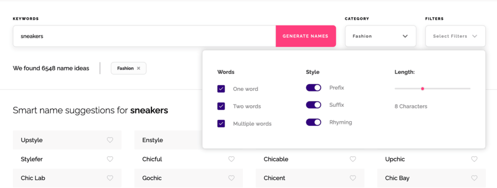
With all of that in mind, take your time. Picking a domain is a huge decision. Use this business name generator that discovers some snappy names with meaning. You can also set how long your name should be and which category it should fall under:
Once you have your domain, search Google for your name to make sure there are no existing brands in your niche that you’ll have a problem overcoming in branded search.
2. Use WordPress
WordPress is the easiest platform to set up a site. And it is also incredibly SEO-friendly and flexible.
No other content management platform has so many years of fine-tuning and such a rich directory of plugins. You can do just about anything with WordPress without having to code anything.
WordPress is free, most plugins are free or freemium, and all it takes is a few-click installation on most hosting providers.
WordPress also doesn’t require a lot of optimizing, especially at the beginning. All it takes:
- Choose a theme. Unlike your domain name, this will be easy to change down the road, so focus on the theme being lightweight rather than pretty. Here are a few fastest themes out there
- Enable HTTPS: Here’s a detailed guide on doing that on WordPress
- Set your permalinks to “Post name” and choose your time zone in “General Settings”
- Publish some fundamental content to give search engines something to crawl. More on this below:
3. Set up Your E-A-T Right Away
The first thing you can do when launching a new site is to start with Lorem ipsum text on your fundamental pages: About us, Contact, Privacy Policy, etc.
Those types of pages convince your first visitors that you are a trusted business to deal with and send quality signals to Google.
Make sure your E-A-T is set up well:
- Your foundation pages (About us, Terms of Service, Contact us, etc.)
- Your website security information (how is your visitors’ privacy protected?)
- Basic facts about your business
- Some social proof from beta testers or first product buyers
- Your author bylines detailing why they have expertise on a topic
- Links to your social media profiles
- More importantly, your service or product pages. What is it you are selling?
Ensure your service pages are as descriptive as possible. In order to achieve that, try adding not just text but also some videos that demonstrate the key benefits of your products or services.
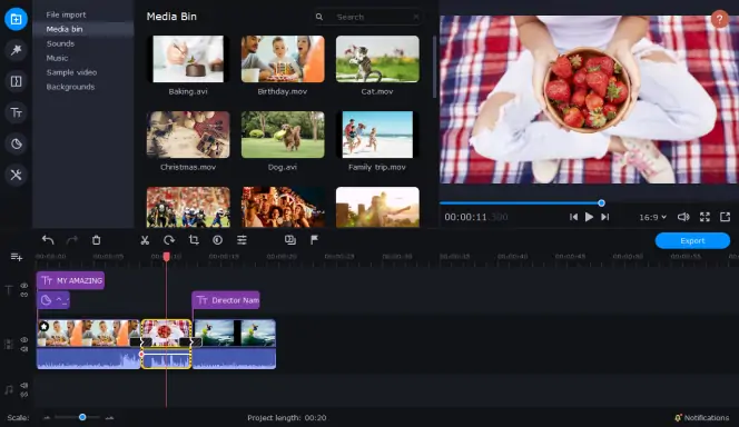
Also, since the majority of visitors prefer watching videos with sound off, make it convenient for them by adding subtitles, so that they can get to the meat of the matter even without having to listen to them.
You want your first visitors as well as search engines to know right away!
4. Start with the Least Competitive Search Queries
One of the biggest challenges of optimizing SEO for a new site is that you have no unique data to rely on.
Any data that you are going to use at this point is public, so you have zero competitive advantage unless you get really smart and creative.
When launching SEO for a brand new site, you need at least This content targeting definitive search queries at a minimum:
- Pages describing your services/products: These will target high-intent queries
- Initial content putting your products in the educational courses: What are those problems your products help solve? These could also be use cases.
#2 is where you can focus on less competitive search queries to start generating some organic search traffic earlier and send those visitors to your key “money” pages.
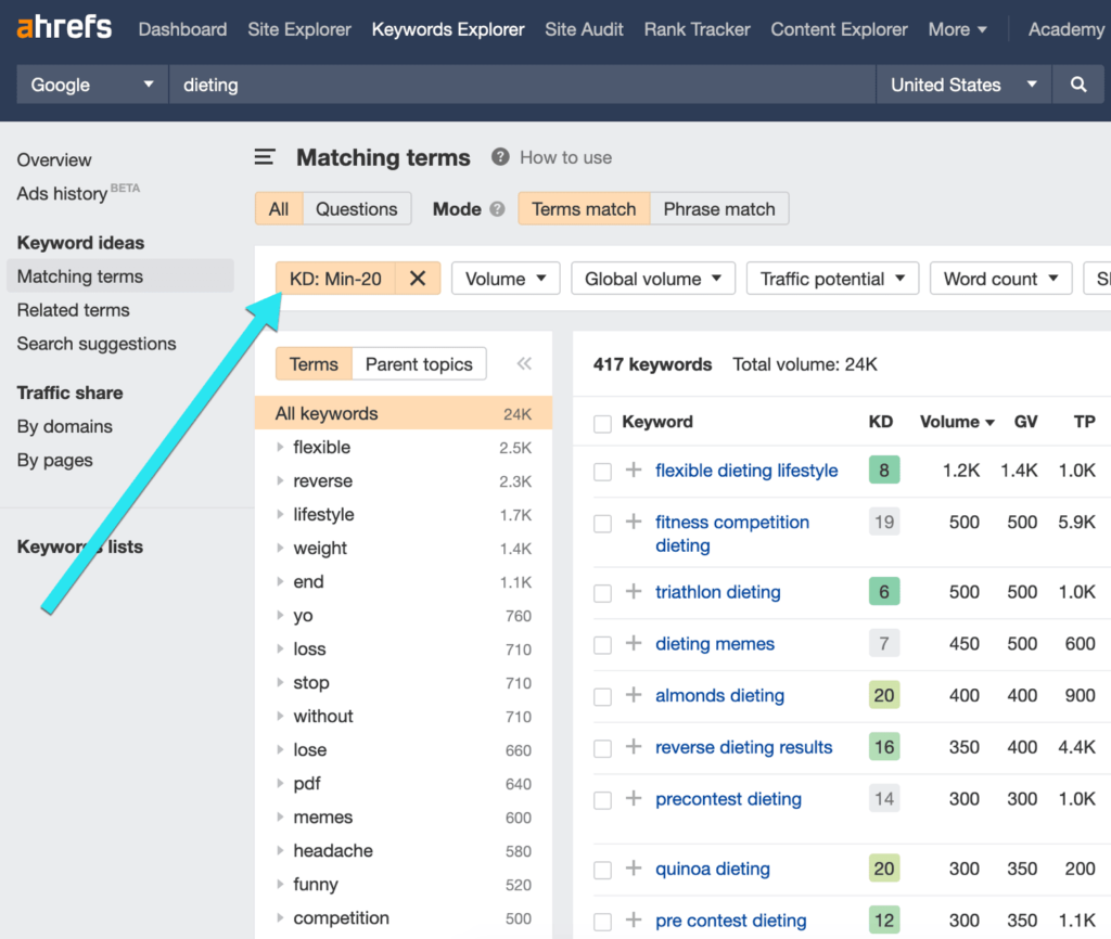
Ahrefs is a great tool to find those low-hanging-fruit keywords to target when starting a new site. The platform offers a “Difficulty” metric that shows how difficult it will be to rank for each keyword on page 1.
For a brand new site, you may want your keyword “difficulty” to be no higher than 20. For that you will need to create a filter inside the Keyword Explorer:
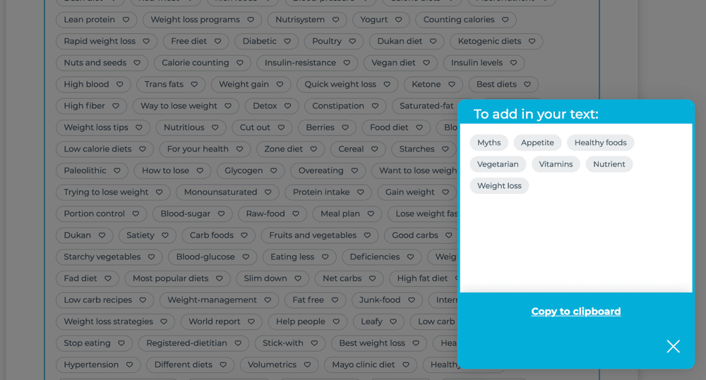
When creating your content, use Text Optimizer to build semantically relevant context and include related concepts:
5. Start Monitoring Your Progress
You want to start collecting your site’s data as early as possible. This will help you get ahead of your competition by utilizing your own data and making more informed decisions. You don’t have to do lots of web tracking systems.

These three will be enough:
- Google Analytics
- Facebook Pixel (especially if you are starting an ecommerce site and planning to use retargeting ads down the road)
- Google Search Console: Google will start collecting data about you as soon as they discover you but things like sitemaps may speed things up.
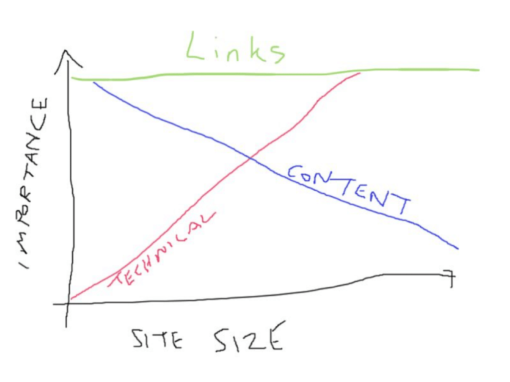
6. Focus on Content-to-Content Links
Links will help your site get discovered by Google as well as start growing its credibility. No site should be launched without a smart link acquisition strategy.
Links are still key to organic search visibility, so there’s no search engine optimization strategy without links.
Self-serving link building is a risky tactic that can bury your website in penalties and filters, and the risk is even higher for new sites that have no good record with Google.
With that in mind, don’t be in a hurry and try to avoid any link acquisition tactics where you can control the anchor text of the link.
There are a few powerful and safe link building tactics, and most of them come down to one process:
- You create useful and truly unique content assets. (e.g. an original study)
- You reach out to media publications for them to consider covering it.
It takes time and effort but you just cannot put a price on contacts you’ll be building underway. Make sure you build strong relationships with all the publishers that chose to link to your content. Every further outreach campaign will be easier from there.
Your New Site Is On Its Way to Ranking
SEO for a new site is mostly about building a foundation. You don’t have to do everything perfectly when starting a site. You just need to lay a good foundation to start collecting data and expanding.
SEO takes time, so whatever you do, don’t expect fast results. Google needs to start crawling your site and forming your opinion about your content before they know it is worth showing up for its users.
The post SEO for a New Site: Checklist appeared first on Content Marketing Consulting and Social Media Strategy.
Source: convinceandconvert.com

6 Ways to Integrate SEO Across Teams
When I started in digital marketing, I splattered meta-data and keywords into content like Pollock. I am not proud of this because not only does this date me, but it is also horrifically against best practices as we see them today. If you ever read anything along the lines of “California vacation lovers and those who love California vacations? For the best California vacation, look no further than these California vacations,” I send my deepest apologies.
Fast forward 20 years, I’m now happy to say that organic SEO best practices have dramatically improved, both for the marketer and the end-user. As we move into 2022, it’s more important than ever to remember search does not take place in a silo. It should be a thoughtful, integrated strategy running across the complete customer experience.
6 Keyways to Integrate SEO Across Your Organization
Not sure how to integrate SEO? We have six key ways to de-silo your search integration across your organization when it comes to working with search engine optimization teams, agencies, or practitioners.
#1. Search Meets Research, Personas, and the Audience Journey

Search traffic provides a treasure trove of qualitative and quantitative information about your audiences’ needs, vernacular, attitudes, and more.
- Do people talk about your travel product by saying “vacation” or “trip”?
- Do high school students looking for information about their college of the chosen search for “ASU”, “Arizona State”, or “Arizona State University”?
- When searching for enterprise software, do your customers say “platform,” “tool,” or “technology”?
Using search data helps you discern what will resonate best with your audience. Couple this with surveys, stakeholder interviews, and digital data and you have a solid (and quantifiable) foundation for your personas and audience journeys.
When search teams share high-level keyword information across the organization, it can help support everything from media relations to product development to recruitment and beyond.
#2. Integrate SEO and UX
According to “SEO For Everyone” authors Rebekah Baggs & Chris Corak, search and user experience teams shouldn’t be kept on separate tasks (or quite frequently within separate silos). These practitioners or teams often have some of the same goals in mind: ensure the site is easy to find, navigate, use, and enjoy. Although, they may approach the process of getting to the end goal differently.
Don’t let the idea of The One Perfect Keyword create tunnel vision—you want to be looking at the bigger, more nuanced picture. An improved user experience means people stay on the page longer, interacting further with your site, not clicking the back button, revisiting the site anew, and sharing your content—all boons for SEO. The better the overall site experience (think UX, load times, mobile navigation, et al.), the more likely you’ll reach the coveted top ten in SERP.
– Baggs & Corak
#3. Search and….. the Offsite Experience?

During my Britney-and-Justin-era SEO days, I didn’t anticipate I’d be planning for SEO even before the site experience began.
Today Google wants you to stay on Google.
Don’t let the idea of The One Perfect Keyword create tunnel vision—you want to be looking at the bigger, more nuanced picture. Click To Tweet
It is now critical that search marketers consider how their content is presented, consumed, and shared even before the user gets to their site. Examples of this include maps, movie listings, local listings, and product descriptions.
As top search results provide answers via the SERP itself, search marketers and content creators need to button up content, images, and calls to action even before a user steps foot on your site.
#4. Search and Social
One of my favorite mash-ups over the years has been searching and social. It’s interesting to find how to search keywords and activities on your site overlap with social engagement conversions and customer care. This isn’t revealed through a pretty Venn diagram.
This typically looks like a psychologist blot experiment with various overlaps in bizarre and unpredictable ways.

As the great resignation continues and teams have more and more to do (with fewer resources, patience, and stamina), one way to offset that workload is figuring out ways to collaborate, leverage each other’s expertise, and do more together, outside of the SEO silo.
Top social sites for search engine optimization (and content distribution, amplification, and atomization too!) include LinkedIn, Pinterest, Medium, Twitter, and Meta (the artist formerly known as Facebook).
According to Pinterest, 444 million people globally come to Pinterest every month to get inspired. Last year, 88% of Pinterest users purchased a product as a result of their New Year’s Resolutions.
#5. SEO, Meet Creative and Content

Content marketers and writers need to ensure content is not just “me me me” or “product product product” copy.
What questions does your audience need answering? In what cadence? Where? Why? How (video vs text vs app, for example)? I can promise with 99% accuracy it’s not, “why are these SaaS tool features so yummy?”
Creativity is critical too. According to Google’s John Mueller:
Sometimes those small differences do play a role in regards to how people perceive your website. If, for example, you have something that is on a financial topic and people come to you and say, “well, your information is okay but it’s presented in a way that looks very amateurish,” – then that could reflect how your website is perceived. And in the long run could reflect something that is visible in search as well.
Poor design can lead to high bounce rates and short time on site, adversely impacting ratings. Search marketers working on their 2022 goal or to-do list might consider adding “meet with the creative team” (over coffee or cocktails works!)
For a goldmine of additional insights from Google’s John Mueller Bookmark This: 57 SEO Insights
#6. SEO and Video

With YouTube continuing to dominate as a primary search engine, optimizing videos for SEO should be on your radar as well. Videos should mirror your search keywords, be thoughtfully optimized, and mirror the sophistication of your brand, both from a creative and UX perspective.
Keep your eye on:
- Channel trailer, featured video, and channel sections
- Channel name, description, and site links
- Profile picture, banner image, and video watermark
- SRT Files,Tags, & Hashtags
- Titles and headlines for thumbnails
Now’s The Time To Integrate SEO
To help phase your efforts, begin by learning what terms and topics your audience is searching for, build content focusing on those phrases and issues, and use the research to understand the highest interest levels. Focus your content initiatives on those first.
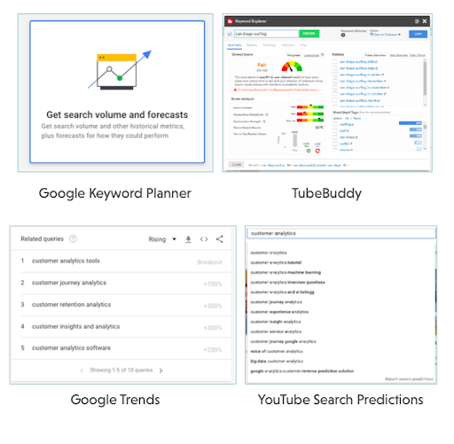
In addition, tools like TubeBuddy, Google Keyword Planner, Google Trends, and YouTube Search Predictions will help you learn what is working – and what’s not as you integrate SEO.
The post 6 Ways to Integrate SEO Across Teams appeared first on Content Marketing Consulting and Social Media Strategy.
Source: convinceandconvert.com

The Best Website Builders (In-Depth Review)
I’ve been building websites for years. It’s way easier now than it used to be. You can go simple or take your site to the next level–no programming or design experience is necessary.
There are a handful of popular options that will get you to where you want to go. However, the best website builders have different strengths and limitations.

Disclosure: This content is reader-supported, which means if you click on some of our links that we may earn a commission.
I use WordPress because I can do exactly what I want and support millions of visitors to my blog each month.
It might work for you, but some of my other top picks could work better, depending on what you are trying to do.
5 Best Website Builders
Here are the five best website builders you can start using today.
I’ve included in-depth reviews to help you get a sense of why each product is so good.
Take control and manage every detail of your site.
Or, use my number one pick to have the website build itself.
Your call.
#1 – Wix Review — The Best for General Use
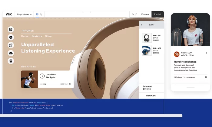
Wix is a really easy website builder that can help you create what you want.
Start with a template and customize from there.
You do not have to know anything about design to put together a really sharp-looking website.
And you’re not stuck going one way or the other.
Make a blog, online store, whatever you want.
And if you don’t feel like dragging and dropping the different site elements into place, simply answer a few questions, and Wix Artificial Design Intelligence (ADI) will build a site for you.
Wix is truly the “jack of all trades” in the sense that it does everything well, but nothing is truly exceptional.
However, it serves its purpose for the average person looking to set up a website, and the price is extremely competitive.
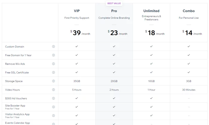
Pros of Wix
Here are the best things about Wix:
Powerful app market –
Wix has an enormous amount of add-on features that you can access through their app market.
Want to book meetings directly on your site?
They have got you covered.
Want a live chat pop-up box?
Simply click and install it on your site.
Covers every need –
Wix covers most of the needs of people looking to set up a website.
This includes setting up an ecommerce store, blog, or even just a simple information website.
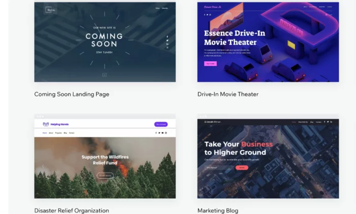
Lots of templates –
Wix has a wide variety of templates that you can choose from to get your website up and running quickly.
Their templates are well designed and take the user experience into consideration.
Cons of Wix
Here are the weaker parts about Wix:
No migration –
A huge downside with Wix is that you’re locked in, so you cannot take the code of your website somewhere else later on. This can cause problems if you quickly need to scale your business.
Jack of all trades, master of none –
Wix’s main strength is also its weakness.
Although it has many features, it cannot compete with the quality of niche website builders.
Who should use Wix?
Small businesses –
If you are offering a service such as legal advice or marketing,
Wix is a solid website builder that will handle all of your needs.
If your focus is selling products online, avoid Wix.
Freelancers and professionals –
In a similar manner, Wix is great for professionals who want to showcase their personal brand. It will allow you to cover all the potential bases of highlighting your portfolio, such as taking meetings and even blogging.
#2 – Weebly Review — The Best for Beginners
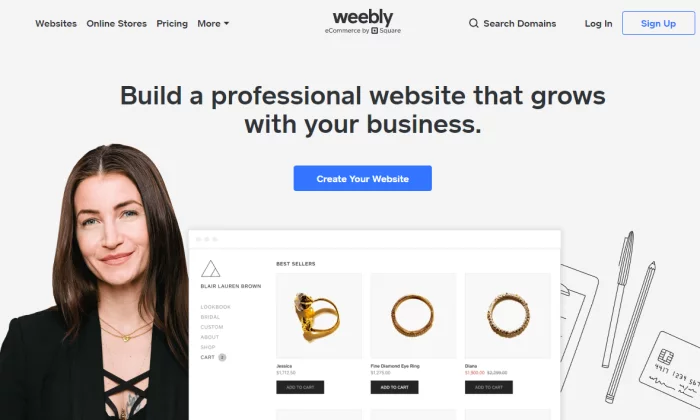
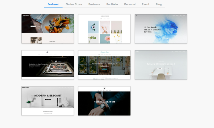
Next, we have Weebly, which is a drag-and-drop site builder that prides itself on its ease of use.
Weebly currently powers over 50 million websites and has been around since 2006, which is a huge achievement and testament to how effective the platform is.
So, what has caused Weebly to be consistently favored among users?
It comes down to the simple user experience and short learning curve.
Weebly does not bombard you with features or a complicated interface.
Instead, it allows you to get straight to the point of setting up your website.
Pros of Weebly
Here are the best things about Weebly:
- Simple and easy to use – Weebly has a simple interface with drag and drop mechanics that just work. Everything feels natural and intuitive. It also helps that they have an onboarding mechanic with email and popup explanations when you get started.
- Migration – If you decide you want to host your own website, Weebly makes it easy for you to take your site off their platform.
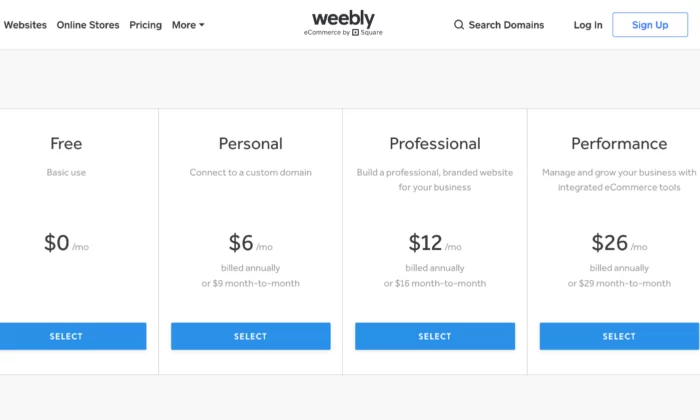
- Affordable – Compared to other generalist website builders, Weebly has one of the most affordable pricing structures.
- Great customer support – Weebly has a powerful customer support team who are active every day of the week. They typically reply within 1 day by email or even quicker via their live chat or phone lines.
- Online store capability – While limited on its free and lower-tier plans, Weebly allows you to set up a web store powered by Square. If you’re already using Square as a payment processor, Weebly allows a cheap and easy way to start selling products online.
Cons of Weebly
Here are the weaker parts about Weebly
- Lacks diversity of function – The tradeoff of using Weebly is that it is not as powerful as Wix. For example, there are fewer features. In addition, some features such as their content management system and analytic tools are much weaker than competitors.
- Limited customization – As Weebly uses a drop and drop interface and themes, the customization can be quite limited. Wix also has this problem, but they have more tools at their disposal to solve this issue.
- Scaling problems – Weebly is simply not a great platform if you have plans to grow your website in a significant way: it is just a simple website builder for day-to-day users.
Who should use Weebly?
People who need simple websites – As a rule, you should use Weebly if you are not very tech-savvy and want to set up a simple website quickly. One category of users would be associations or clubs who want to set up an information site about their group.
#3 – Web.com Review — The Best for Building Landing Pages
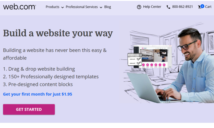
Web.com is a lot like Weebly—it’s fantastically easy to use, with an intuitive drag-and-drop editor that lets you mold any available template to your needs.
And it comes at a great price and with great support.
But I think Web.com’s website builder shines brightest for a particular need: setting up landing pages and single-page sites in a snap.
Seriously, it’s so easy with Web.com—start from one of their 126 templates, then just tweak the colors, swap out some imagery, replace the copy, and add a custom form.
Voila, you have a gorgeous landing page, done in about 15 to 20 minutes.
You can build a ton of unique landing pages in one sitting or make simple or temporary websites with ease.
And at a competitive price, too.
Pros of Web.com
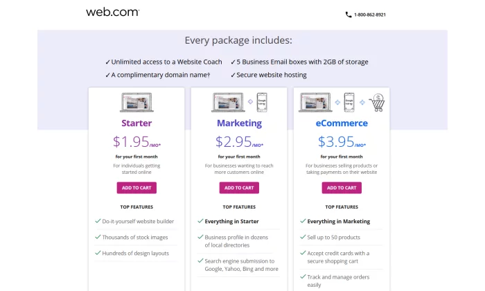
- Email accounts – Web.com gives you five email accounts to match your domain. That’s a boon for folks building landing pages with Web.com—not only can you get multiple sites up in a flash, but each can have separate associated email addresses for doing split testing or for collecting contest entries in a place where they won’t overwhelm someone else’s inbox.
- Free domain for one year – Web.com will throw in one year of an available domain for free when your purchase one of their website builder plans.
- Very affordable – Everything I mentioned above is in the Starter plan, which starts at $1.95 for your first month and then is $10 per month after that. You can save big, though, if just go for a full year at checkout—that’s just $50 for the whole 12 months, a savings of over $60.
Cons of Web.com
- No building from scratch – You are somewhat penned in by the templates available to start from. It’s easy enough to customize them far away from the original look, but some elements are permanent or at least inflexible, which can make it harder to quickly build the exact site you had in your mind.
- Limited eCommerce features – Web.com also has Marketing and eCommerce plans for their website building service. They’re a little more expensive and more appropriate for standalone business sites, especially for local and small businesses. But more advanced selling features are missing overall.
Who should use Web.com?
Salespeople and marketers working on multiple campaigns – If you want to knock out landing pages in no time flat and get the useful benefits of email and domain included, go with Web.com and enjoy every bit of value you get from their Starter package.
Get started with Web.com today.
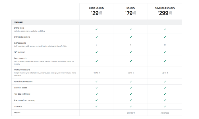
#4 – Shopify Review — The Best for Ecommerce
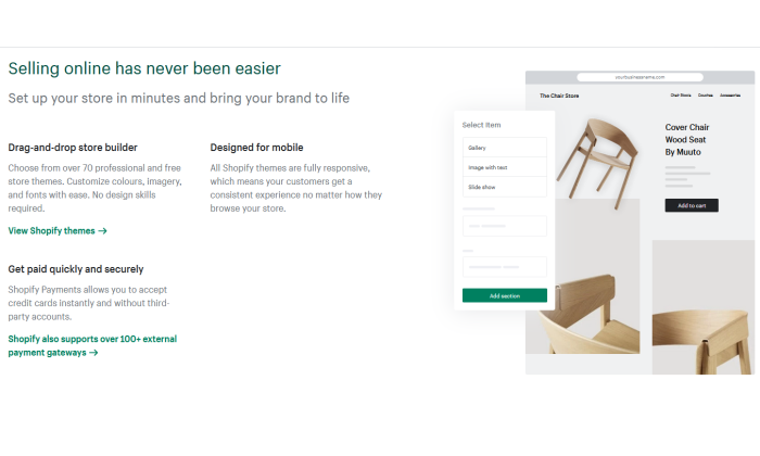
If you plan on selling any type of product online – from jewelry to electric scooters – then your best bet will be to use a dedicated ecommerce platform and website builder.
Without a doubt, the number one in this category is Shopify.
The platform powers over 1 million merchants in 175 different countries, and is the third-largest online retailer in the US, trailing behind only Amazon and eBay.
The Shopify software represents a complete end-to-end platform that allows you to set up, manage, and promote a store online. You can easily list your goods for sale, take payments, and fulfill orders – all under one roof.
Pros of Shopify
Here are the best things about Shopify:
- Ecommerce specialty – The main draw of Shopify is that it is a niche website builder focused on setting up an ecommerce store. This means that all their features and processes are geared toward that end, resulting in a powerful platform that can help maximize sales.
- Security – If you are going to be handling transactions, you need ways to keep your site safe and customer data secure. Shopify stores have strong cybersecurity measures in place which a self-hosted website would typically lack.
- Integrated sales channels – Shopify has strong integrations with other platforms, such as Facebook and Amazon. This allows you to streamline your sales by managing your catalog on each platform under one roof.
Cons of Shopify
Here are the weaker aspects of Shopify:
- Niche focus on ecommerce – Because the focus is on ecommerce, Shopify lacks some of the features and finesse of other website builders. For instance, their content management system is very limited compared to WordPress.
- Transaction fees + monthly fees – With each sale, you make on Shopify, there is a transaction fee that ranges from 2.4% – 2.6%. Combined with payment provider fees, this can eat into your margin.
Who should use Shopify?
- Brick and mortar stores – If you have an in-person store and are looking to sell your products online, Shopify will offer you a solid footing into the digital world.
- Ecommerce startups – Entrepreneurs that are starting new brands or drop shipping will also benefit from the quick end-to-end setup that Shopify offers.
#5 – WordPress Review — The Best for Content Management
One of the oldest and most reliable website builders is WordPress.
The platform has come a long way since it launched in 2003 and is the most popular content management system on the web today.
In fact, WordPress powers a whopping 37.6% of all websites.
As WordPress was around during the earlier days of the web, its focus revolved around content, which was the most prominent form of the website at the time.
It maintains that focus to this day, with WordPress having arguably the best content management system out of all the different website builders.
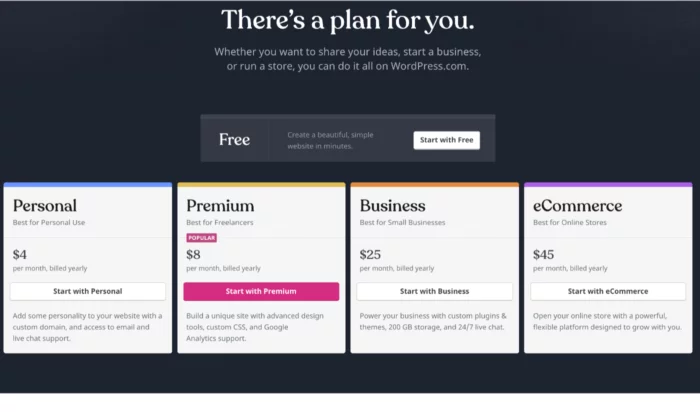
An important caveat is that WordPress is divided into platforms:
- WordPress.org – This is the open-source (free version) of WordPress that comes with greater flexibility, but is harder for non-technical users.
- WordPress.com – This is the paid version. You can get help with the installation of themes and management but is generally less customizable.
Pros of WordPress
Here are the best things about WordPress:
- You have full control – Unlike other website builders, WordPress is fully customizable as the site is developed directly with code, as opposed to drag and drop interfaces. This means that you have much more flexibility in terms of design and function.
- Robust blogging and CMS – WordPress is built front the ground up with content in mind. It has some of the best tools for publishing and managing content including team management, advanced scheduling, and categorizations.
- Lots of plugins – There are over 52,000 plugins available for WordPress. You can measure and boost your SEO with plugins such as YoastSEO, or you could even add a new function such as a shopping cart.
Cons of WordPress
Here are the weaker aspects of WordPress:
You may need help – As your WordPress site is developed with code, you will likely need help to install and update your WordPress theme. This can come with a hefty cost, particularly if you want ongoing changes.
Learning curve – If you want to manage and update your site yourself, it can take some time to learn how to do so. Managing and scheduling posts are relatively easy, but updating how your site looks or installing a plugin is much more difficult.
Security issues – As your WordPress site is self-hosted, you are more vulnerable to cybersecurity issues. Some of the plugins for WordPress also can act as a risk as well.
Who should use it?
- Bloggers – If writing is your main focus, then WordPress is a great choice. The platform is designed for bloggers, optimizing content management, and SEO. WordPress will allow you to scale and get the most out of your content.
- Content-centric businesses – Likewise, if you are building a business that is content-heavy, such as a new website, WordPress will help you to manage the operational side of content production much easier.
What I Looked at to Find the Best Website Builder
Now it is time to take a closer look at some of the specific features to consider when evaluating a website builder.
Remember that although some website builders may fall into the same category, each may suit your needs differently.
For instance, you may be setting up an online shop and your primary consideration may be a low learning curve, whereas somebody else may be thinking about a platform that can allow them to scale easily.
Here are some features you should consider.
Ease of use
Things to consider:
- Intuitiveness – Some website builders are easy to use and have simple interfaces with drag and drop functionality. This is useful as you won’t have to Google the change you want to make with the tool.
- Learning curve – If you are not great with technology, it is unlikely you will want to spend hours learning how to set up a website. Some website builders are much easier than others.
- Setup time – Similarly, you may want to get your site up and running immediately, particularly if it is an event you want to promote.
- Ongoing management – Needing external help to manage your site defeats the purpose of a website builder. It must be easy to manage in terms of updates.
If you are new to setting up online or are time-constrained, how easy it is to get started will likely be your primary concern.
Scalability
Things to consider:
- Custom code – Website builders use standardized code, which is the building block of a website. These allow you to easily create a site with various features. In some cases, however, you may need your own custom features and the ability to write your own code.
- Migration – At some point, you may want to host your website yourself. However, not all website builders allow you to easily make this move. In some cases, you may have to redevelop your site from scratch.
- Integrations – You will probably create new goals as your website grows, such as running ads or embedding social feeds. Some website builders are more compatible with other platforms and are easier to integrate.
You should think strongly about scalability if you are already an established business looking to create an online presence. This is particularly true if you are already selling products at scale in the real world.
Startups in the fundraising process and are looking to scale fast or even change the core features of their product should also take caution here.
Support
Things to consider:
- Support channels – You will need to consider the different ways you can get in touch with support teams such as live chat, email, and phone. In-depth FAQs (frequently asked questions) are also important.
- Responsiveness – If your site breaks at 5 PM eastern time, but their support only works European hours, then you are in trouble. Some teams may also respond much quicker than others.
- Engagement – Unfortunately, some support teams are useless. Maybe they are being paid very little so they do not care, or they are overworked. Either way, you need support that can actually solve your problems.
If you plan on running a site with a lot of visitors and it happens to go down, the last thing you want is an unresponsive support team. This is especially true if you plan on driving a lot of traffic at a given time.
A website builder with a strong support team is also useful if you are just getting started online, considering you may still get stuck, even with simple interfaces.
Price
Things to consider:
- Cost – Some website builders can be more costly, with some reaching upwards of $299 a month (for landing pages, for instance). Others are permanently free with the option to upgrade for a small monthly fee.
- Trial – Before you commit, it can be useful to take advantage of a trial offer to play around with the tools. You will likely find that some are a better fit than others.
- Hosting & domain – Most website builders will host your website on the web, which is typically included in the price. Some may also offer a domain as part of the package. Otherwise, you would have to purchase these yourself.
If you plan on making money from your website, either by selling products directly or capturing leads, then price should not be a key consideration for you. Make an investment in the best service for your needs.
However, if you just want to set up a small information site, then you could do with the cheapest options.
Generally, website builders that have feature depth are typically more expensive as they solve more specific problems.
Features
Things to consider:
- Ecommerce shop – If you plan to sell things online, you need a website builder that allows you to do so. Consider sub-features such as payment processing and product catalogs.
- SEO – Some website builders have tools that allow you to rank better in Google searches.
- Marketing tools – You may also need other marketing tools, such as forms, pop-ups, and chat boxes.
- Community – In some cases, you may want to expand your website into a community where people can communicate and network (otherwise known as a forum).
- Analytic tools – Website builders may also offer analytic tools that help track traffic on your website or at least integrate with other tools that do.
- Niche features – Perhaps there are some special features you are looking for such as the ability to set up a crowdfunding campaign in addition to having a standard website.
The features of a website builder are the main thing to consider when deciding which route to follow.
This is because they will have the most impact on your specific goals.
For instance, if you want to set up a landing page for a specific product, trying to optimize with a generic site builder will be a pain.
It will probably lack the in-depth analytic tools that a dedicated landing page builder would have.
Also keep in mind that there are some features that you may not need now, but you could need in the future, such as if you plan on running paid ads to your blog posts.
Design
Things to consider:
- Themes and templates – Website builders allow you to start with a predesigned website that is customizable to various extents. Some themes serve different purposes in terms of branding and utility.
- Mobile-friendliness – You will need to ensure that your website builder automatically makes your website easy for mobile users, typically with responsive design.
- Customization – It is likely you will want to make some changes to your template. You will need to consider the various customization tools available.
Regardless of your goal, you should always be concerned with providing a great user experience to the people who are visiting your site.
It simply makes logical sense – if your site is hard to navigate, people won’t get the most out of it.
The actual design and branding are important too.
For instance, some designs are more corporate while others are more welcoming.
There may be a design template that really suits your particular brand.
And if you are selling something, you need to ensure that the design is optimized to increase conversions.
Now that you have a good understanding of the types of website builders and the features to look out for, it is time to take a look at some of the best website builders on the market.
Conclusion
An important thing to keep in mind is that the website builders listed above can serve multiple functions. Now that you have a solid overview, it’s time to look into the details of each platform.
Use my recommendations as a guide to get started:
Follow the links to further explore each option. The best choice for you will come down to both your needs at the moment and where you plan on taking your website in the future.
After reading reviews like this one, make sure you take a step back and put your particular needs at the forefront of the decision before you commit.
Source: feedproxy.google.com

How to Create a Lead Generation Minisite in 3 Steps – Tips & Tools
Do you have a long list of domains you never had time to create a website for?
Who doesn’t, right?
Here’s an idea for at least one or two of those: set up a lead generation website.

I have an SEO background, so in most cases, my advice would be: keep everything on your main site.
Don’t dilute the brand.
Why Do You Need a Separate Minisite for Your Brand?
Yet, there are several reasons why you may want to set up a separate minisite for your brand.
These reasons include:
For personal branding reasons.
Ok, I have my business and my main site, but what do I do with myname.com domains which I rightfully registered so no one else would?
Should I just keep it empty?
I don’t have time to maintain another site!
That’s when a one-page “portfolio” style website makes total sense.

When you need to take an extra position in SERPs.
This makes sense for brand-driven search results.
Google will usually grant you one — maximum of two — positions when people search for your name in combination with another term, but, obviously, you’d want to control more of those search engine result pages.
Let’s say people are searching for something like [your-name coupons], there will be lots of third-party (affiliate) sites that will potentially drive those customers away by showing your competitors or showing ads.
So grabbing a separate domain, like your-name-coupons.online and curating the most recent special deals of yours would give you more control of that search.

When you are launching a completely different project.
I am an SEO and suddenly decide to write a book on being a mom.
It is a good idea for me to register a domain (which would match my book title) to start collecting leads for my future book independently of my main business.
In all the above cases, getting those sites to rank and drive some organic visibility will be quite doable.
When it comes to personal brand or brand-driven queries, all it takes is to set up a minisite and link to it from your main site.
That being said, keeping all links and brand exposure consolidated around your main site is obviously smart, yet there are many cases when you need a separate entity.
On top of that, you are likely to be busy and cannot spare much time for your new site, so let’s keep things easy.

How to Set Up a Mini Lead Generation Site
Here’s how to set up a mini lead generation site:
1. Pick a Domain
This step is getting harder and harder now that it is becoming next to impossible to find an available .com domain that wouldn’t be all dashes.
I’ve got good news for you:
There are lots of options beyond .com domains, and all of them are equally effective.
There’s a cool tool that will help you pick a great domain and even help with branding.
Namify is what that tool is called, and it’s a time saver!
The tool allows you to find a cool brandable name in minutes. Unlike other domain name generators, it focuses on short names that create niche associations and are easy to remember.
You’ll love those ideas.
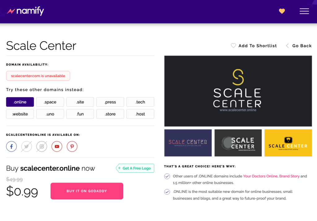
On top of that, Namify will draft your visual brand identity (logo and color scheme) for you to use right away:
2. Set Up Your Site
When dealing with a secondary asset (which is not your main site), the easier the setup, the better.
With that in mind, I suggest using WordPress, which makes it incredibly easy to create a website.
Here’s a detailed beginner-friendly guide on making a WordPress site.
All you need is to follow the steps.
And here’s a huge collection of one-page WordPress themes (both free and paid) which are easy to customize to match your chosen color scheme, logo, or your main brand.
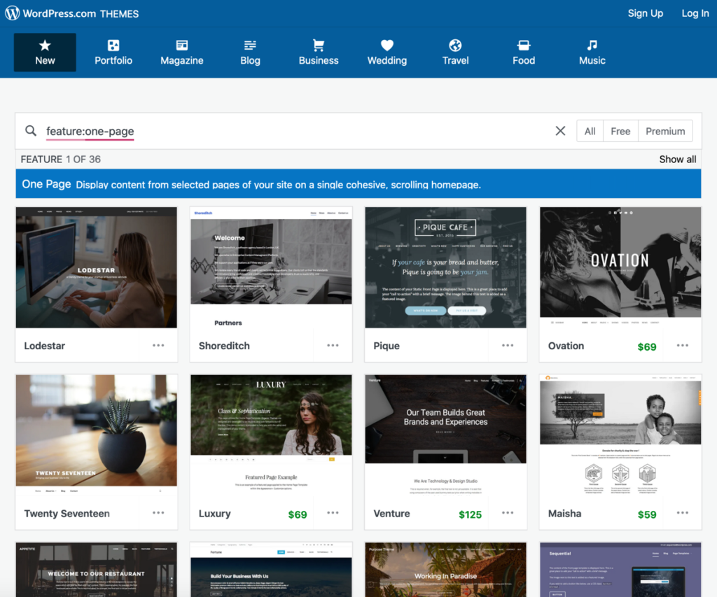
There are tons of one-page WordPress themes to choose from.
Once the basic setup is done, it is time to create your content.
To make it easier, try running Text Optimizer for your core search query — it basically writes content for you.
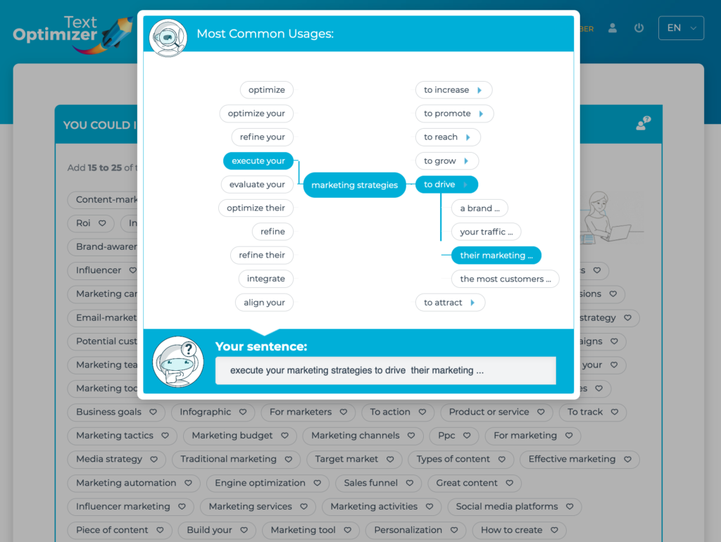
I use Text Optimizer to create the core structure of my page: the subheadings, introduction and key points to be covered.
After that, I write my text.
This has been the biggest writing productivity booster I’ve ever tried.
Since this is going to be a website focusing on collecting leads, using Text Optimizer is a great idea because it is also an intent optimization tool that makes sure your copy meets your site visitors’ expectations and hence increases the conversions.
3. Set up Your Lead Generation Funnel
Finally, setting up a clear lead generation funnel is something you will be focusing on.
Obviously, you will need to keep experimenting with your CTA wording and placement, here but here are a few ideas for you to get started:
3.1 Set up your lead generation forms
Setting up a lead generation form doesn’t require any technical skills these days.
Here are a few easy-to-use online form builders you can use to create a form to collect leads from your site visitors:
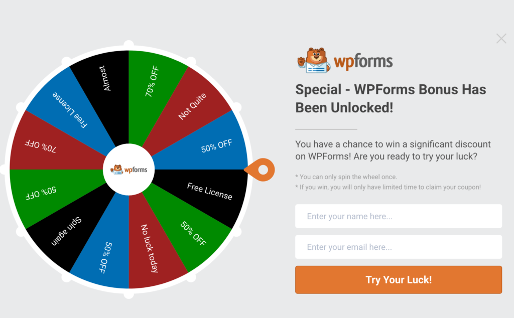
Don’t be afraid to gamify your lead generation web forms and make them fun!
3.2 Implement secondary engagement triggers
No matter how cool your web forms are going to be, the majority of your site visitors may feel wary of giving you their email addresses.
Some people may be in a hurry; others may not have enough trust in your brand.
Regardless of the reason, these people may be willing to convert a bit later.
So coming up with additional engagement triggers is helpful:
- Install Facebook pixel to be able to reach out to those visitors through Facebook ads
- Try using a smart chatbot or feedback widgets to get those people to talk to you without sharing their personal details. This may encourage them to follow your conversion funnel on a later basis.
- Use more traffic-driving conversion optimization tactics to engage more of your site visitors. Remember that certain conversion optimization tactics will also improve your rankings, so it is well worth the effort.
3.3 A/B test often
Again, this is going to be an ongoing process: When it comes to generating leads, there’s never “good enough.”
You need to experiment with new engagement triggers and change your forms on a regular basis.
This is where A/B testing to identify your better-working tactic is always a good idea.
I know lots of marketers who shy away from A/B testing because it is deemed too technical.
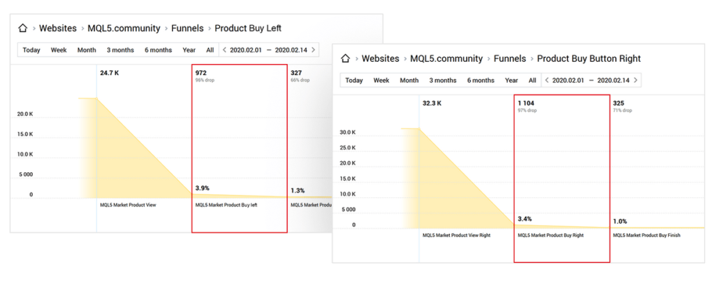
Finteza is a web analytics tool that makes A/B testing easy and available to anyone. Here’s how to run A/B tests using Finteza.
Conclusion
If setting up a minisite to claim your old but neglected domains have been on your mind for quite some time, I hope this guide will finally get you up and running.
I did my best to make it as easy to follow and implement as possible.
When it comes to lead generation, every bit helps, and who knows, maybe this site will drive some great leads.
The post How to Create a Lead Generation Minisite in 3 Steps – Tips & Tools appeared first on Content Marketing Consulting and Social Media Strategy.
Source: convinceandconvert.com

Best WordPress Backup Plugins
If you get hacked or accidentally lose your password, you’ll save yourself the massive headache of losing everything on your site. But only if you have a backup plugin installed.

Disclosure: This content is reader-supported, which means if you click on some of our links that we may earn a commission.
What would happen to your WordPress site if all your data was wiped out?
If you don’t have a clear answer to this question, then you’ve landed in the right place.
Using a WordPress backup plugin is one of the smartest things you can do to ensure your site is protected from disaster.
If you get hacked or accidentally lose your password, you’ll save yourself the massive headache of losing everything on your site. But only if you have a backup plugin installed.
Without one, you’d be back to square one.
But which WordPress backup plugin should you use?
You’ve got options.
In this post, I’ve reviewed my top five recommendations and included a short buyer’s guide to help you figure out which one fits your needs.
Ready?
Let’s make sure your site’s backed up.
Top WordPress Backup Plugins
#1 – Backup Buddy Review — The Best For Efficiently Restoring Your Site
Like Backup Buddy rhetorically asks on their site, “What good is a backup if you don’t also have a way to restore your site properly?”
And they couldn’t be more right.
Backup Buddy ensures you always have the latest backup of your site by providing you with a zip file you can use to upload and restore a broken site.
Once uploaded, Backup Buddy seamlessly walks you through the steps to get your media files, text, plugins, and more back up and running.
Additionally, you can choose to restore individual files instead of restoring the whole site if that’s what you want to do.
You can even schedule automated backups at intervals you customize.
Some top features of Backup Buddy include:
- Backs up your entire WordPress installation
- Customizable backup content that you can pick and choose to restore
- Offers hourly, twice daily, daily, biweekly, weekly or monthly backups
- Automatically sends your backup files to access remote storage locations like Dropbox or Google Drive
Backup Buddy has three pricing options, all with one-time fees:
- Blogger — $80 for one site
- Freelancer — $127 for up to 10 sites
- Gold — $199 for backing up unlimited sites
You can quickly sign up and get started with BackUp Buddy here.
#2 – WPvivid Backup Pro Review — The Best For Migrations
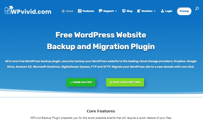
WPvivid Backup Pro is a great backup plugin you can safely set up and start using to migrate your site.
They’ve been used on more than 90,000 websites to do more than just back up and safely migrate data files.
WPvivid Backup Pro offers incremental backups to ensure it isn’t slowing down your site as it works in the background to backup all your data once it’s been configured to your needs.
As far as its backup migration capabilities, WPvivid Backup Pro supports manual migration methods, as well as auto migration and migration via remote storage (as a premium feature).
Some of WPvivid’s best features include:
- Create either manual or scheduled backups
- Advanced migration features in case you want to migrate your site quickly
- The ability to create a staging site
- It backs up all your core WordPress files
- 24/7 ticket support
- Set a size limit for files that you’re not interested in backing up
Here’s a quick look at their pricing packages:
- Basic — $49 per year for up to three websites
- Freelancer — $99 per year for up to 100 websites
- If you get hacked or accidentally lose your password, you’ll save yourself the massive headache of losing everything on your site. But only if you have a backup plugin installed. — $149 per year for unlimited websites
All three plans are annual subscriptions, unlike other backup plugins, many of which are a one-time licensing fee.
WPvivid also offers a 14-day free trial, visiting so you can test it out before you purchase a plan.
#3 – JetPack Review — The Best For Making Site Changes Safely
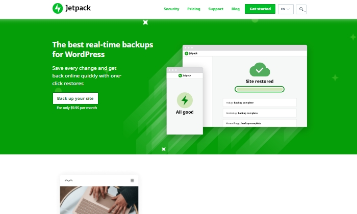
Jetpack is a strong contender for a reliable backup plugin that works great for making site changes safely.
Picture this:
You’re making exciting new changes to your site, whether that’s CSS customization, adding new plugins, or altering your core site files.
Then suddenly, something breaks.
With Jetpack, you can quickly restore your site to how it was before you made that crucial mistake with just a few clicks.
This makes it an easy and reliable plugin to work with if you’re constantly updating your website.
The Jetpack plugin even comes complete with a mobile app so that you can virtually restore your website right from your phone no matter where you are.
Plus, Jetpack offers plenty of security features, too.
This can only be a plus for a backup plugin and makes it worth keeping in your corner.
Some top features of Jetpack include:
- Provides malware scanning and protects your site from spam
- Downtime monitoring lets you know if your site is down immediately
- Malicious hacking and attack protection
- The mobile app you can take and use with you everywhere
- Automatically cleans up spam comments off your site
If you choose to go with JetPack, the question becomes what kind of pricing package you’ll feel comfortable going with, as there are many options.
The three main packages are:
- Backup Daily — $7.95 per month billed yearly
- Security Daily — $19.95 per month billed yearly
- Complete — $79.95 per month billed yearly
The Backup Daily tier offers automated backups, one-click restores, and unlimited site storage.
On the other end, Complete provides the full Jetpack suite, including real-time security, enhanced search, CRM features, and even design tools.
Jetpack also offers a limited free forever plan that includes basic site protection, downtime monitoring, and changelogs.
Additional product bundles you can purchase separately on a per month basis include a Security Real-Time plan, a Real-Time Backup plan, a Scan package, an Anti-spam bundle, a Site Search plan, and the CRM Entrepreneur add-on.
Jetpack offers peace of mind by providing one-click restore options and monitoring your website’s security at pretty affordable rates.
Still, I recommend you visit their comparison page to ensure you’re deciding on the right backup bundle.
Start using Jetpack’s powerful backup features here.
#4 – BlogVault Review — The Best All-In-One Backup Solution
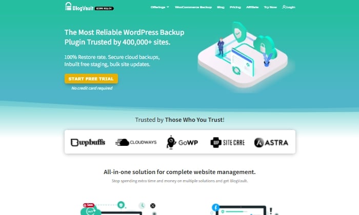
BlogVault makes for a reliable all-in-one backup plugin that ensures your site’s backup is stored securely in the cloud.
It’s used by over 4,000,000 websites and trusted by businesses like Astra, Cloudways, and GoWP.
BlogVault’s plugin offers key storage features like changelogs that can help you identify problematic modifications to your website.
They go as far as providing 90-day archives to ensure you recover from any site mistakes, which are bound to happen at some point in your site’s lifetime.
If your site experiences downtime, with BlogVault, you can make it so that your site’s backup still shows up to users. What exactly does BlogVault backup?
Everything from the basics like blog posts, your media library, and media files to blog comments, plugin files, WordPress settings, categories and tags, theme settings, WordPress core files, and even user details.
Because of how complete and robust BlogVault is as a plugin, it’s one of my favorite backup plugin recommendations to make.
Some of BlogVault’s best features are:
- Provides centralized dashboard where you can manage multiple sites
- Provides custom WooCommerce table backups
- Performance checks that inform you about site speed and ways to improve your site
- Get uptime and downtime status checks
- Handy customer support that gets in contact with you in less than 24 hours
- Incremental backup option available so the plugin doesn’t slow down your site
If you’re not in love with everything BlogVault offers yet, take a look at their affordable pricing tiers:
- Personal — $7.40 per month for daily backups
- Plus — $12.40 per month for daily backups
- Advanced — $20.75 per month for real-time backups
You can definitely take them for a test drive with their free trial.
Otherwise, get started using BlogVault here.
#5 – UpdraftPlus Review — The Best Free Backup Plugin
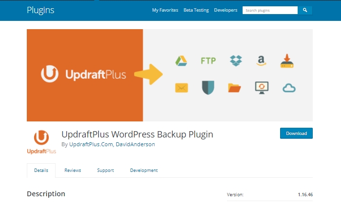
If you’re looking for a free backup plugin, look no further than UpdraftPlus.
It makes restoring all your site files hassle-free and straightforward.
It has over 3,000,000 active installations and is a reliable backup option if you are running your site on a shoestring budget.
UpdraftPlus has a paid version you can upgrade to with a lot more features and capabilities.
But for now, we’ll focus on what the free version can do for your site.
UpdraftPlus is a cloud-based plugin that ensures you have access to your site’s files and data in case of cyberattacks, server crashes, conflicting plugins, or anything else that would bring your site down.
Once you upload the UdraftPlus plugin, you can set it up, forget it, and let it run in the background while you work on more important tasks for your business.
Best features of UpdraftPlus:
- Backup to an exhaustive list of cloud options
- Lets you set up automated backup schedules for convenience
- Uses fewer server resources than other free backup plugins
- Has the ability to restore your site
Updraft Plus is free, and you can read reviews and download it here.
What I Looked At To Find The Best WordPress Backup Plugins
The most basic use of a backup plugin is to keep updated backups of your site continuously.
There are plenty of plugins on the market that will do just that.
Here are some of the criteria I looked at to find the best plugin options for your WordPress site.
These will be helpful factors for you to think about as you choose which plugin to invest in.
Restoring Options and Complete Backups
If you’re frantically trying to get your site back up and running and want to restore it to how it was before it crashed, you’ll be thankful for a restoring option you can upload in minutes.
This way, you’re enabled to troubleshoot fast, save your rankings in search engines, and have a contingency plan for when things go south.
It’s a great feature to look for in any backup plugin you decide to use. Especially if their pricing features hook you into yearly subscriptions.
Along with quick restoring options, it’s a good idea to ensure your backup plugin does complete backups, meaning it backs up everything on your site from images to texts, themes, media files, and your whole database.
If your entire site goes down, a partial backup will be less useful.
Full backups are worth any extra cost.
Preventative Overload Configuration
It’s always a plus to know that a plugin was built to work with your site and not against it.
This means it was designed with every aspect of your site in mind.
This includes not overloading your site so that it slows down or has trouble loading.
Some of the best backup plugins allow for interval backups, configured so that your site doesn’t suffer from slow loading times.
As you probably know, load time is a crucial SEO factor that Google takes seriously as it decides where to place you in SERPs.
The fewer resources your backup plugin takes up, the better your chances of ranking on search engines.
Cloud Storage
This brings me to cloud storage as a desirable feature in a backup plugin.
It can be both a cost-effective and scalable option to give you peace of mind.
With cloud storage, you can store all your site information safely with your backup provider, where you’ll always have access to your data within minutes.
This also helps you minimize storage overhead and have easy access.
Bringing It All Together
Using a reliable WordPress backup plugin is one of the best ways to keep your site safe while you sleep soundly at night.
In the scenario that you lose everything on your site, meaning your files, images, blog posts, guides, PDFs, and more, you’ll want to be able to bring all of it back with a few clicks.
That’s where backup plugins come in.
To summarize the plugins I reviewed in this guide, take a quick look at the list below:
- Backup Buddy — The best for efficiently restoring your site
- WPvivid Backup — The best for migrations
- JetPack — The best for making site changes safely
- BlogVault — The best all-in-one backup solution
- UpdraftPlus — The best free backup plugin
Take a moment to check out each one so that you’re comfortable with your final plugin choice.
If you’re unsure, make sure to revisit this guide whenever you need it.
Now it’s your turn.
Which plugin do you use to backup your sites?
Comment below!
Source: feedproxy.google.com

How to Create Your First Website Like a Pro
You’ve decided to create your first website—great! I’m going to teach you to set up your site like you’ve done these thousands of times before.
Disclosure: This content is reader-supported, which means if you click on some of our links that we may earn a commission.
What You Should Know About Starting a Website
In order to get your website online, you will need a domain name and a web host.
A domain name is where people access your website. For QuickSprout, that would be www.quicksprout.com (also called a URL, the technical component of a domain name). A web host is a business that you pay to provide storage for all of your crucial website data.
Bluehost allows you to buy and register both a domain name and hosting plan.
What If I Want a Free Website?
You can start for free at WordPress.com.
To use the free plan, you will not need to register a domain name or choose a web hosting provider since your website will automatically be generated as a sub-domain of WordPress.com. For example, if you wanted to start a blog about vintage teacups, your URL could be www.vintageteacups.wordpress.com.
If you’re in this for the long haul, keep in mind that your audience will be much more likely to trust your brand if you own your domain name (i.e. www.vintageteacups.com). Investing in domain registration and hosting is the first step towards growing an independent business.
A Step-by-Step Guide to Creating Your First Website
Ready to get started? These 8 steps will walk you seamlessly through the process from sign-up to beginner content building so you won’t have to worry you’ve left anything out.
Step 1: Consider your website goals
Do you intend your website to be a portfolio of your work? A niche blog? An eCommerce site? You can do all of this and more via WordPress, which opens up the world wide web of possibility with its full-powered CMS.
How do you want to be known by your audience? That’s your business name.
And how do you want them to reach you? That’s your domain name.
Since your domain name will be a major face of your business, you’ll want to put some good thought into it.
A strong domain name serves your business goals by referencing your product or service. It should be catchy, memorable, and easy to type. Try for shorter rather than longer names where possible.
How can you come up with the right name?
Let’s take the two businesses we’re working on within this guide as an example.
WordPress is short, iconic, and evokes images of text (“word”) and potentially a printing press (“press”). It’s clear that their business model is based on sharing content.
Similarly, Bluehost includes the word “host,” suggesting they are a web host provider. The combination of “blue” and “host” is simple and catchy.
Both names are highly brandable and easy to remember.
Step 2: Choose your Bluehost plan
The benefit of hosting on Bluehost rather than just WordPress.com is that Bluehost takes care of your site’s security, speed, performance, and updates for you.
We recommend shared WordPress hosting, which gives you access to a server specifically attuned to the WordPress software package. This means that safety, security, and speed are all built in — put another way, managed for you.
To choose a plan, go to Bluehost’s pricing page. You’ll see this:
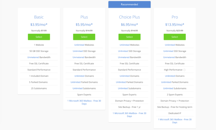
Bluehost offers four hosting plans: Basic, Plus, Choice Plus, and Pro. At every tier, the plans include a free SSL certificate (adding an extra layer of security to your site), unlimited bandwidth, and plenty of storage. For most sites, the performance of the hosting will be more than good enough.
Select the plan and that’s right for your budget. You can always upgrade later.
Step 3: Register your domain name
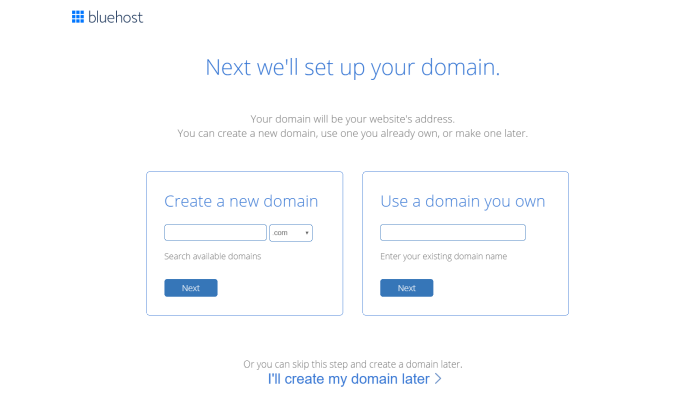
After selecting a plan, you’ll be prompted to register your domain name.
If you already own a domain name, enter it on the right. You may need to change your DNS records to make sure your domain name servers point to Bluehost, allowing people to access your website.
If you are registering your domain name with Bluehost, enter it on the left. Domain registration is free for one year with a managed WordPress hosting account. Always be sure to note when your domain must be renewed so it doesn’t expire without your notice, leaving your website inaccessible.
You’ll be asked to fill in personal information before finalizing your purchase.
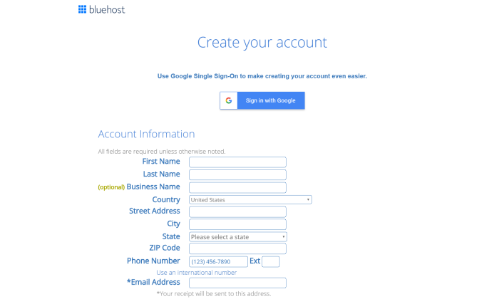
Be sure to choose a strong password for your Bluehost account (preferably not the same one you use to log into any other site). You’ll then be ready to install WordPress.
Step 4: Install WordPress with one click
Connecting Bluehost with WordPress is incredibly easy. In your Bluehost account control panel, navigate to “MOJO Marketplace” and choose “One-Click Installs.”
This will bring you to the Scripts and Platforms page. After you click the WordPress icon—found under “Blogs” at the top of the page—an installation window will open. Click “Start” to begin the installation.
Choose the domain name on your account where you want to install it. In the “Check Domain,” you’ll make sure your domain name is pointing to your account. This is especially important if you bought your domain name before signing up for Bluehost.
If you get a warning that you are overwriting files, you can check the box without worry—since this is your first website, there’s nothing to overwrite.
In “Show Advanced Options,” you can choose your WordPress username along with a strong password—or log in if you already have a WordPress account.
Check “Automatically create a new database for this installation.” Read the terms and conditions and check the box.
Almost there! Click “Install Now.”
You’ll now be taken to the progress page. After installation is complete, you will see your site URL, admin login URL, your username and password. Print and store this master list in a safe place.
Time to log in to WordPress! Log in at your admin URL and you’ll find yourself at the Dashboard, where you can begin on the visual design for your site.
Step 5: Try on some themes for size
Also called “skins,” your site theme is like an outfit for your website. The theme you choose will affect your site visuals, content layout, and some of the customizable design features you have access to.
WordPress has a number of both free and premium (paid) themes.
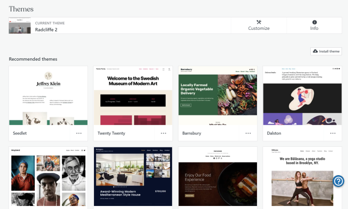
When choosing a theme, pay special attention to:
Good design: Is the design clean and organized? Is it responsive to optimize for the roughly 50% of people who prefer mobile viewing? How easy is it to navigate?
Compatibility: Is the theme compatible with the latest version of WordPress and with popular plugins?Back-end: Is there active development on the design? How easy is it to access support and documentation?
Most themes allow you to try a Live Demo so you can see how it will look and compare its appearance to your design and content goals for the site.
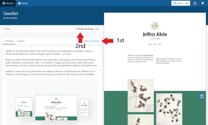
When you’re ready, click “Activate Theme” to install. You can always add plugins for additional functionalities or switch themes when you are better accustomed to WordPress.
Step 6: Add some helpful plugins
If your website theme is like a “skin” or outfit that gives the website substance, design, and form, your plugins are the accessories that pull the outfit together.
Plugins work alongside your theme to provide desirable functionalities, like a comment filter, contact form, or search engine optimization (SEO) toolbox, and are built to work seamlessly with WordPress’s back-end operations.
While some are best-suited to a particular type of site, like eCommerce or blog, many are all-purpose. Plugins can be free or paid.
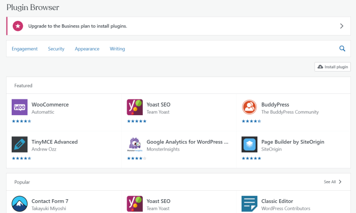
In most cases, you will need a WordPress Business plan or higher to use plugins. Aspects of Jetpack and Akismet (see below) are included with your blog.
Popular plugins:
Jetpack: This integral plugin enhances your site security, performance, marketing, and design capacity. Site speed, image serving, and SEO are just a few things it can help you with.
Akismet: A “spam-fighting service” that protects your posts, trackbacks, and messages from spam.
All-in-One SEO Pack or Yoast SEO: These SEO plugins help you optimize your site to be found organically in search results when people search for similar products, services, or content.
WP Forms or Ninja Forms: You can use either of these plugins to build professional contact forms within minutes, without any coding experience required.
Be sure to vet your plugins before installing: A large number of positive user reviews alongside information about the developer, functionalities, and latest release date can all help you make the best decisions for your site.
Step 7: Begin building your site content
On WordPress, there are two meaningful distinctions when it comes to organizing your site content, pages and posts.
Pages make up the main framework of your website, and generally appear in the navigation bar for easy access. There are a number of essential pages you’ll want to add, including your Homepage, About page, and Contact page.
Posts are individual pieces of content, each with a unique URL, that make up a blog. Many people choose to make their blog a central focus of their website, but you don’t have to.
Many businesses keep blogs as a tool in their content marketing toolbox, and WordPress makes it possible to designate as a secondary page (see Step 8).
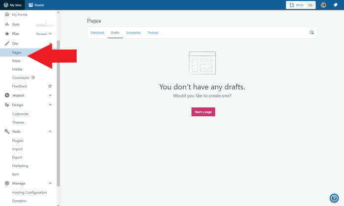
When you start adding content to your website, it may be helpful to get inspiration from existing websites, both those where you spend a lot of time and sites that have a similar function to yours. Ask yourself:
How is the content of these websites organized? What are the major pages? How prominent is the blog? Does the site include subpages, and what are they? Where is the contact form located? How do they use media to create an engaging experience?
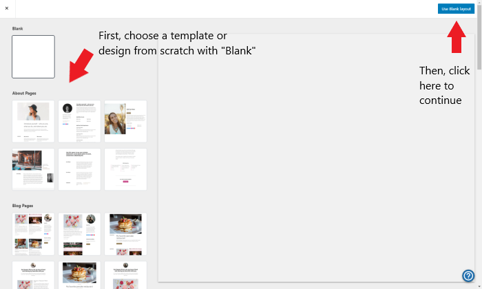
Here’s how to create your first page (ideally, the homepage):
After creating the essential pages, consider your website’s functionality from the point of view of your future site visitors.
Although it may be tough in the beginning to put yourself in their shoes, successful site content is laser-focused on the audience.
Ask yourself:
What will my visitors want to do on my site? What will be less useful to them?How can I structure my pages, content, and media to create a positive User Experience (UX)?
How can I set up site navigation so that important information and features are easy to find? What information do my visitors need to understand my offering?
What information do my visitors need to trust me?
Don’t feel pressure to include all possible content at once; less is often more for a new website. Your site will likely change over time based on your evolving business model as well as the needs of your audience. You can always add more content as you go.
Additional pages
On the one hand, the beauty of website creation is that your site design is completely up to you. Depending on the purpose of your website, however, you may be required by law to include certain content, like:
Contact details, Cookie handling, Commerce: terms of service, refund policy, privacy policy
Be sure to check the relevant law in your area and update your website regularly.
Step 8: Finalize your homepage and navigation
Do you want your homepage to appear as a traditional homepage or a blog?
WordPress allows you to choose whether you want a static (unchanging) or dynamic homepage (shows your ten latest blogs). The dynamic version is the default.
To designate a static homepage, find the “Site” category in the left-hand sidebar and click “Pages,” then “Add new page.” You can choose a premade layout or click “Use Blank Layout,” as in the photo just above. Then name your page and click “Publish.” For example:
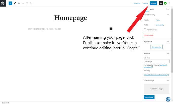
Now, navigate to the “Design” category in the left-hand sidebar of your Dashboard and click “Customize.”
There are many things for you to play around with here, including adding your Site Title, Tagline, and Icon, adding a header or footer, and changing the site colors.
For now, click on “Homepage Settings” and toggle the option for “A static page.” Beneath, you can choose the page you just created.
It’s time to start adding content to your homepage!
Once you add more pages, like About or Contact, they will show up as part of a navigation bar that is designated by your theme. In “Customize,” click on “Menus” to change the page order and location.

What’s Next?
You’ve just created your first website. Congratulations on this exciting new step!
Now you can start familiarizing yourself with the WordPress interface. While creating Pages and Posts, you’ll be using the Block Editor, which uses Gutenberg blocks to help you add content and make your site engaging and interactive.
Since your website is a representation of your brand, I recommend building your content with a critical eye. At the same time, learning as you go is part of the experience.
You can always delete or click the back button—no change is permanent, so feel free to play around.
The post How to Create Your First Website Like a Pro appeared first on Neil Patel.
Source: feedproxy.google.com

5 Data-Driven Content Marketing Tips You Need to Use Now
These days, marketers have access to powerful competitive research tools that reveal almost everything about competitors’ marketing tactics: what search keywords they focus on, how they build links, and even how much traffic they are able to generate.
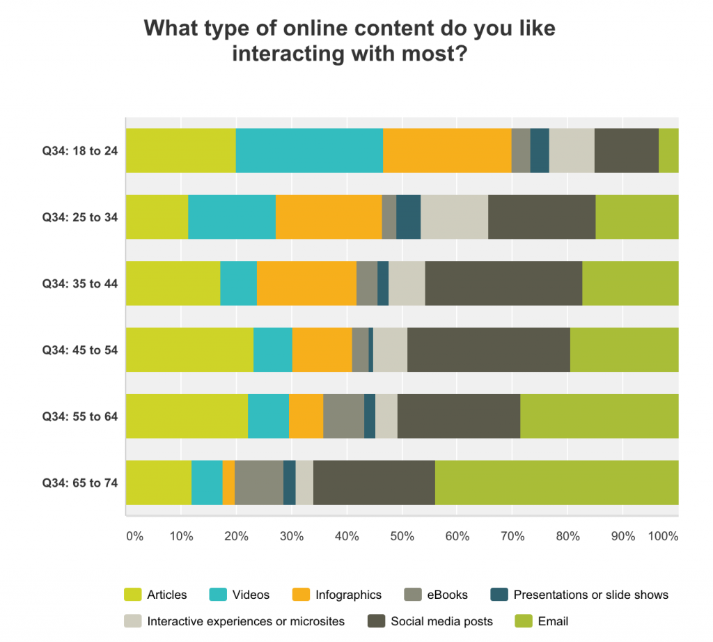
The bad news is there’s an opposite side of that coin: your competitors have the same amount of insight.
In other words, you and your competitors are operating based on the publicly available data, which makes it even tougher to succeed.
As we all know, a smart approach to content marketing is a data-driven approach.
Yet, the smartest approach to marketing is to prioritize your own data —something no one else has.
Instead of going after your competitors and trying to emulate their success, use your own data and let them follow in your footsteps.
5 Types of Internet Data to Create Content Strategy
Here are five types of internal data that will help you create a unique, effective SEO and content marketing strategy that puts you ahead of your competition.
1. Create an effective dashboard to consolidate different data points
I am a self-proclaimed control freak, so the first step in setting up any strategy is always getting organized.
If you are a marketer dealing with large websites (or many large websites), as well as numerous paid and social channels for promoting your owned media assets and sales touchpoints, it is important to aggregate multiple data sources to capture unique patterns and insights.
However, the more data you have, the harder it is to make sense of it.
This is where AI-enhanced business intelligence solutions like Sisense come into play, allowing marketers to consolidate, visualize, analyze and report on data from multiple sources.
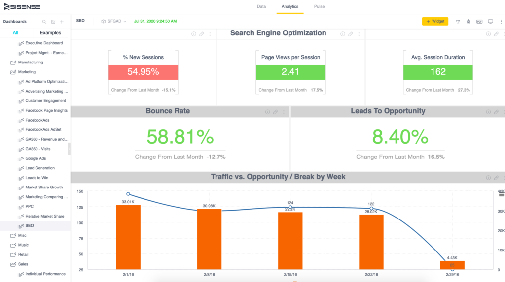
Consolidate, visualize, analyze and report on data from multiple sources with solutions like Sisense.
In addition, Sisense allows you to create your own custom data reporting apps that you can embed as analytics dashboards and interactive reports for internal use — or even as part of the value you offer to external stakeholders.
Once you create your dashboard, decide what kind of data you should be monitoring in order to create a better-performing content marketing strategy.
Here’s where you can start…
2. Update your best-converting content
In most cases, around 20%-30% of any website’s content is responsible for 70%-80% of its traffic.
And that is ok.
Generally speaking, it may be wiser to get your best-performing content to perform even better than fruitlessly trying to get your weaker content to start delivering results.
At the very least, optimizing your best-performing content is actually the lower-hanging opportunity not to miss.
Finteza is a web analytics suite with a strong focus on conversion monitoring.
You can set up multiple events you want to be tracked on your site to evaluate your content performance.
Finteza helps you identify content that does the best job converting your readers into buyers or subscribers.
Select your primary event you want tracking on your page.
Click the “Pages” report, which will be sorted based on how well it converts your site visitors.
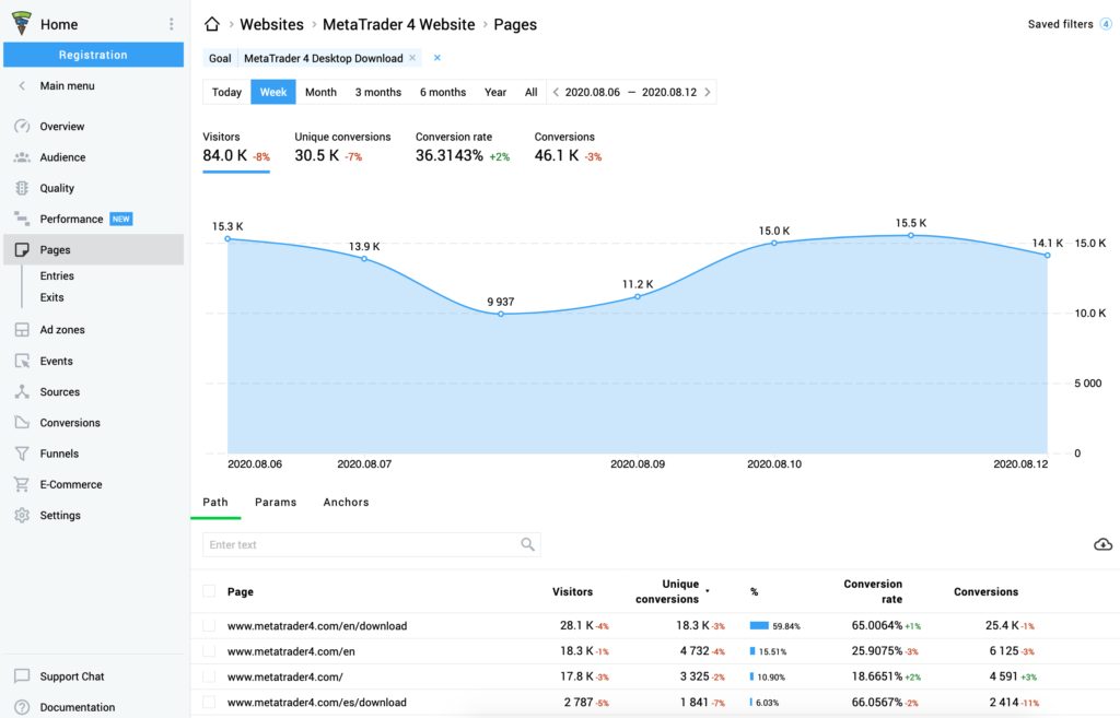
With Finteza, you can see the page that does the best job converting your site visitors—these are the pages you want to focus on ranking higher.
3. Monitor your site internal search
While your Google rankings are publicly known (thanks to all the smart competitive intelligence tools out there), your internal site search is your own data source no one else has access to.
And yet, it is one of the most under-utilized data sources out there, with few publishers paying attention to what their readers are searching for.
Your internal site search is like a map of everything your target audience wants and whether your site satisfies their needs, especially if you are using the right tools.
Google Analytics offers a robust on-site search analytics option which also comes for free.
There are also a variety of WordPress plugins that enhance your site search functionality as well as report on what is being searched and how the search results seem to satisfy the site users.
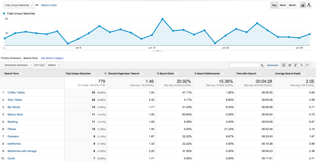
Screenshot source: Internal Site Search Optimization: Best Practices for Your Site (which is also a great guide to bookmark)
4. Re-optimize for your most clicked keywords
Approximately half of Google’s search results are comprehensive and interactive enough for users never to click elsewhere.
In other words, Google’s SERPs are sending fewer and fewer clicks to publishers.
Yet, Google remains the most effective traffic source out there. According to various case studies, organic search optimization can bring about a massive increase in ROI.
ClickMatix, an Internet Marketing agency based in Melbourne, cites an average of 30% increase in revenue and up to 150% increase in conversions within about 6 months after implementing an SEO strategy.
Your SEO strategy should be all about targeting rankings that send clicks.
This means that not all rankings are worth fighting for.
But how do we know if a particular search query is going to generate traffic until we actually get our page to rank there?
The first step is to make publicly available data into account (search volume and more).
The next step is to review SERPs prior to optimizing for them.
In many cases, as a searcher, you can tell whether another user would feel compelled to scroll down and click organic listings.
For example, in the case below, the need to scroll beyond the first image results is very slim.

There’s no need to scroll beyond this view.
But your most reliable source of data is — again — yours.
Google’s Search Console allows you to identify search queries that send you clicks — even when your page isn’t normally ranking #1.
These are rankings you want to rank higher for. If you are getting clicks when you rank #3 or lower, rest assured the traffic will be much better when you rank #1-#2.
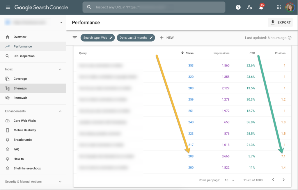
Look at your keywords with the highest click-through rates in Google Search Console, and identify the search queries that send you clicks, even when your page isn’t at position #1.
5. Create content to address your branded search queries
Finally, check to see how your future and current customers are searching for your own brand — this will give you a lot of insight into how they perceive it.
Are searchers having trouble navigating your site or finding some particular information?
Do they search for reviews?
Are there any negative terms (scam, bad, etc.) that happen to be searched alongside your brand?
Again, Google’s Search Console gives you access to that data. Make sure to use the “Query” filter to narrow search queries to those including your brand name.
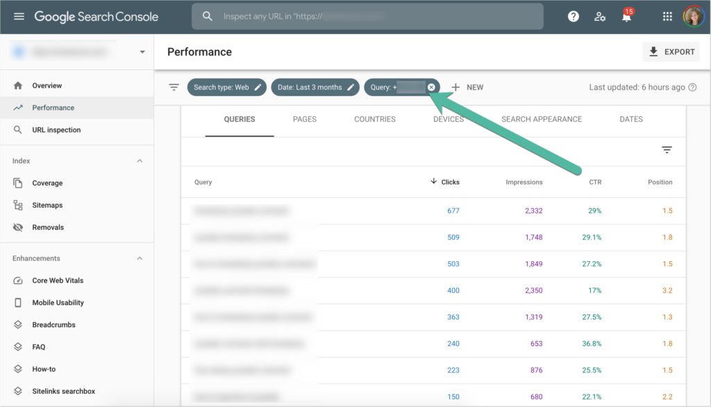
In Google Search Console, filter by query and review your branded search queries.
Conclusion
These days, content marketers have access to more data than they care to use, which is unfortunate because knowing which data to use and how to use may put you ahead of your competition.
Hopefully, the tools and ideas above will get you started!
The post 5 Data-Driven Content Marketing Tips You Need to Use Now appeared first on Content Marketing Consulting and Social Media Strategy.
Source: convinceandconvert.com

How to Identify and Close Your Keyword Gaps
Would you like to uncover new traffic-driving search queries for your site?
I bet you are thinking, “Yes, of course,” right now.
If so, here is a new idea for you: Perform a keyword gap analysis.

What is Keyword Gap Analysis?
Keyword gap analysis (also referred to as content gap analysis) analysis means identifying ranking opportunities your site is missing.
Usually, it involves analyzing which queries your close competitors are ranking for and your site is not.
But there are various ways to identify content gaps.
Why is Keyword Gap Analysis Important?
There are many different ways people search for the same thing online.
It may be impossible for a single team to foresee all of those.
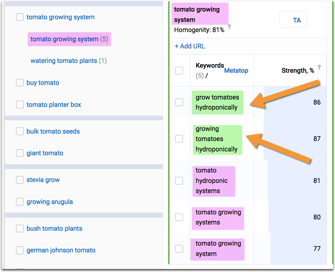
Even if you think you are pretty good at keyword research, there is one step you have always have to start with: your core term.
But what if your customers have a different idea of what that core term should be? If so, you are missing a huge chunk of keywords.
There can be synonyms, local terms, jargon, etc. you are not considering.
There may be products or product features you are not offering.
There may be problems your service is solving, but you fail to mention them on your site.
In all of those cases, content/keyword gap research is helpful.
How to Perform Keyword Gap Analysis
Here is how to perform keyword gap analysis:
1. See what your competitors are ranking for, but you are not.
This type of analysis is available through any SEO platform these days. My two favorite ones are:
Spyfu
Spyfu offers an easy and quick way to find your keyword gaps.
All you need is to enter your domain.
The tool will identify your organic or paid competitors and generate the list of keywords that you are missing.
In Spyfu, the feature is called Kombat, and it allows you to research your keyword gaps based on the following intersections:
- Keyword universe: Keywords unique to any of the entered domains
- Weakness: Keywords both of your competitors are ranking, but you are not.
- Exclusive keywords: Keywords that are unique to your domain (your competitors’ keyword gap).

The detailed view will let you see and export all your missing keywords together with their search volume and “keyword difficulty” that takes into account various factors (like title optimization, quality of backlinks pointing to the page, etc.)
What I love about Spyfu’s tool is that it allows you to find keyword gaps for both organic and paid keywords.
You’ll find similar sections inside Ahrefs and Semrush, but I don’t believe either of those offers paid keyword research.
Ahrefs
As mentioned, Ahrefs’s “content gap” tool works similarly to Spyfu’s.
What I like about Ahrefs is that it helps you research a section of your site, not just your domain or URL.
I find it pretty handy when I want a close look at a specific part of the site and identify higher-level gaps.

For example, if you were to analyze a flower shop using Ahrefs, you would be able to investigate keyword gaps for its /special-offers/ section, including all URLs that are included in that section.
This is a very handy option to have, especially if you are dealing with a large and/or multi-category site.
2. Semantic Analysis
Unlike Spyfu and Ahrefs, Text Optimizer doesn’t look at your specific competitors. Instead, it:
- Takes your search query
- Performs a search for it in Google or Bing
- Grabs search snippets those returned
- Applies semantic analysis to identify underlying concepts and entities
- Reads your content and identifies related concepts you failed to include in your copy.

There is no need to include ALL the suggestions in your content.
But the more you include, the closer the gap between your page and its organic competitors will be.
I like the tool because it pushes you to create longer, better-researched copy.
3. Your Own Analytics
Finally, you can also find content gaps within your own website analytics.
Look for under-performing pages—pages that seem to send people off from your site and pages that don’t engage your audience.
These pages obviously need some help.
Finteza is a web analytics suite that focuses on conversion and engagement analysis.
For example, if I see a graph like this, I know there’s a page that doesn’t perform well:

This is an obvious sign of a content gap:
- This page does rank and brings clicks to the site, so we cannot just trash it
- Yet, the page fails to engage anyone, so it needs content gap research.
At this point, I’d look at competing pages to see how they cater to the target audience, which questions they address, how they engage their visitors, and how their copy is better than mine.
Here are more ways to diagnose and fix lead generation problems on any content-based page, and here’s how to use analytics to improve conversions.
There are many more analytics solutions out there— here are more options.
How to Close Those Content Gaps

Keyword gap research is not simply a content optimization technique.
By identifying keyword gaps, you may discover new ways to present your products (e.g. colors, sizes, etc.), such as content-based landing pages that address problems your customers are facing and introduce your products as a solution.
Chances are, you will need to involve your product development, customer support, sales, and reputation management teams, as many gaps you are discovering can be turned into new product ideas, selling points, and competitive advantages.
While researching your newly discovered queries, look for other things you can pick up during your research.
What are your competitors doing better?
Maybe it is a nice page layout, an engaging content element, or a new way to structure content — there’s always something more to learn from your competitors.
The post How to Identify and Close Your Keyword Gaps appeared first on Content Marketing Consulting and Social Media Strategy.
Source: convinceandconvert.com

Why Good Site Architecture Is The Only CRO You Need
When you hear the words “site architecture,” the first thing that comes to mind is probably SEO. It doesn’t take much digging into SEO best practice to learn that Google loves a site with clearly defined architecture that’s easy to crawl and index. But if you stopped your site architecture planning with just your SEO, then you’ve missed out on the greater picture.
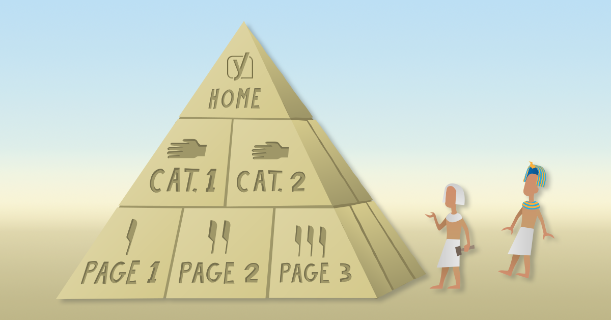
Site architecture isn’t just an effort to game search engines into ranking your site higher.
It does help with SEO, but it’s so much more than that.
Ultimately, your site architecture should be a strategic effort that allows your organic or paid visitors to navigate easily and use your site for its intended purpose.
That means that site architecture is the older brother of conversion rate optimization.
So in this post, I want to show you exactly how site architecture simultaneously supersedes and enables traditional conversion rate optimization efforts.
And to start things off, I want to dig a little deeper into why so many conversion rate optimization efforts fail.
Why conversion rate optimization doesn’t always work
When dialing in your conversion rate optimization, it’s easy to want to focus on the more traditional efforts.
Typical conversion rate optimization efforts require brands to set up competing versions of the same page in order to see how they can improve them.
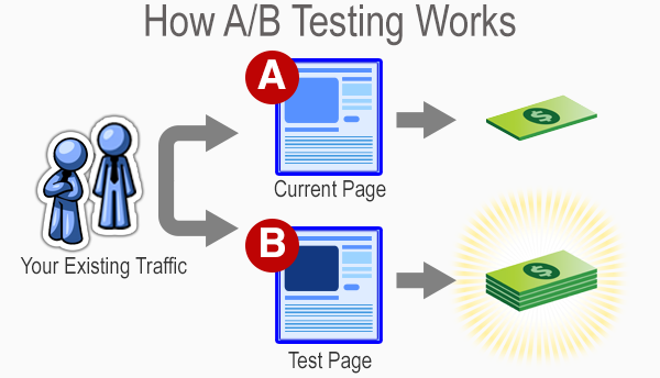
It’s like a battle royale for website pages.
After a week or two of waiting and measuring, the best-performing page wins.
One of them stays up, while the others are discarded for all eternity.
From there, more experimentation occurs based on the winning page’s performance to see if anything else can be improved.
Sometimes, brands will even get brave and conduct some multivariate tests to see if changing multiple elements can yield improvement.
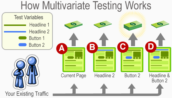
Much like a traditional A/B test, the results hinge on a last-man-standing approach.
Brands can be the loser, and the winner stays up as the subject of more experimentation.
All of this is an ongoing effort to see how you can improve conversions over time.
Many frequent blogs about this practice, which even has its own career field in the marketing industry.
But these types of tests aren’t always the most dependable for small brands that need to optimize as efficiently as possible.
And even some large businesses fall prey to common A/B testing mistakes.
For example, elements like sample size can drastically skew the results of conversion rate testing.

Simply put, if you’re not getting enough traffic, then you’ll be making changes and concluding off of insufficient amounts of data.
That means you could be making the wrong moves and ultimately hurting your brand’s performance.
Or you could also be testing something silly, like colors on your website.
To put it in ConversionXL’s Ott Niggulis’ words:
“There is no universal best color. What works on one site, doesn’t necessarily work on another.”
And that’s part of the point as well.
Many conversion rate optimization trends rise on the backs of a brand or two saying they saw good results from a particular experiment.
Then everyone does it, and confusion results when improvement doesn’t follow.
And then to make matters worse, many brands often don’t allow a proper amount of time to see if their results end up sticking.
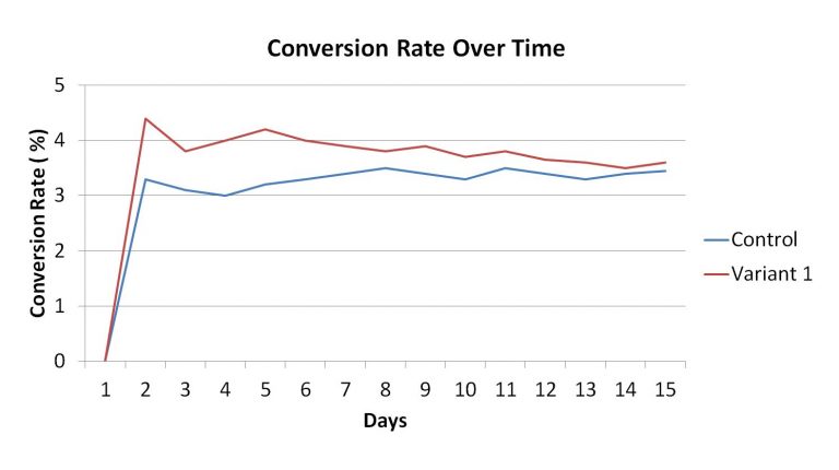
If your variable regresses back to your control’s average, then there’s a good chance that dropping your control could be a bad idea.
Many brands will prematurely make a decision in the first few days, which ultimately hurts them in the long run.
People call this the small win mentality. It ultimately leads to poor optimization and potentially undermines your results.
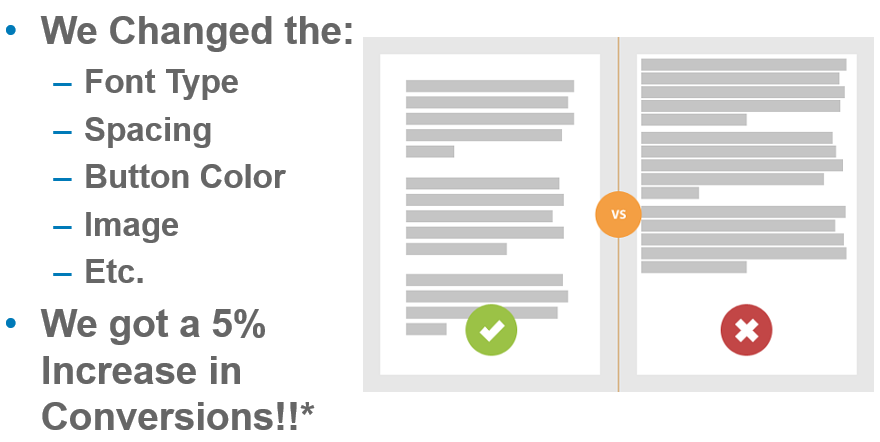
So with all of the potential pitfalls of traditional conversion rate optimization, can site architecture create a more foolproof way to ensure that your website sees plenty of conversions?
To answer that, I want to break down some of the basics of site architecture and show you how it correlates to your conversion rate optimization.
How site architecture creates conversions
Your site’s architecture focuses on building a platform that is easier for your users to navigate.
When you look into what site architecture actually is, you’ll typically see a graph that offers a genealogy-like depiction of how pages on your site interact.
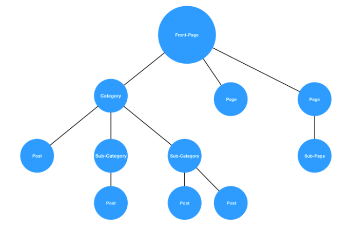
While there’s a good chance no two sites will be exactly alike, this hierarchy style is a pretty standard example.
You start from a homepage and then navigate through a series of categories and subcategories until you’ve found what you’re looking for.
If this process is fluid, as in the graph above, then your users will have no issues.
But if the architecture is muddled, and it’s hard to find a page that should fall under a natural category, then it’s increasingly more likely that your users will leave.
In other words, the idea is to create a fluid user experience that ultimately leads to trackable and accurate conversion testing.

If you implement this correctly, you’ll have a site that’s easier to improve on in the long run.
But does site architecture have a genuinely positive effect on your conversions?
A brand called Voicer reported a 75% increase in conversions by correcting some “small” user experience flaws in their site.
If they can see that kind of improvement from small changes, imagine what would happen on a site that has significant user experience problems.
And yet another brand reported a 112% increase in revenue by improving the usability of their site.
So, good site architecture that leads to a good user experience can clearly act as a solid basis for conversion rate optimization.
But breaking down the user experience of your website isn’t a simple process.
It requires a great deal of data gathering and analyzing to get to a point where you can indeed create a site architecture that works well for conversions.
Thankfully, there’s a method called the honeycomb model that shows you how exactly user experience can be broken down to help optimize your conversion rates.
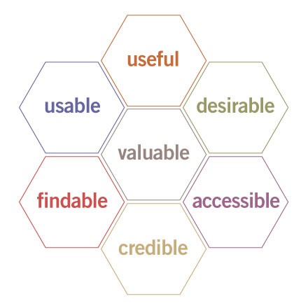
This methodology provides a simple framework that helps brands create websites with the following characteristics:
- Useful: Serve the purpose for which they created it.
- Usability: Simple and easy to use.
- Accessible: Anyone can use it.
- Desirable: Provides positive emotion and is pleasant to use.
- Findable: Navigation is intuitive, and solutions are easy to find.
- Credible: Conveys in a believable or trustworthy manner.
- Valuable: Delivers on a promised value.
If you can fulfill all of the requirements in the honeycomb model, then you optimize your sales funnel paths naturally for conversions.
So for the rest of the article, I want to show you some ways that you draw a direct line between user experience, site architecture, and conversion rate optimization.
Site Architecture for Lead Generation
You’ll see without a doubt that site architecture is a viable path to increase your lead generation.
Reason #1: It gives your site utility
The first steps of the honeycomb model rely on creating a website that is useful and usable.
This addresses the utility and the function of your site in a few ideas that are easy to understand.
But just because they’re easy to understand doesn’t mean they’re easy to implement.
When building out your site’s architecture, you need to create an experience that helps your user find what they came for.
This natural flow is the first place to start when addressing the usability and usefulness of your website.
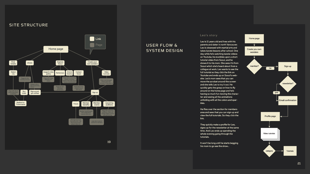
This ultimately determines how people interact with your website.
And how they interact with your website will, in turn, determine how many conversions you get in the long run.
Think of it in terms of an example involving a site that sells power tools.
On a well-designed website, this would be a logical flow of thought:
Users can navigate based on the type of tool that they want to find. The site then presents individual products according to whether they are cordless, electric, or gas powered.
Now imagine if you were to switch some of the products around.
In this case, if you were trying to find a gas-powered saw, you would naturally look under the gas-powered tools.
If you misplace this in your site’s architecture, a user might navigate to the logical page but still be unable to find a product you actually have.
That means no matter how much you optimize the page, your organic traffic will struggle to navigate your site and may ultimately leave.
So when linking site architecture to conversion rates, the first place most brands start is with a mockup of what they want their users to achieve.
The purpose is to base the entire website design process on actual data and user behavior.
In the words of Paypal UX designer Larry Sawyer:
“They say a picture is worth a thousand words, but a mock-up is worth even more than that.”
So this design process typically follows a flow of testing, analysis, definition, ideating, prototyping, and then validating.
If you follow this particular model, you’ll be able to create a website that is usable by anyone in your audience and thus inherently useful to all parties.
So your initial goal is to optimize your site according to what visitors are doing.
You then take that information and analyze their behavior to see what stands out.
How they use your site defines what is essential, which further provides you the ideas you need to test if you want to improve your conversions.
From this information, you create a prototype of your website, and then validate your findings with additional testing.
If the prototype is invalid, you rinse and repeat until your site is in complete working order.
Keep in mind that this style of UX design does typically involve more design than just site architecture.
But for our purposes, we want to focus on the bigger picture.
So when finally creating your site’s architecture mockup, many brands start with a comprehensive markup of how the elements of every page contribute to the user experience.
As this professional breakdown demonstrates, you can draw out and improve every aspect of your site.
From this exercise, you can create a basic outline of what your users should achieve on every page of your site.
The purpose here is to take a vast amount of data from your original design and then strip it away until only a series of user actions remain.
This, in turn, dictates your site’s architecture as it is a direct representation of how you want your user to use your site.
From this simplified design, one then typically creates a more comprehensive wireframe mockup.
Once you’ve completed the wireframe, you only need to finalize your imagery, copy, and calls to action.
You can then test your new prototype site to see if your user experience is positively affected.
If this simplifies the actions your users take, then you truly aligned your site’s architecture with the intent of your audience, thus fulfilling the usefulness and usability criteria.
This process can be tedious, but it’s a great illustration of how data-backed and conversion-oriented your site architecture really is.
If you can successfully do this with your site, you’ll be one step closer to creating a better overall conversion funnel that will help your brand for years to come.
Reason #2: It creates positive momentum
As we move deeper into the user experience and site architecture connection, the next layer according to the honeycomb model hinges on creating positive momentum.
That means according to the honeycomb model it needs to be desirable, accessible, and findable.
So once you’ve established a flow and created a site that’s usable on any device, the next step is to move beyond and create a pleasant experience.
It may surprise you to learn that one in three users will leave a site because they can’t find a product.
That means your site architecture can hurt conversions in a very direct way.
So your goal at this point should be to create a site that’s both easy to navigate and that builds natural forward momentum.
If you strive to emphasize the architecture of your site with compelling storytelling, the natural result will be that more users complete actions on your site.
That means finding a way to create a site whose architecture naturally lends itself to being informative, interactive, and even at times entertaining.
Consider the example of the site My Grandmother’s Lingo.

This award-winning website helps users learn new words from one of the oldest language in the world.
The creators designed the website for use and utility but even took that effort a step further by making it compelling and engaging.
The tantalizing idea of learning something both old and new hooks the user, and then sends them on a 10-minute journey where they learn something.
In the end, the primary goal is to help spread awareness of these ancient languages and provide a platform for future preservation.
How do they achieve this? Through vivid storytelling and clear site architecture that’s geared toward positive momentum.
But momentum isn’t just about storytelling.
It also relies on where you position yourself, like on mobile.
More than ever, users are browsing with a mobile device.
That means that the architecture of your site needs to be conducive to both a desktop user and a mobile user.
If you only focus on one or the other, you are missing a significant portion of your potential audience, and thus you are losing conversions.
And if someone comes to your mobile site only to find it isn’t optimized, then all positive momentum is gone.
But momentum has to start even further back with your SEO.
And site architecture plays a critical role in bringing organic traffic to your site and providing forward momentum.
In one study, a brand was able to increase their site’s organic traffic from 800 visits per month to over 3,600 per month by focusing on the user experience their website gave.
That’s a growth of 350%.
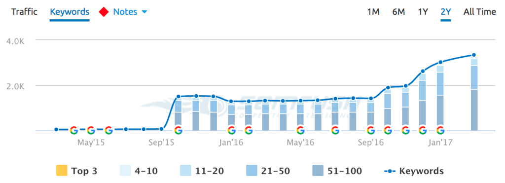
They achieved this by focusing entirely on the information architecture of their site and its contents.
So it’s clear that site architecture can lead to more traffic.
If your traffic can access across any device, then your momentum continues.
Moreover, if your storytelling is engaging, you further the momentum again.
And all of this links back to your site’s architecture and how well both Google and your audience utilize it.
Reason #3: It ultimately clarifies the value
The final reason that links your site’s architecture to your efforts concerning conversion rate optimization hinges on your site being credible and valuable.
Another way you could say that is, “How does your site’s architecture help you deliver on your promise?”
If you fail to deliver a promise by creating a muddled and confusing site, then you’re never going to be able to see any real improvement from an A/B test.
And according to the LIFT model of CRO, the clarity and relevance of your value proposition will ultimately take your brand to new heights.
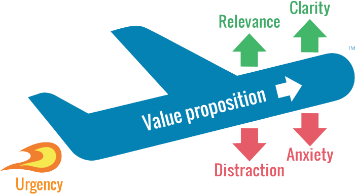
The key to remember here is that users don’t always come to your website via your homepage.
There’s a good chance they could enter at any given point, so long as they have the right URL.
For example, how do you potentially sell – via your site’s architecture – to a visitor who first visited your blog?
If you don’t have a way for them to get their bearings and navigate your site immediately, you could potentially lose a lead before the process even begins.
Your goal then, with your site’s architecture, is to provide value at every stage.
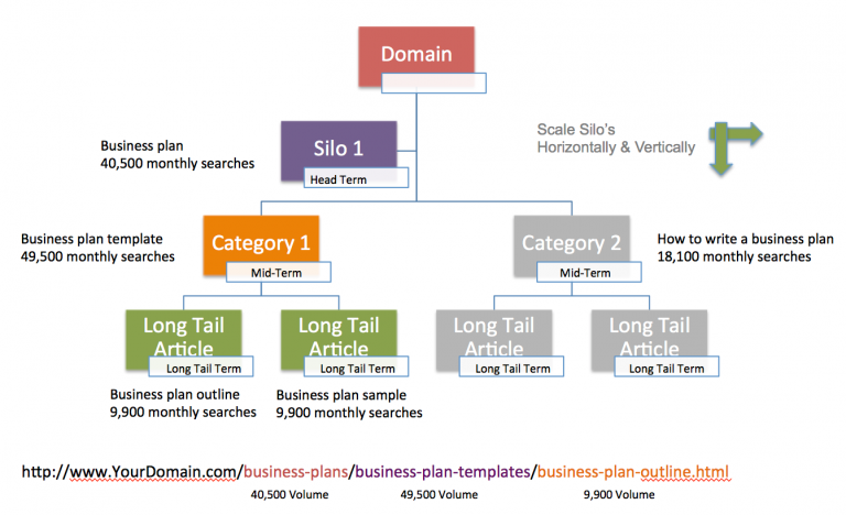
That means that when someone comes to your site, they should immediately know where they are.
Elements such as your permalink structure even play a role in helping your visitor understand where they are and what value your site offers.
If you parse your site out into easily understandable silos, like the example above, users will see your site as much more credible and ultimately more useful.
Take for example the Merge and Purge case study that sought to boost organic traffic and improve user experience.
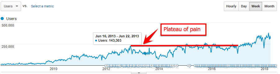
In this case, the focus was on taking disparate pieces of content created over many years and compiling them into understandable content silos.
When the site was simplified, they saw a 32% increase in organic traffic.
And as we’ve already seen, organic traffic is part of the site architecture conversion machine.
So in this case, by clarifying the value of their site by creating a cleaner content architecture, the brand was able to achieve a big win.
Brands should always seek to clarify their value proposition, and in this case, the answer is simple:
Your site architecture is the best place to start.
Conclusion
Conversion rate optimization is a nuanced and technical field.
It takes a lot of time and effort to learn the ins and outs of what works and what doesn’t, and that often trips up brands that seek to experiment and grow their online presence.
A/B tests fail very often, and the resulting frustration often turns businesses away from conversion rate optimization as a whole.
But if you were to focus on creating robust site architecture, the results can be very different in the best possible way.
Site architecture is the backbone of conversions, and following the honeycomb model to help improve your user experience is the best course of action.
If you do, your site will have much more utility, and your site’s users will be able to navigate with ease.
From there, you can use your architecture to build positive momentum and keep people engaged with your brand.
And finally, you’ll have a clearer and more appealing value proposition that users can find from any entry point.
You’ll be much better suited to grow and convert new leads by merely creating a solid site architecture.
How has your site’s architecture helped or hurt your brand?
About the Author: Neil Patel is the co-founder of Neil Patel Digital.
Source: feedproxy.google.com